We all want kitchen cabinetry that fits the space and our personal style as perfectly as Cinderella’s slipper. Achieving that designer look can feel intimidating, though. The extra costs of experts like architects who are excellent at creating dream homes are not always available or affordable.
Connect with trusted tradies. Receive instant quotes for your next job with hipages.

Sometimes you just want an easier way to achieve a high-end look. This exact desire to upgrade within constraints was faced by homeowners Hayley and Terry Little. Keen to get the renovation ball rolling following the 2020 purchase of their new Gold Coast home, they were met with a common Covid-induced conundrum: building products were in short supply and tradesmen were restricted from entering their property.
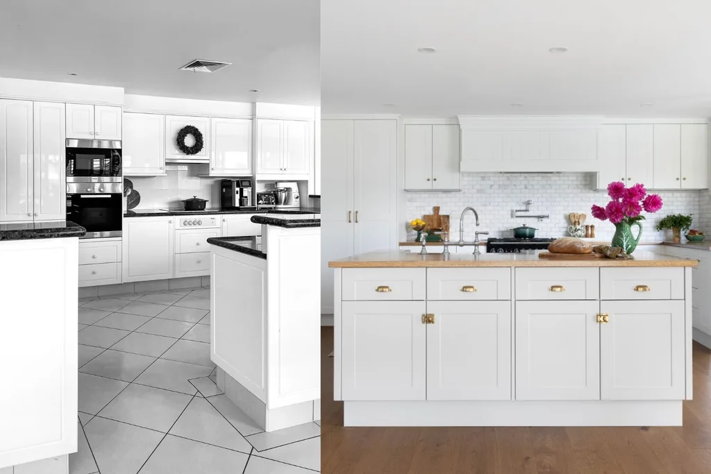
“That’s when I decided to start a few projects myself,” says Hayley, who also shares the home with her three children, Lucinda, 22, Arabella, 20, and Orlando, 11, cats Skipper and Salem, and Holly the spoodle. The results are magnificent, as you’ll see in the before-and-after pics of their Kaboodle kitchen and laundry below.
Here’s exactly what they included to achieve a designer-looking DIY renovation:
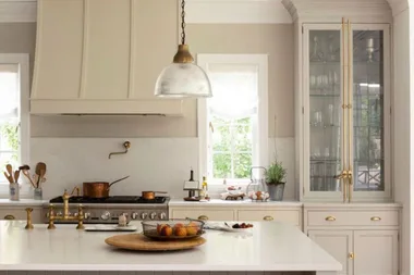
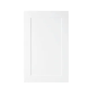
1. Custom flat-pack cabinetry
“I’d seen a few amazing kitchen transformations on social media using Kaboodle products, which sparked my interest,” says Hayley. “The range is available from Bunnings – the one store that stayed open during lockdown – and I was able to buy most things straight off the shelf and special order other items.”
The covetable element to Kaboodle cabinets is that you can customise it to suit your space. Plus, it comes packaged like a set of Lego that pieces together on site.
2. Well-planned storage
“Storage was, and always should be, a priority when designing the kitchen,” says Hayley. “Kaboodle has a great range of hidden storage solutions, which I utilised to maximise every square inch of space.” She names the pull-out pantry as one of her favourite features, with its wire baskets ideal for sorting and categorising food items.
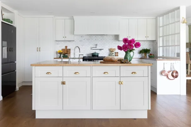
There are cupboards and drawers above and below the oak workbench and built into the central island, while a small nook above the fridge serves as a display area. “I love an opportunity to create a vignette and this spot is ever-changing with different decor,” Hayley adds.
3. Rangehood cover
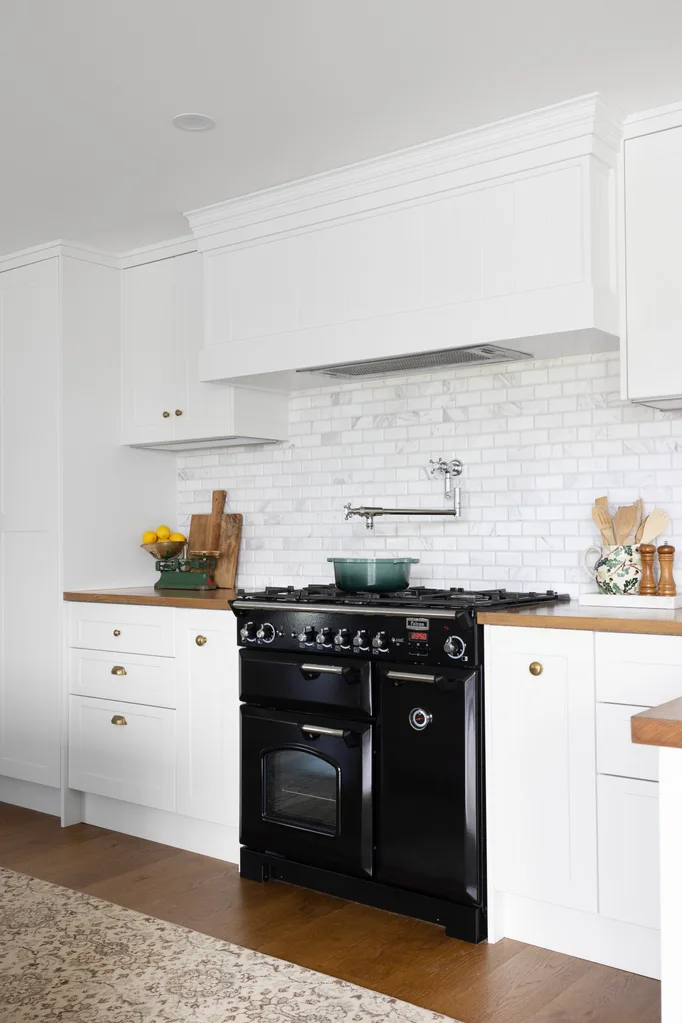
“The rangehood was a process – it took a while to make a decision here,” Hayley recalls with a laugh. She and Terry debated a number of options for its concealment, from VJ boards to tie in with other areas of the home, to Venetian plaster with curved lines, and even stainless steel with a brass trim. “This went on for weeks, then one day, I went back to VJ and my husband loved the idea. I think with the dropped ceiling it was the right choice. It’s simple yet adds texture and interest.”
4. Statement appliances
Eschewing the trend for concealing appliances, Hayley has made a feature of hers, opting for a classic black Falcon oven and cooktop and matching black Electrolux refrigerator.
5. Mixed hardwares
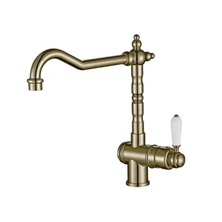
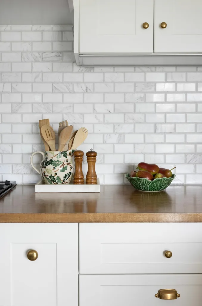
To lend texture and interest within the white palette, Hayley added a mix of styles with the hardware. “I used different knobs and pulls by Forge Hardware Studio in a raw brass finish that will patina beautifully over the years,” she shares. The pot mixer and sink bridge mixer are from Brodware.
6. Luxe colours and prints
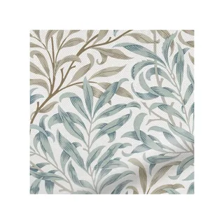
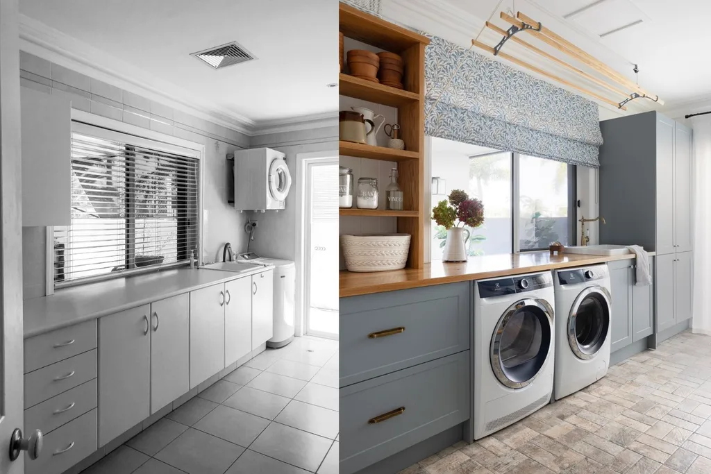
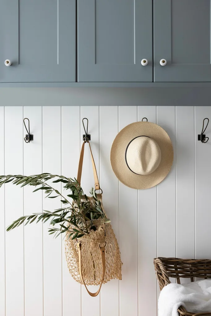
The laundry was treated to a duck-egg-blue colour scheme, all new storage solutions, including two drawers for dirty washing, wall hooks and broom storage, plus new blinds in a pretty willow print. “Both spaces are practical and hardworking,” says Hayley. “Everything has a home and we can find things quickly and put them away easily.”
7. The same layout
While the original laundry was a decent size with a good layout, storage was scarce and the cabinetry and decor had seen better days. “The laminate was peeling off and the doors were falling off their hinges,” reports Hayley, who also wanted to update the baby blue and beige colour palette. In good news, the room’s position, separated from the rest of the house by a small thoroughfare, meant it could have its own identity.
8. Beautiful shades
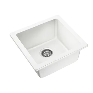
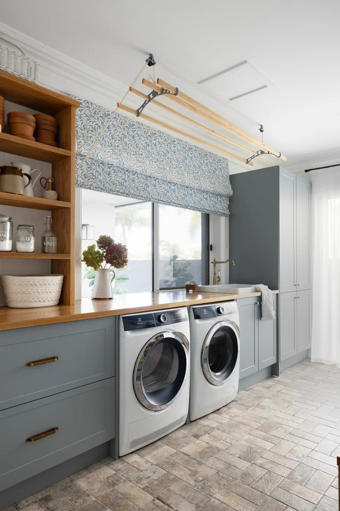
First step: all new Kaboodle cabinetry in the same ‘Alpine’ profile as the kitchen, but in shade Kaleo. There are drawers for dirty washing, a cupboard for broom storage, and an oak bench with a ‘Ravine’ sink and ‘Clasicó’ tap from Turner Hastings. Chicago Brick State Street tiles from National Tiles are on the floor.
Sheer linen curtains and blinds in William Morris ‘Willow Bough’ fabric from Blinds Online soften the effect. “This is probably my favourite space in the house,” says Hayley. “I wanted it to feel more like a living area than a cold utility room. It’s still functional and practical – perfect for our family.”
9. Wood elements
Benchtop shelves were made from offcuts leftover from the oak work bench. “I love that we were able to repurpose them; it’s ended up being such a gorgeous feature of the laundry,” says Hayley. A Kitchen Maid clothes airer provides another lovely focal point. “I love the beautiful wood lines mixed with the cast iron,” she adds.
10. Hanging hooks
A feature wall of Easycraft ‘EasyVJ’ panels painted in Dulux Snowy Mountains Quarter is studded with hooks sourced on Amazon to hang hats and bags for that ‘styled’ look.
SHOP THE LOOK
Source book
Interior design: Hayley Little, @mumlittleloves.
Kitchen and laundry: Kaboodle, kaboodle.com.au, @kaboodlekitchen.
 Photography: Louise Roche / Styling: Kylie Jackes
