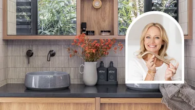
The modern bathroom is nothing like its predecessor. Far from a tacked-on box or a dark and pokey water closet, homeowners now understand and appreciate the benefits of a beautifully designed and decorated bathroom.
Connect with trusted tradies. Receive instant quotes for your next job with hipages.

Like every other room in the home, a bathroom is now planned for success, starting with a realistic budget first and foremost. From there careful planning can inform key choices on a colour scheme, layout, fixtures, tapware and finishes such as tiling, benchtops and cabinetry.
Take a tour through eight beautiful bathrooms that hit all the right style notes.
1. Tiny and all white
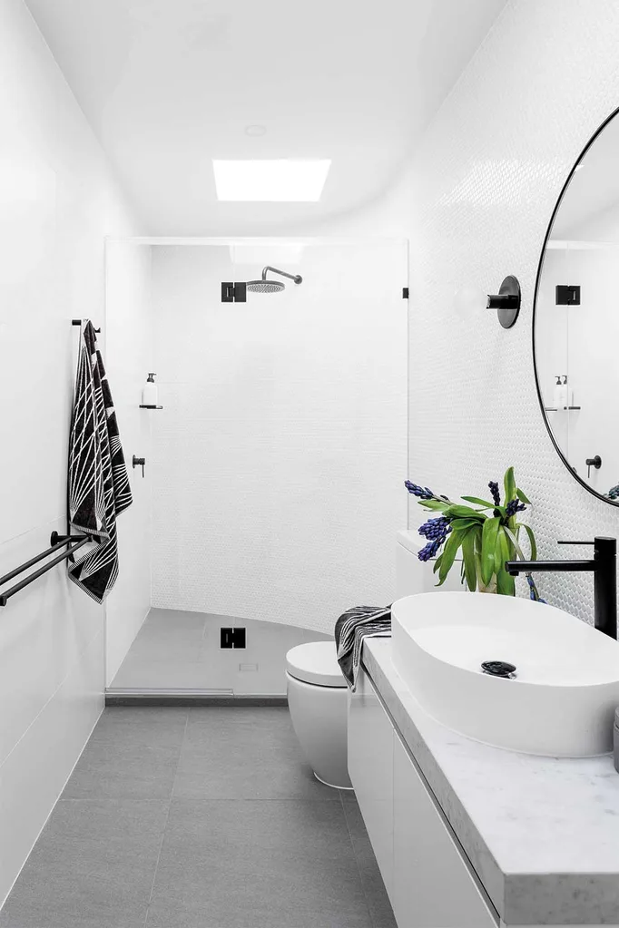
This small bathroom design has cleverly used every inch of available space without compromising on style. Black tapware punctuate the space and draw the eye around the room. The curved wall is echoed in the round mirror and elliptical basin and toilet.
2. All about the view
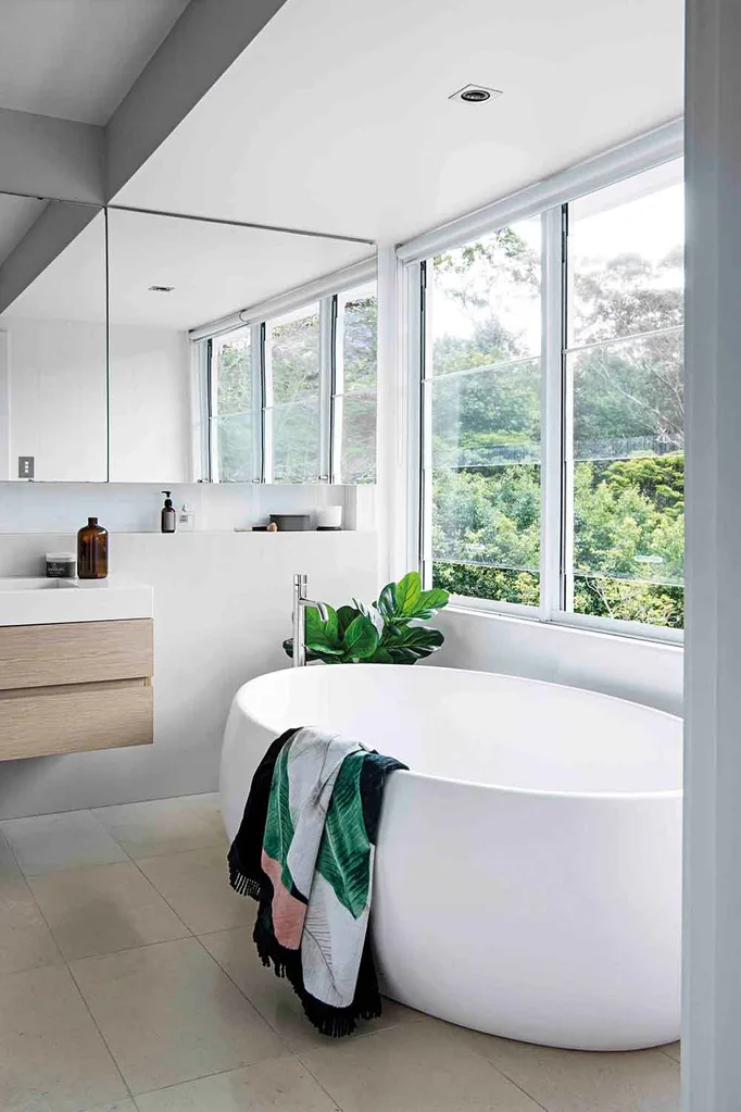
This bathroom looks larger than it is due to custom-built storage following the line of the bulkhead above and hidden behind a bank of large format mirrors. A handy shelf is recessed underneath and the floating vanity takes the eye from wall to wall across the neutral floor tiles.
3. Retro never looked so good
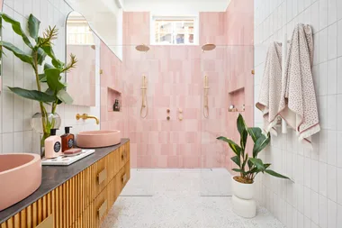
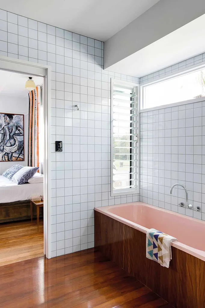
Embracing the best of mid-century style, this bathroom heroes the soft pink colour of the bathtub with complimentary groovy square grey tiles. Taking the timber up the side of the bath connects the tub to the flooring and gives a contemporary edge – as if it was always there.
More timber details in a custom mid-century style vanity where the top of a pedestal basin has been set into a terrazzo benchtop. The black pendant and tiling bring the look up to date.

4. Masterful master suite
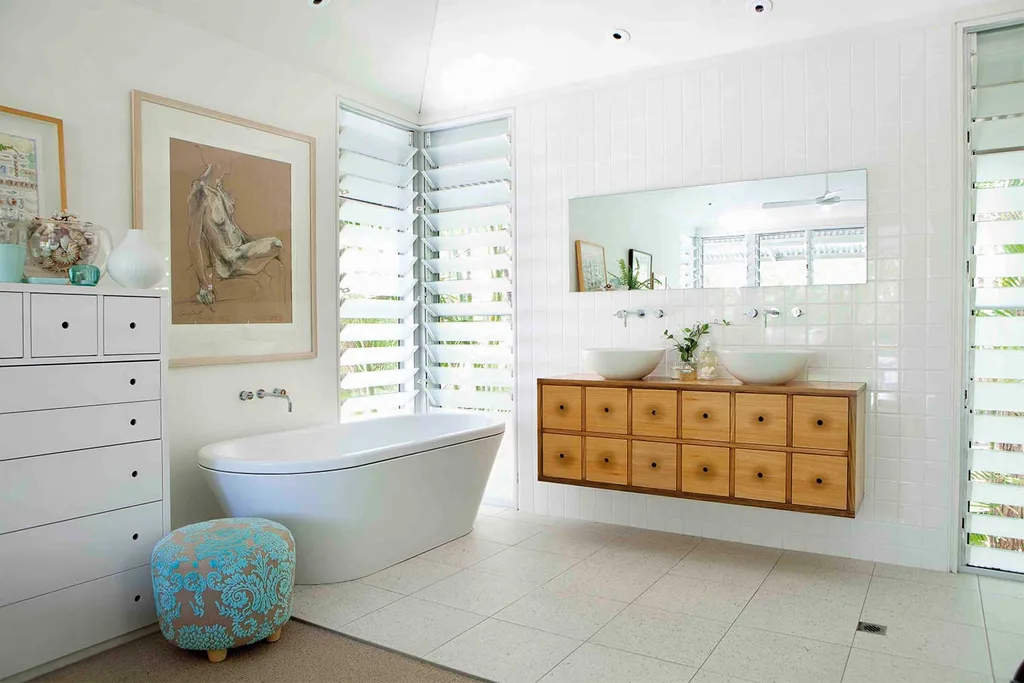
This corner of a master suite is enhanced by mounting a floating vanity unit along its entire width. The timber finish wards off a clinical feeling to the space and louvre windows provide ample airflow.
The large artwork hung above the bathtub bridges the living and wet spaces and continues the large scale.
5. Geometry at play
In this small bathroom subway tiles taken all the way to the ceiling give the impression of space. All-white surfaces and the frameless glass shower create a light a bright effect, whilst the tiny hexagonal floor tiles are a nice delicate touch.
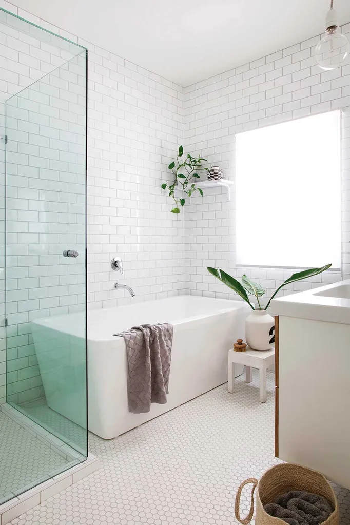
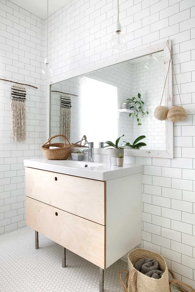
The vanity is kept neutral with light blond timber drawer fronts and an oversized mirror visually doubles the space.
6. Hardworking cabinetry
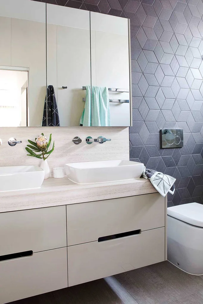
This custom-built cabinet it wall hung to avoid encroaching on the floor space and the benchtop cleverly wraps up behind the basins to incorporate the splashback for a streamlined effect. Choosing a finish that matches the floor tiles is a masterstroke that allows the moody matte patterns of the black geometric wall tiles to stimulate the eye.
7. Line it up
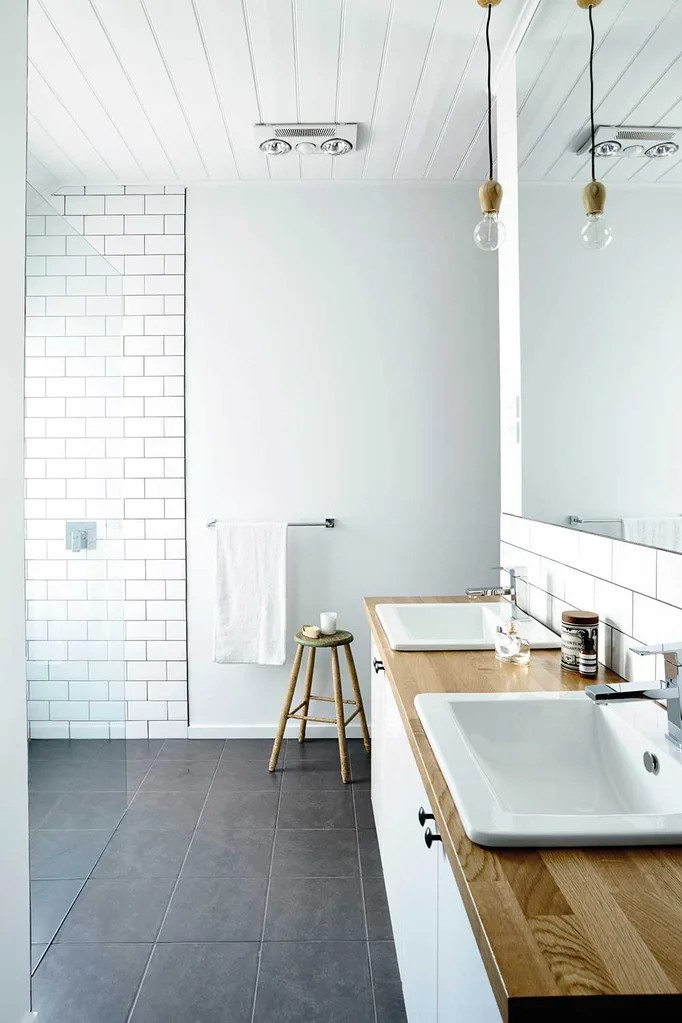
All of the linear surfaces work together in this bathroom to extend the galley-style layout to the full length of the room. Ceiling boards are reflected in the lines of the laminated timber benchtop and floor tiles are laid in a straight pattern. A frameless glass shower disappears.
8. Let there be light
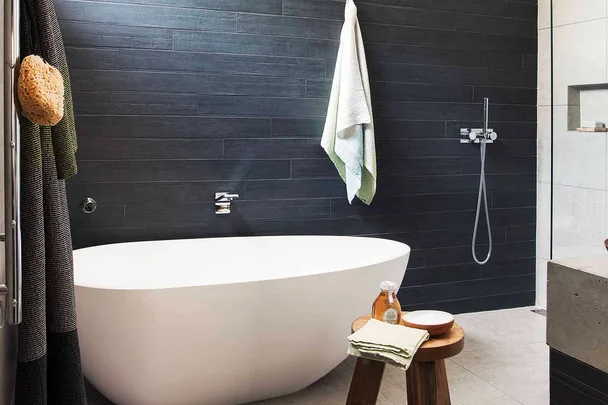
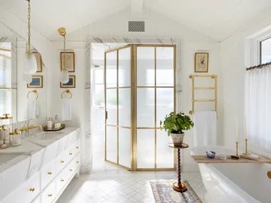
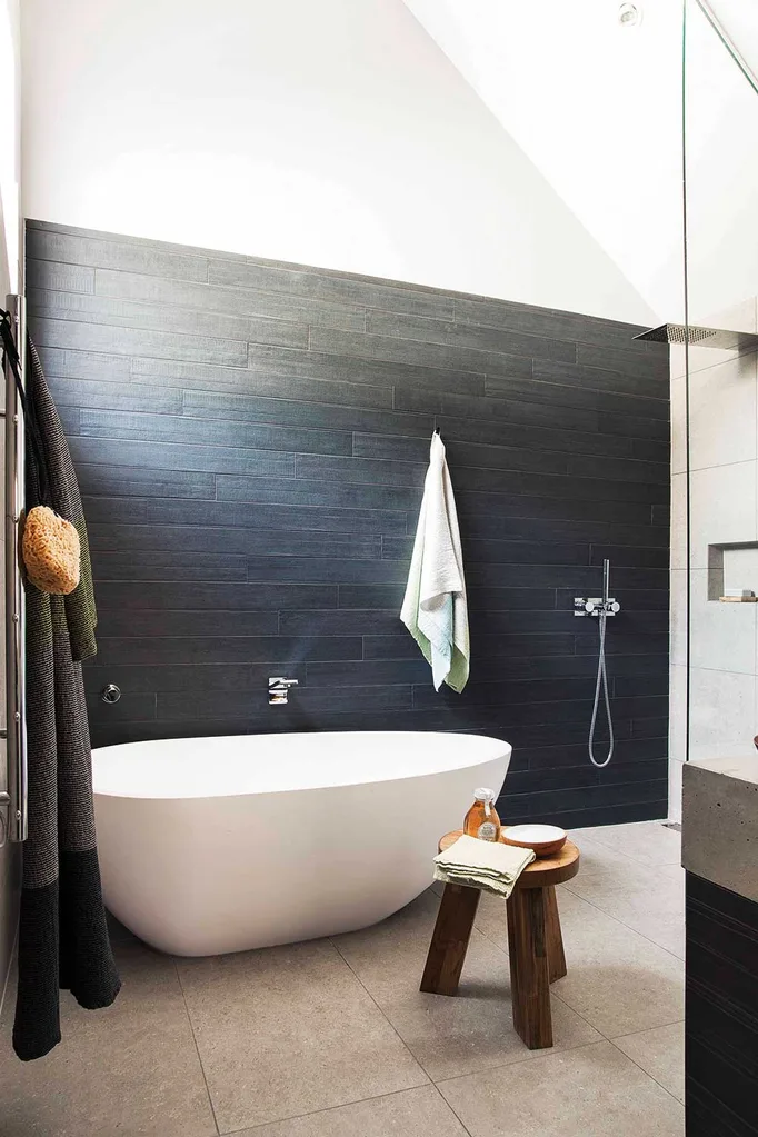
The pitched ceiling affords a flood of light into this bathroom, however, tiles have been taken up the wall only as far as the base of the pitch to anchor the space and provide a welcome intimacy. The amount of available space means everything can be chosen in large format sizes – floor tiles, extra long wall tiles and a heavy custom-poured concrete benchtop for the vanity. The shower is left open to the bathtub area and disappears from view, doubling the size of the space.
You might also like:
10 brilliant bathroom ideas for an instant refresh
Six ways to save money on your bathroom reno
Tub tally: how to choose the right bath
