There’s no doubt open-plan living is a friendly home design – the whole family can gather while doing separate things, be it cooking in the kitchen, working at the dining table or curled up on the sofa. But there’s a knack to making it feel cosy and inviting while creating a cohesive living experience across three, or more, zones. We’ve examined three beautiful open-plan rooms to reveal the inspirational ideas that make each one work.
Here’s how to make three different shaped areas work in an open space.
Box-shaped layout
In a square or rectangular shaped area, each zone flows into the next, so creating intimacy in a large shared space is key.
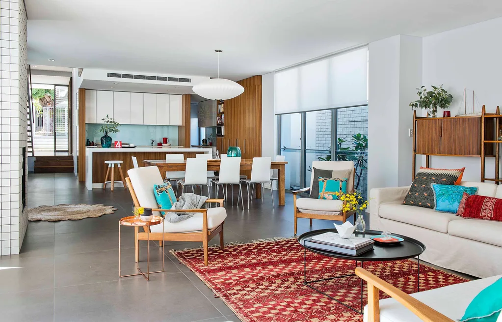
A linear layout like this one is the most difficult to manage as there are no visual barriers to frame the space, which can make it feel cavernous and cold. The secret to making it work is to demarcate each zone visually. Here, the colour palette, furniture groupings and architectural features work together to give each area its own identity while maintaining cohesion and flow. Large-format charcoal floor tiles and a quiet base palette, together with repeated touches of timber in the kitchen finishes, jarrah bespoke dining table and a wooden cabinet in the living area, smoothly unite the three zones.
A statement pendant, like this Nelson saucer pendant from Modernica over the dining table, is a classic zone-defining element. “You don’t want all your lights to be in the same style, nor do you want them to be a random selection,” advises interior stylist and author Tahn Scoon. “Instead, pick different pendants for each part of the room, but tie them together subtly by way of material or colour choice.”
Varying floor and ceiling levels can help to frame and define zones. A bulkhead defines the ceiling in this kitchen, neatly distinguishing the working part of the room from the living areas. Also, it can be a useful architectural device – especially in a retrofit reno – to conceal essentials such as electrical wiring.
“A rug in the living area creates intimacy and furniture placement makes each space inviting in its own right,” says interior decorator and stylist Jo Carmichael. This beautiful vintage Moroccan carpet, made of wool and harissa grass, injects colour and warmth. Placing the front legs of one of the vintage armchairs on the rug anchors the seating within the living area, creating a sense of connection.
The furniture is grouped to give each space its own identity; the sofa and vintage armchairs are gathered around a B&B Italia Maxalto ‘Fat-Fat’ coffee table, bought at Space Furniture, while the dining table and white and chrome chairs are set apart from the kitchen island and breakfast bar. “For a room to be functional, it’s important to have at least a metre perimeter around furnishings for comfortable access,” says interior designer Victoria Waters.
T-shaped layout
This design provides a little more definition than other spaces, however, with one zone separated, creating unity is important.
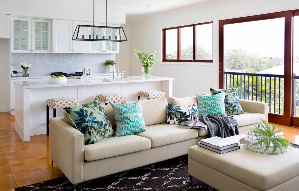
A T-shaped layout offers a great opportunity to create a ‘separate but together’ feel; here, the kitchen and living areas are next to each other and the dining room is set apart but given a sense of unity with the same wall colour – Taubmans ‘Snowy White’ – and an overarching, relaxed Hamptons vibe.
Clutter can overwhelm an open-plan area. This zone benefits from a large butler’s pantry tucked away behind the kitchen. This is the perfect place to store less-than-lovely, functional items, leaving on-show cabinetry such as the glazed wall cupboards purely for display and allowing the whole space to retain an engaging, living-room feel.
Glossy floorboards have been used throughout this space, making the transition from zone to zone feel seamless. Rugs demarcate the living and dining areas (inset), and furnishings and fabrics share a palette, building on the sense of cohesion: the material on the bar stools draws a connection between the kitchen and sofa, while their dark timber legs reflect those of the dining chairs and table.
The downside of open-plan living can be increased noise levels, warns stylist Tahn Scoon, especially in a relatively compact space like this one. “Soften sound by adding plush wool rugs and upholstered furniture,” she suggests. When your living space abuts a kitchen, shop for appliances such as dishwashers and extractors with care, taking the decibel level into consideration – your TV watchers will thank you.
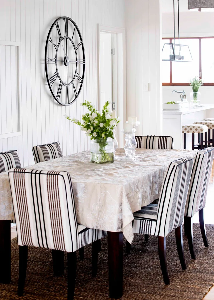
Artful effect Artwork is a fantastic way to create atmosphere in an open-plan area; this oversized clock does just the job in the dining room, while its black framework links neatly to the pendant light – another zone-defining element – in the adjacent kitchen.
L-shaped layout
In this space the zones are open, but already defined. The kitchen is best kept in the smaller area to keep noise confined.
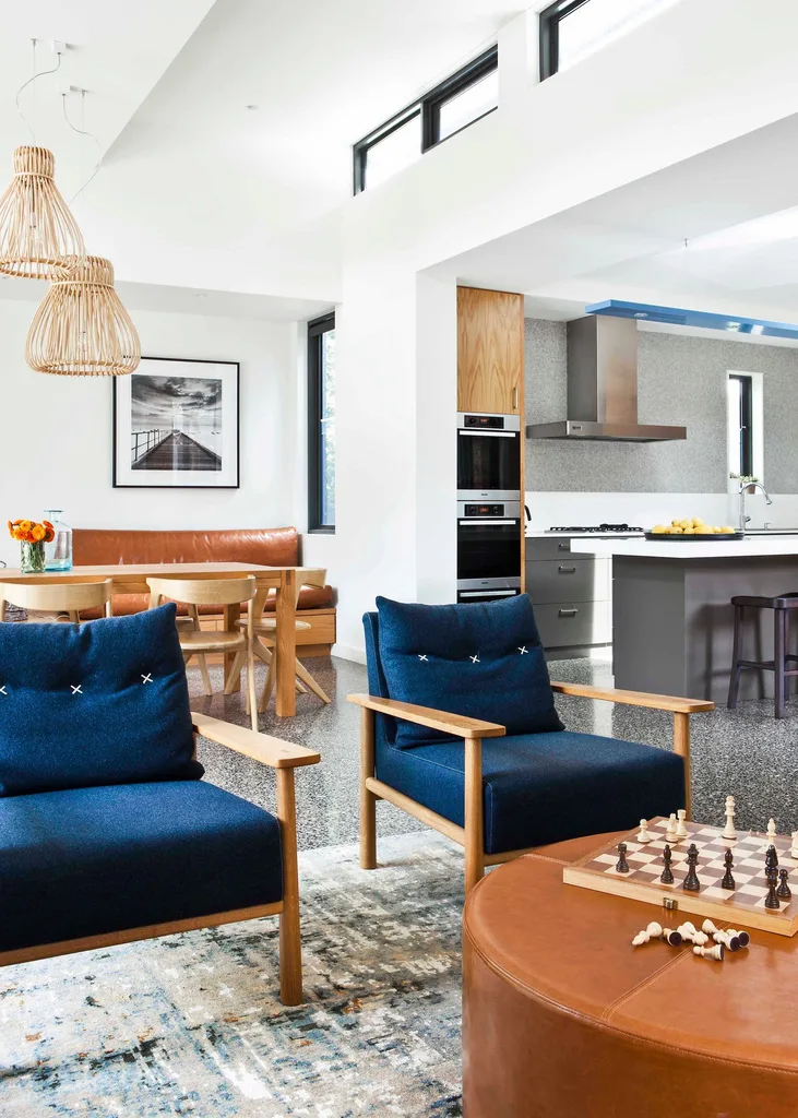
This open-plan room, part of a wider renovation devised by designer Anne-Marie Rush, unites the living and dining areas in one zone, with the kitchen in the shorter portion of an L-shaped space. The division is enhanced visually by a substantial archway and a setback which encloses a built-in timber and leather bench seat in the dining area, and classic definers like the large rug in the living space and set of pendants over the dining table. The repeated use of pale timber in each area forges a subtle connection.
A visual divide is a sure-fire way to give an area a sense of containment; the archway here draws a line between the working and living parts of the space. A short blade wall can have a similar effect, but dividers aren’t restricted to architectural features; furniture can work just as well, but be careful to choose a piece that doesn’t entirely block off the room. “If using a bookshelf as a room divider, use one that has an open back so you can see through it,” says interior designer Victoria Waters. “Ideally, it should be low in height so it doesn’t restrict the view through the rooms.”
“Open-plan living areas can read as one vast space, which can be a bit uninspiring,” says stylist Tahn Scoon. “To create interest, decorate each zone as if it were its own ‘room’; colour schemes should be harmonious but not matching.” Here, while all the colours are complementary, grey dominates in the kitchen, navy in the living area and toffee in the dining room, giving each area a distinct identity.
“Use large artworks to create impact. Position them in the centre of the zone to define the space” ~ Victoria waters
 Gorta Yuuki
