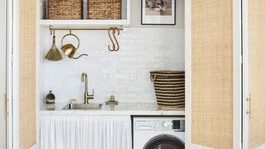
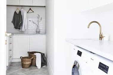
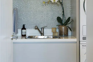
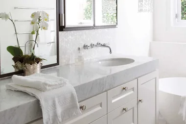
Space is often at a premium in powder rooms and second bathrooms, yet this doesn’t have to affect style and functionality. When planning an update, start by creating a floor plan to determine the dimensions you have to work with and what will fit in. Here are seven key design ideas to stretch your space and inject plenty of style.
1. Take stock
Consider who will be using the room, how often and what you need. “If it is a second family bathroom, storage and more durable finishes will be a top priority,” says Darren James of Interiors By Darren James. “If it’s a guest bathroom or powder room, it’s likely to be used less and therefore the focus can shift to creating a more luxurious feel.”
Where space is limited, you’ll need to consider all the angles. “Ensure you allow adequate clearance for bathroom and shower doors and don’t forget vanity unit doors, too,” advises Belinda Geels of Reece. Sliding doors aren’t intrusive and can be pushed back when not in use.
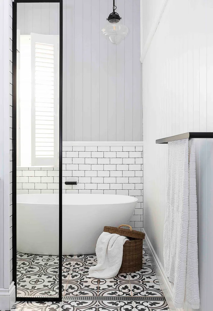
Photographer: Eloise Van Riet-Gray / aremediasyndication.com.au
2. Add little luxuries
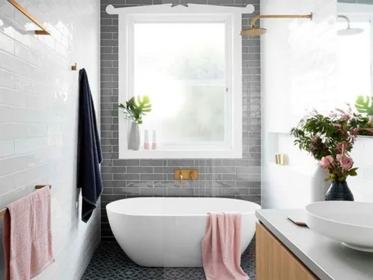
Smaller proportions can offer big benefits. With less space your budget will stretch further, opening up possibilities for bespoke finishes, designer tiles and tapware. Luxuries aren’t lost either. Heated towel rails, beautiful accessories and fragrant candles work wonderfully together to create a mini pamper zone. If it’s a bathroom just for two, the sense of intimacy can be further accentuated with double shower heads and basins, furniture for bath-side conversations and vanities with personalised features such as smart speakers and LED lighting.
3. Key measurements
For a bathroom to be user-friendly and comfortable, factor in sufficient spacing between fittings and fixtures. Use these guidelines as a rule of thumb:
The standard size of a powder room with a toilet and small vanity is 2m x 1m
The average size of a small bathroom is 3m x 2m, a standard bathroom 3.5m x 2.5m and a large one 4m x 5m
At a squeeze, you can fit a shower recess into a 900mm x 900mm space, but 900mm x 1200mm is far more comfortable
The dimensions of an average bath are 1500mm x 720mm x 400mm deep
For comfort and ease of cleaning, allow 450mm either side of the toilet
Ideally, leave one metre between the front of the basin and the nearest wall or other objects
The minimum distance between the back wall of the toilet and the opposite wall is generally 1500mm however, spacing requirements are influenced by the location of the doorway and position of the toilet.
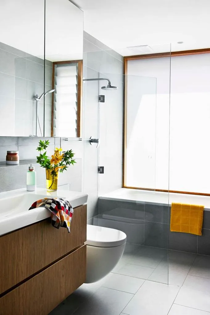
Photographer: Brigid Arnott / aremediasyndication.com.au
4. Stylish storage
Investing in good storage will reduce visual clutter, instantly making your room feel bigger, recommends Suzie Dyson of Omvivo. “There is a move towards mini vanities, which hold the essentials without taking over the bathroom,” she says. With everything in its place the space will feel less cluttered and more conducive to relaxing.
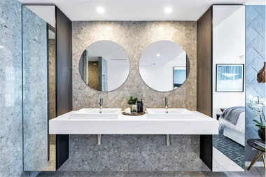
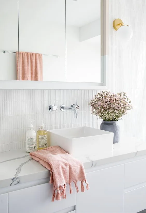
Mirrors are another great way to create the illusion of more space and brighten smaller bathrooms. “In tight spots you always want to ensure accessories offer maximum functionality, and mirror-fronted cabinetry is ideal,” says Belinda Geels of Reece. Full-length mirrors offer real wow-factor, while mirrored tiles are a subtle way to boost reflections, bouncing natural light around the room.
Photographer: John Downs / aremediasyndication.com.au
5. Show off the floor
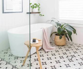
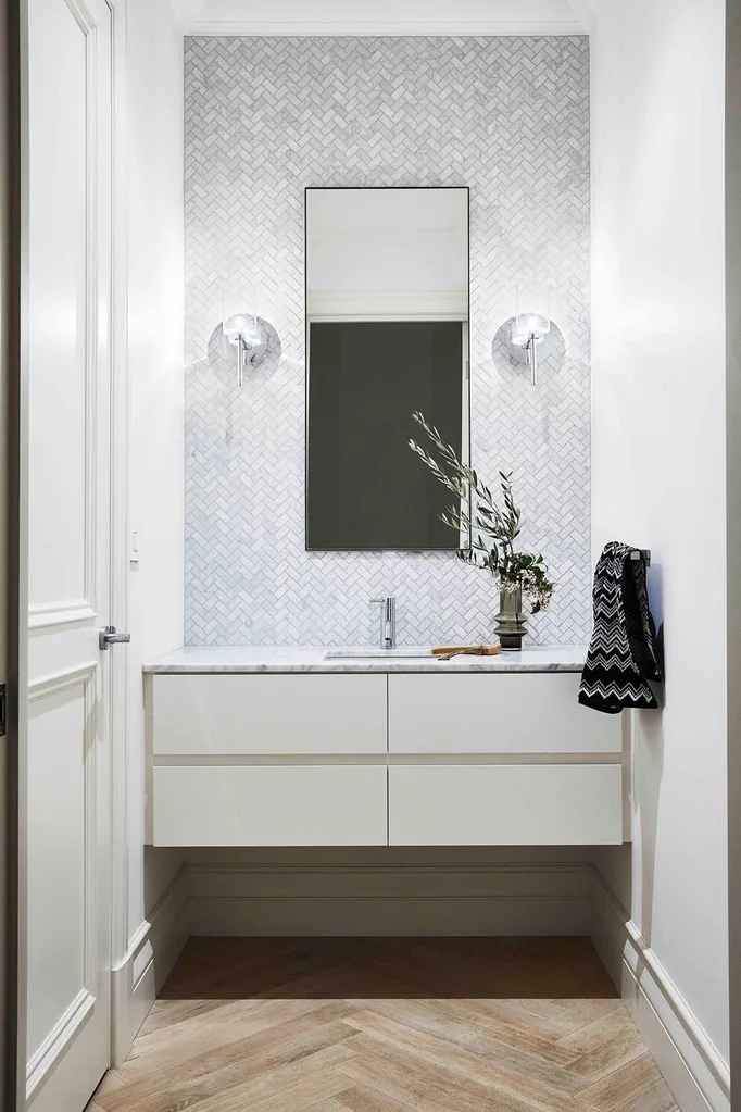
“The more floor you can see, the larger the room will feel, so opt for floating cabinetry and vanities and wall-mounted basins and accessories,” suggests Lee Hardcastle of Enigma Interiors. “If you only have room for a shower, ensure it’s as spacious as possible by creating a wet area with a frameless screen.” If you have room for a bath, freestanding styles with feet create a feeling of space. When it comes to toilets, in-wall cisterns are the least obtrusive on a floorplan.
Photographer: Armelle Habib / aremediasyndication.com.au
6. Choose lighter colours
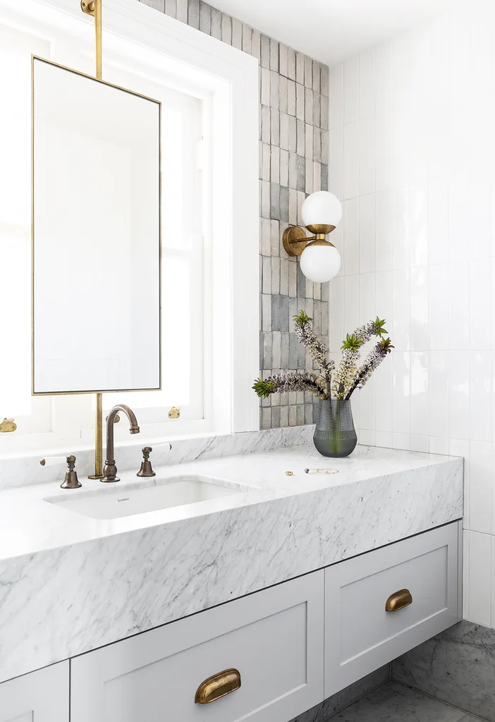
Choosing tiles in a light neutral palette is a simple design trick to allow walls to recede into the background and enhance the sense of space. “In small areas, keep the majority of the walls and floor neutral so the tiles are not too overwhelming,” advises Berrick Wagstaff of Ceramica Senio. “Stone is always popular, and one of the latest looks is ceramic tiles which look like timber, perfect for floors.”
“If you want a splash of colour, introduce it with feature tiles set behind the splashback or within an alcove in the shower.” Larger format rectangular tiles – either 300mm x 600mm or 400mm x 800mm – are a good choice to enhance the sense of scale. Laid in a brick pattern, they will elongate the room, while they’ll give the illusion of more height if placed vertically.
Photographer: Simon Whitbread/aremediasyndication.com.au
7. Let there be light
Make the most of natural light with cleverly positioned glazing and skylights, and showcase focal points with a mix of ambient and task lighting. Back-light shelves and vanities with recessed LEDs to add a sense of depth, illuminate the surrounds of mirrors to draw the eye around the room and, in powder rooms, create a striking statement with a feature light. “Pendant lights can look great but work best with a ceiling height between 2700mm and 3000mm,” advises Darren James of Interiors By Darren James.
