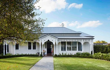
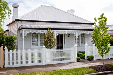
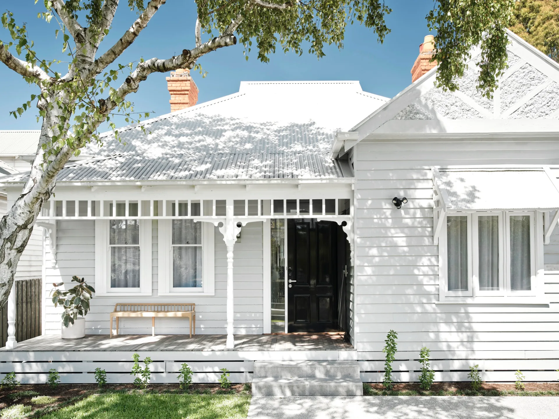
Sometimes charm can hide huge structural problems – or at least persuade you to ignore them. For homeowners Skye and Andrew, this cottage was almost picture-perfect on first viewing, but inside was dark, cold and gloomy, with an awkwardly designed living area and only one bathroom.
In the end, it took the couple almost 12 years of living in the original cottage before they finally embarked on their much-needed and oft-dreamt of renovation. “It took us so long because we couldn’t decide if we wanted to go up or not,” explains Skye. “We realised that pushing the footprint back and out to the side would give us enough space. However, it wasn’t until we removed the back half that we realised how much work needed to be done on the front as well.” The house needed to be restumped and stabilised.
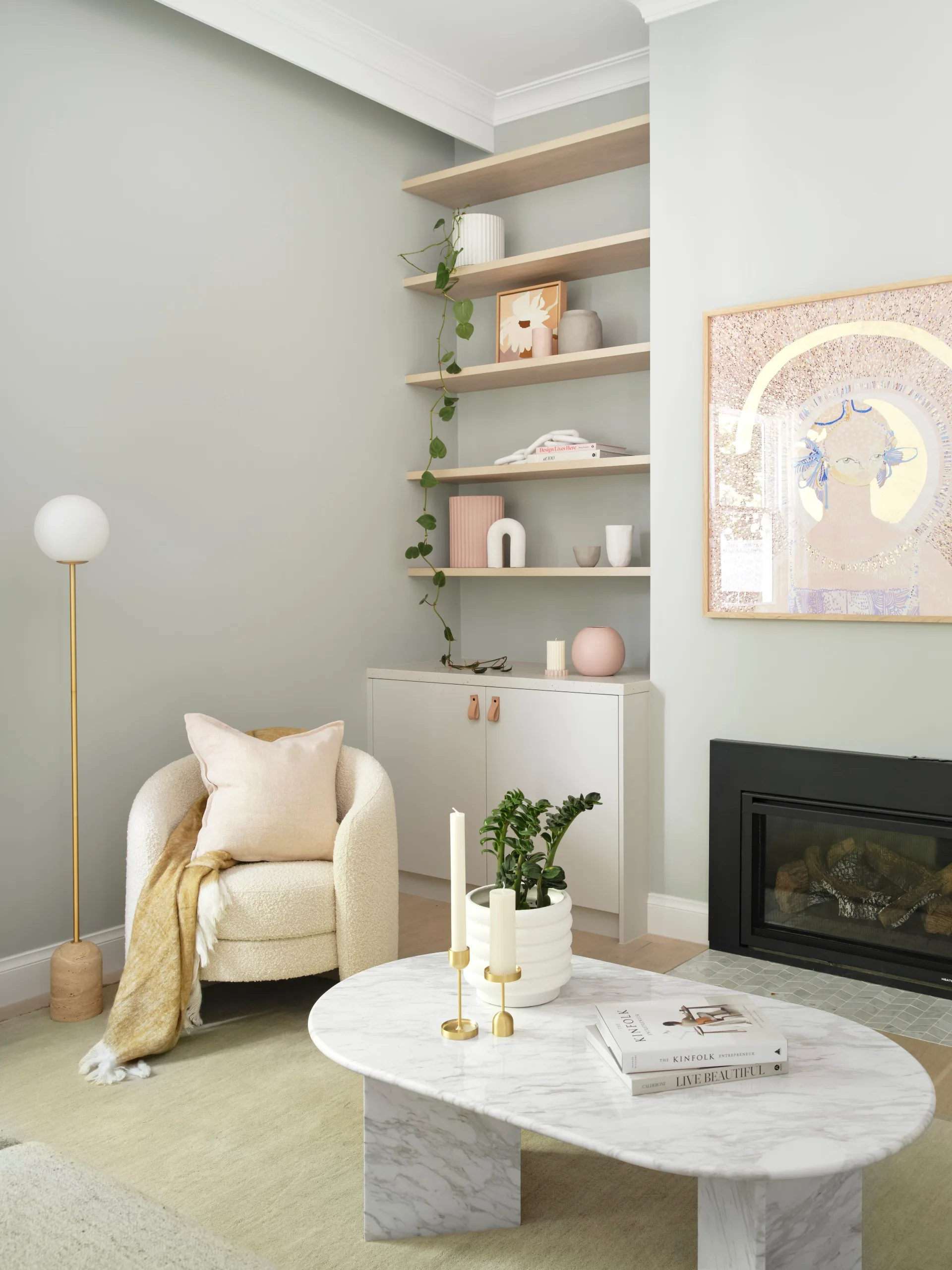
Like many older homes, the original cottage was lacking in storage. Built-in joinery and shelves beside the fireplace alleviate this issue, while also displaying objects, like the vases and sculptures from Norsu Interiors, plus a floral painting by Kimmy Hogan. Above the fireplace is an artwork by Jai Vasicek.
Stylish storage
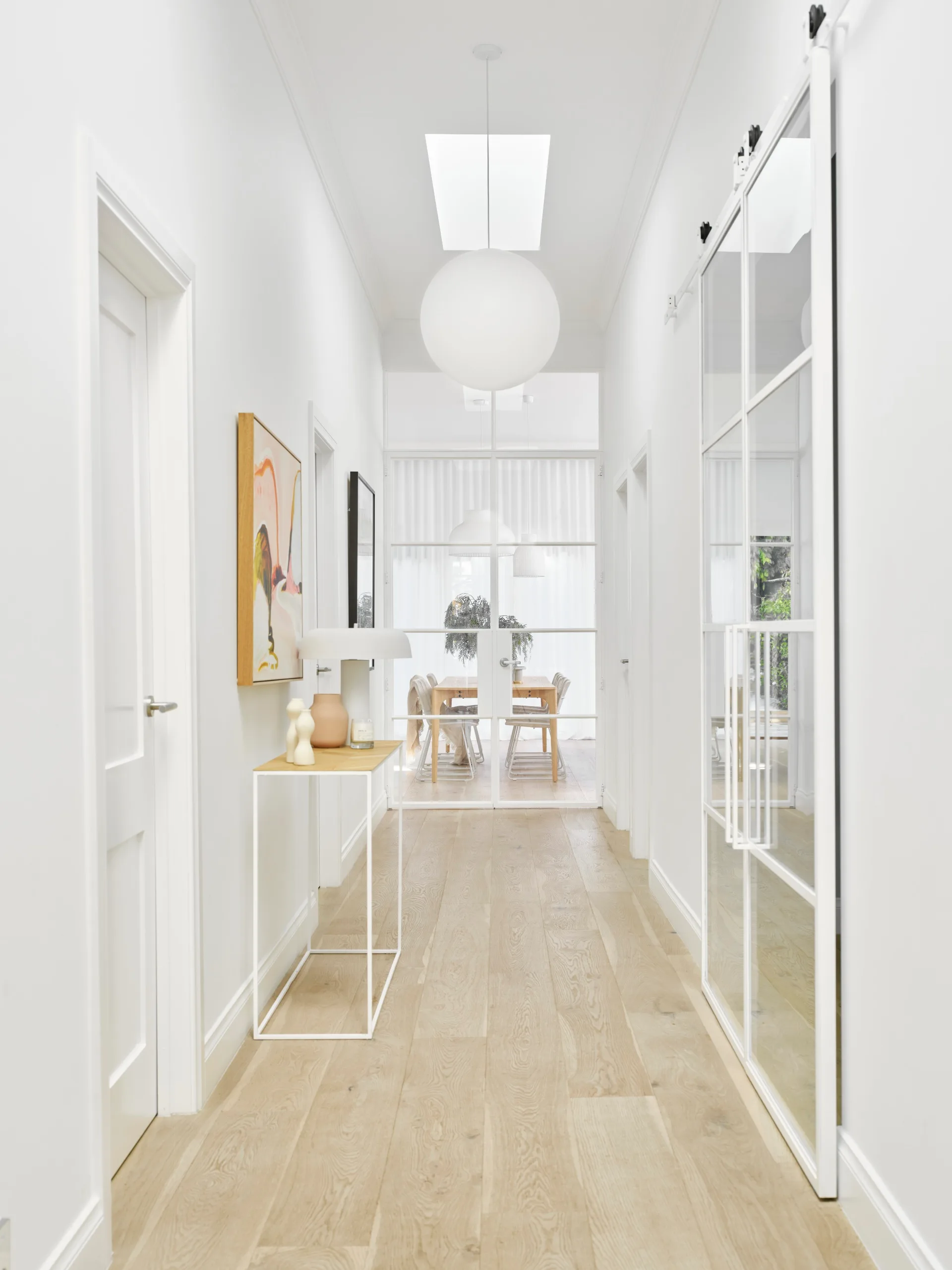
While that was being sorted, the rear was gutted to create an open-plan kitchen and living space. A second bathroom was added and skylights throughout brought in much-needed light. Once the structural elements were there, Skye enlisted the help of interior designer Lauren Bartlett-Bragg from Norsu Design, who helped her create a calm and light-filled home. “Skye’s requirements were big, bright, open plan with as much natural light as possible,” says designer Lauren.
Who lives here? Skye, her husband Andrew and their two children, Henry, 18, and Lucy, 13.
Where? Malvern in inner south-east Melbourne.
Time frame? The project took 12 months.
Why this house? Skye and Andrew had always loved Malvern and they felt the cottage had potential, even if there were structural issues.
Why the reno? After 12 years of living in what was a dark and unstable cottage, they wanted to create a light and modern home for their growing family.
Must-haves: A light and airy feel with plenty of storage. “I just wanted as much light and sun as possible,” says Skye.
The works: The whole front of the cottage was restumped. The rear was gutted to create an open-plan kitchen and living area, skylights were installed, flooring was replaced and a second bathroom was added.
Favourite aspect? “Everything!” says Skye. “It’s so calm and comfortable, especially after living in a dark house for so many years.”
Kitchen and dining
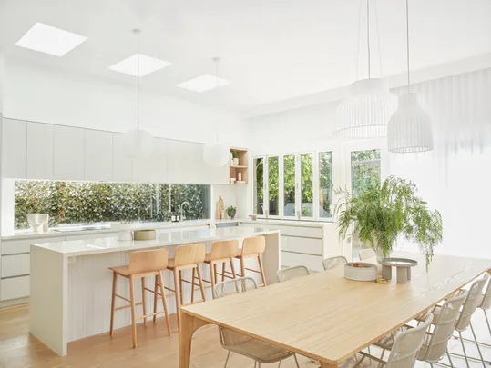
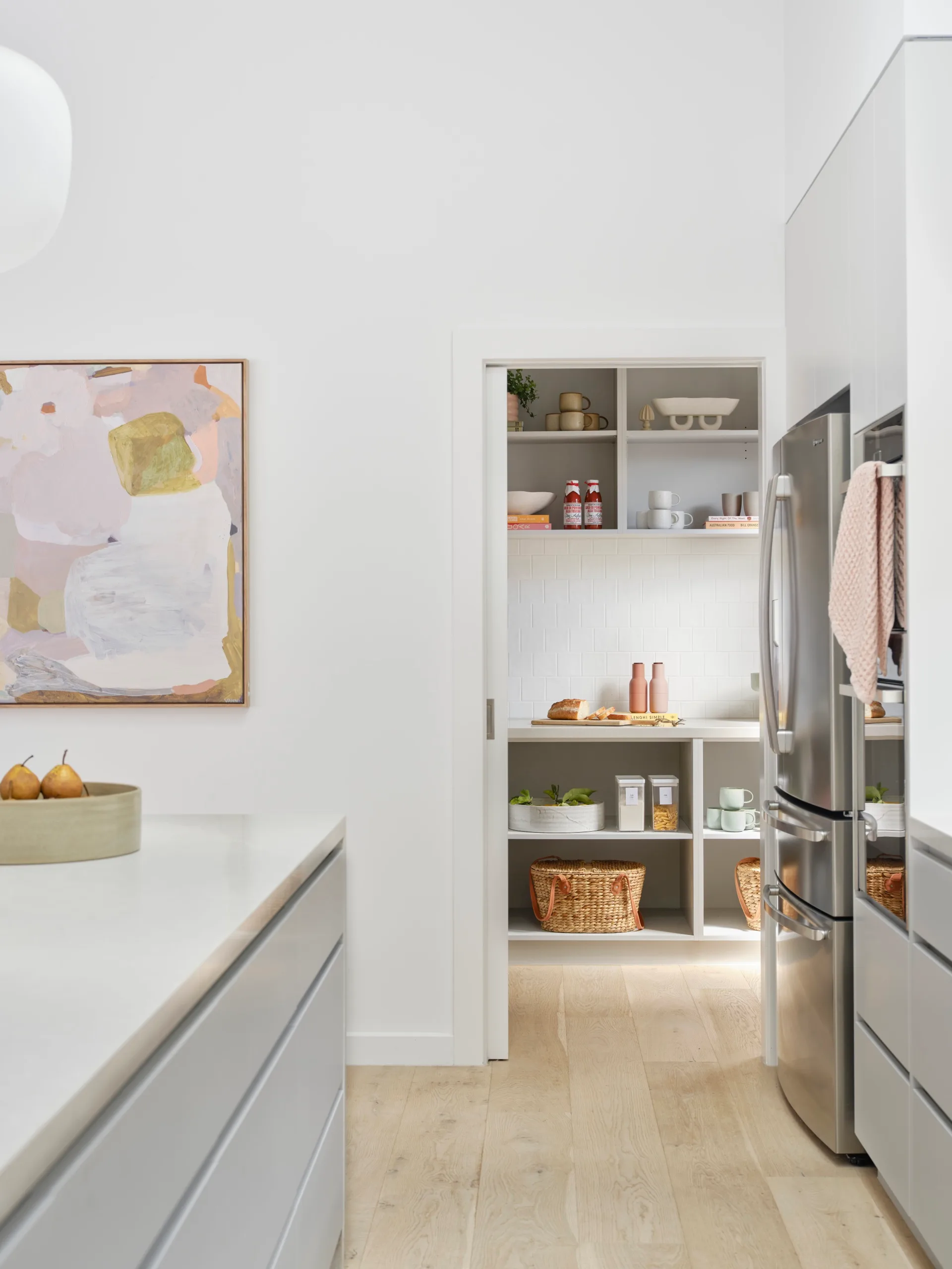
The old kitchen was very dark, so Skye was keen to introduce more light into the area. This was done through a variety of solutions – a window ‘splashback’ lets in the morning sun, the rear windows draw in the afternoon light and three skylights provide all-day illumination. For artificial lighting options, kitchen and dining light pendants by Muuto draw the eye upwards. A servery window connects the kitchen with the outdoor cooking and entertaining area, increasing that indoor-outdoor flow that is so important in modern homes. Inside, a soft palette further lightens the room with custom-built cabinetry, doors and drawers in White Grey Super Matt.
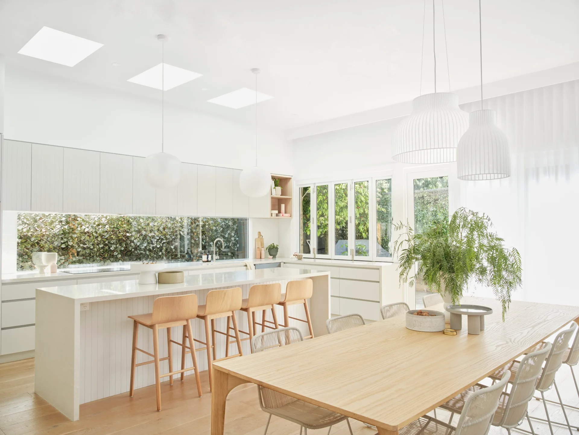
Oak breaks up the white palette of the kitchen, adding warmth to complement the abundance of sunshine in the space. ‘Sketch Tami’ barstools give the option of casual dining at the island, while the ‘Huxley Curve’ dining table, presents a more formal option. Both are from Globe West.
Butler’s pantry
The new butler’s pantry is one of Skye’s favourite inclusions. “We just had one little corner pantry that everything was shoved into,” she says. “This is just amazing. My husband, who’s a plumber, kept saying to me, ‘Don’t you want a sink in there?’ And I said, ‘No, I just want storage and the appliances.’ There’s a sliding door on there, but it never really gets closed. It’s just fantastic – and it’s quite big.”
Living area
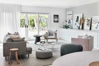
Layers of neutrals abound with soft pops of colour, such as the Too Many Cooks canvas print by Prudence Demarchi. The Molmic ‘Shona’ sofa from Norsu Interiors was custom-made in ‘Hawthorn Silver’ fabric. The European oak of the ‘Nordic White’ Scandinavia Floors floorboards complements the light tone of the Ethnicraft ‘Tripod’ coffee table.
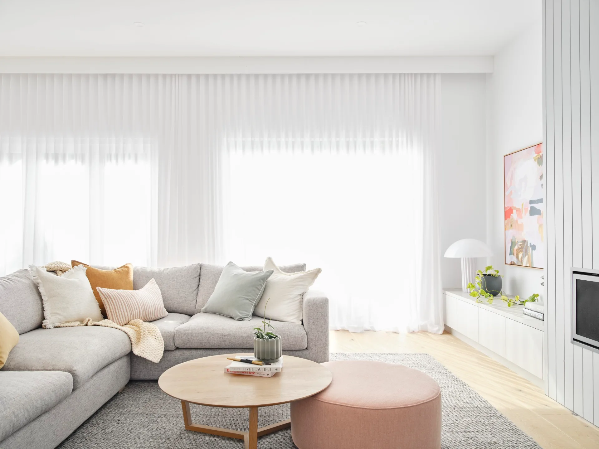
Built-in joinery conveys a feeling of spaciousness. “It maximises space, so there’s not stuff on surfaces,” says Skye. “I love walking into that open plan living area – the size and feel of it, the sunlight coming in is beautiful. It’s so relaxing – whether I am cooking, or reading on the sofa.”
Skye says that working with Lauren and the Norsu Design team taught her to be braver in her design choices, especially with finishes like the White Grey Super Matt on the kitchen joinery. “Lauren chose the light grey in the kitchen, which looks really good,” she enthuses. “And I wouldn’t have the confidence to do that on my own without someone saying, ‘Well, this is what you need to do’.” Thrilled with the results, Skye knows the value of finding the right team to work with.
Interior design advice
“It was our first reno and even though I have a passion for interior design and decorating, I didn’t really have the confidence to bring it all together,” Skye explains. Having a professional to guide her through the process made all the difference. And, according to Lauren, marrying their styles together was simply serendipitous. “Skye loves that classic kind of contemporary Scandi style that we do at Norsu,” she says. “I think we achieved what she wanted.”
While increasing the amount of light in the home was at the top of the must-have list, creating more warmth (both metaphorically, with colour, and literally, with heating) was another desperately needed addition. “It was always cold,” says Skye of the cottage before the renovation. “The heating never worked properly out the back. Now we have this beautiful gas fireplace and we all sit around and watch the footy on Saturday night on this amazing, big couch that we had custom- made.” What could be better?
Main bedroom
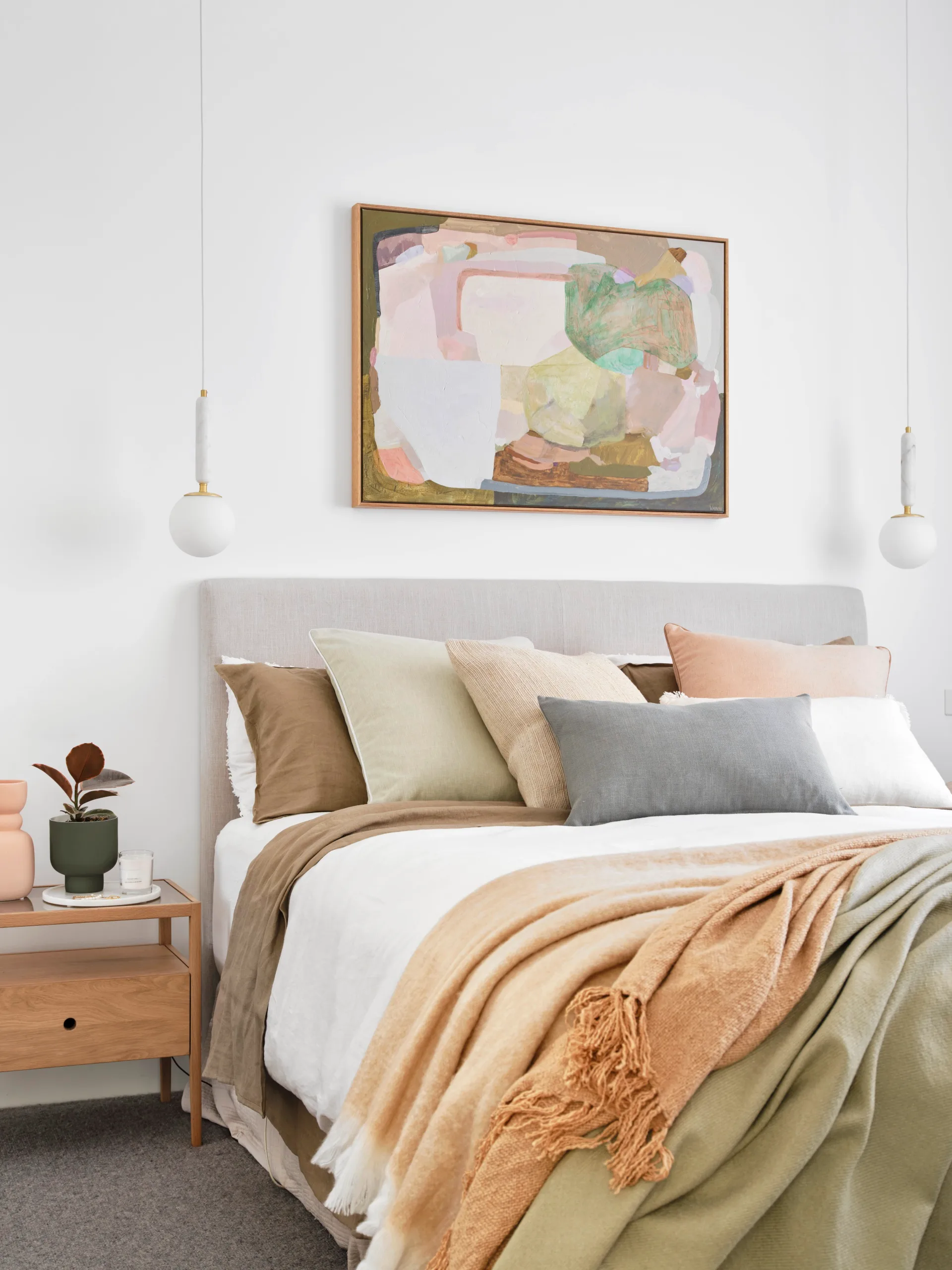
The main bedroom, which serves as a retreat for the parents, reflects the same calming palette as the rest of the house with interior paint Dulux Vivid White used throughout. Additional storage was added courtesy of a walk-in robe and the ‘Spindle’ bedside table from Ethnicraft. While the rest of the house saw new floorboards installed, the two bedrooms received ‘Carramar’ wool carpet in Evening Grey from Godfrey Hirst.
Study
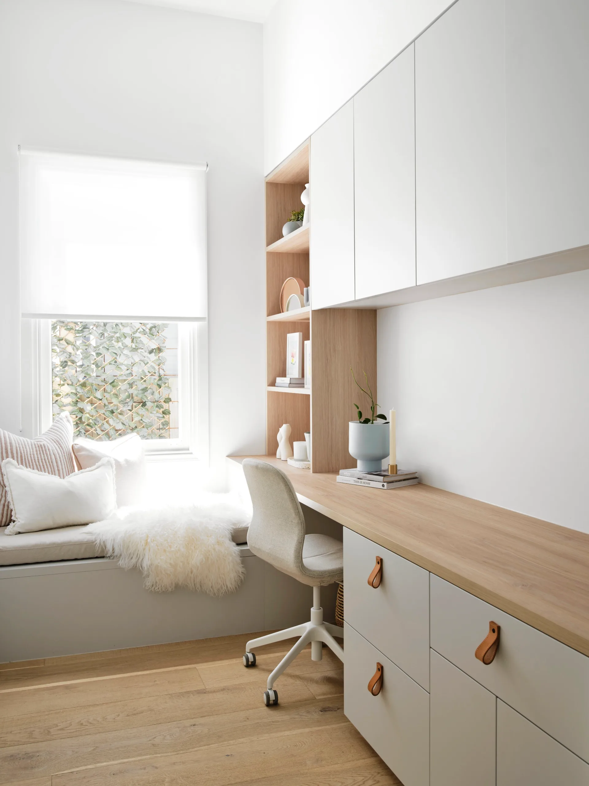
With two children in high school, Skye and Andrew wanted to include a study as part of the renovation. “Neither of the kids have got desks in their rooms because they wanted the space instead,” says Skye, “So, they go into the study.” Lauren designed the room to include a long desk so two people could work at the same time. The room is located on the northern side of the house, so the bench seat allows sunlight to stream in to create a delightful reading nook.
Bathroom
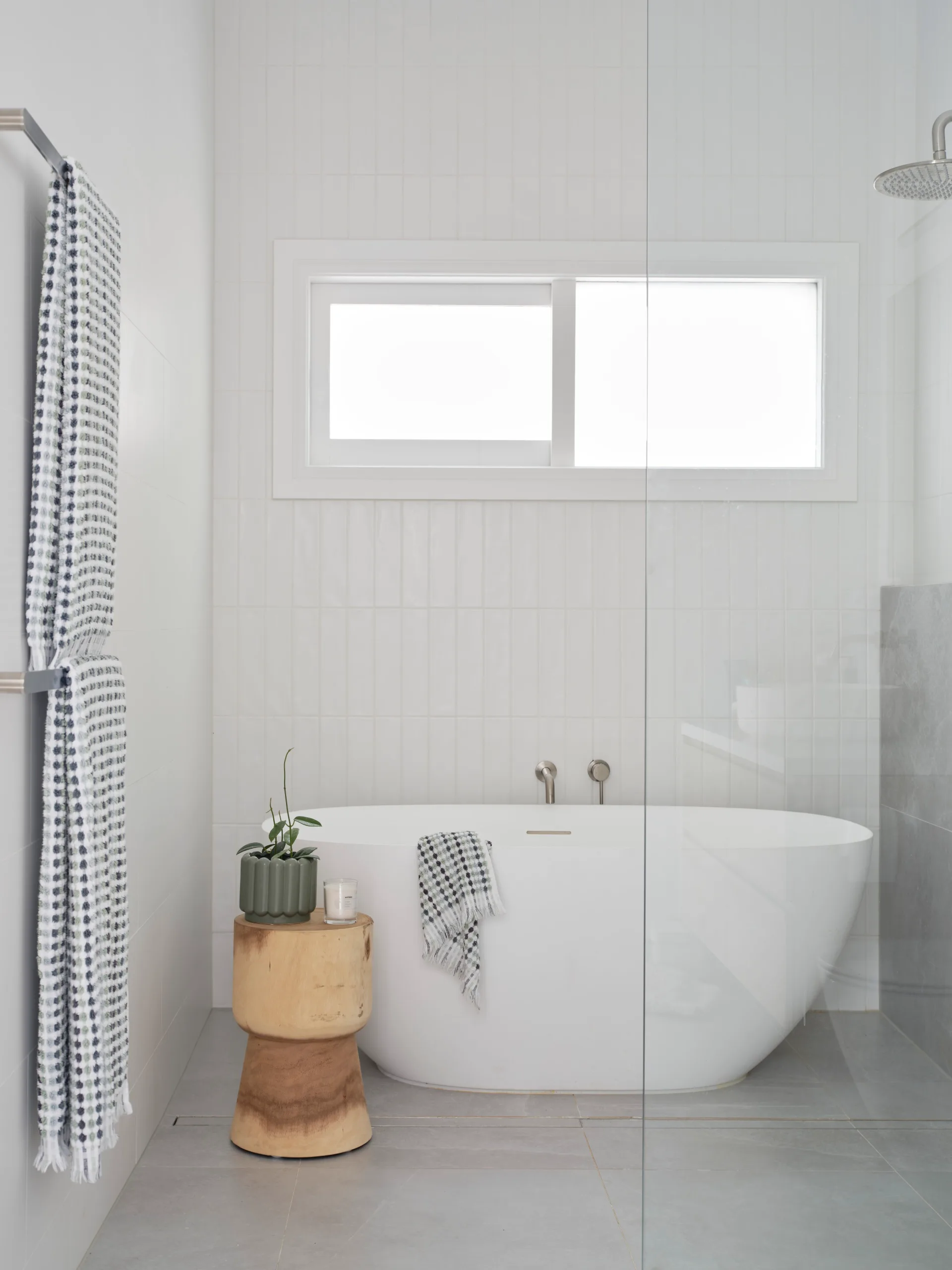
The family bathroom is spacious and luxurious (while still being hardy enough to survive daily use from children). Caesarstone ‘Intense White’ benchtops complement wall tiles of ‘Newport’ matte subway tile and ‘Brushgrove’ matte white tile, both from Tile Cloud.
Ensuite
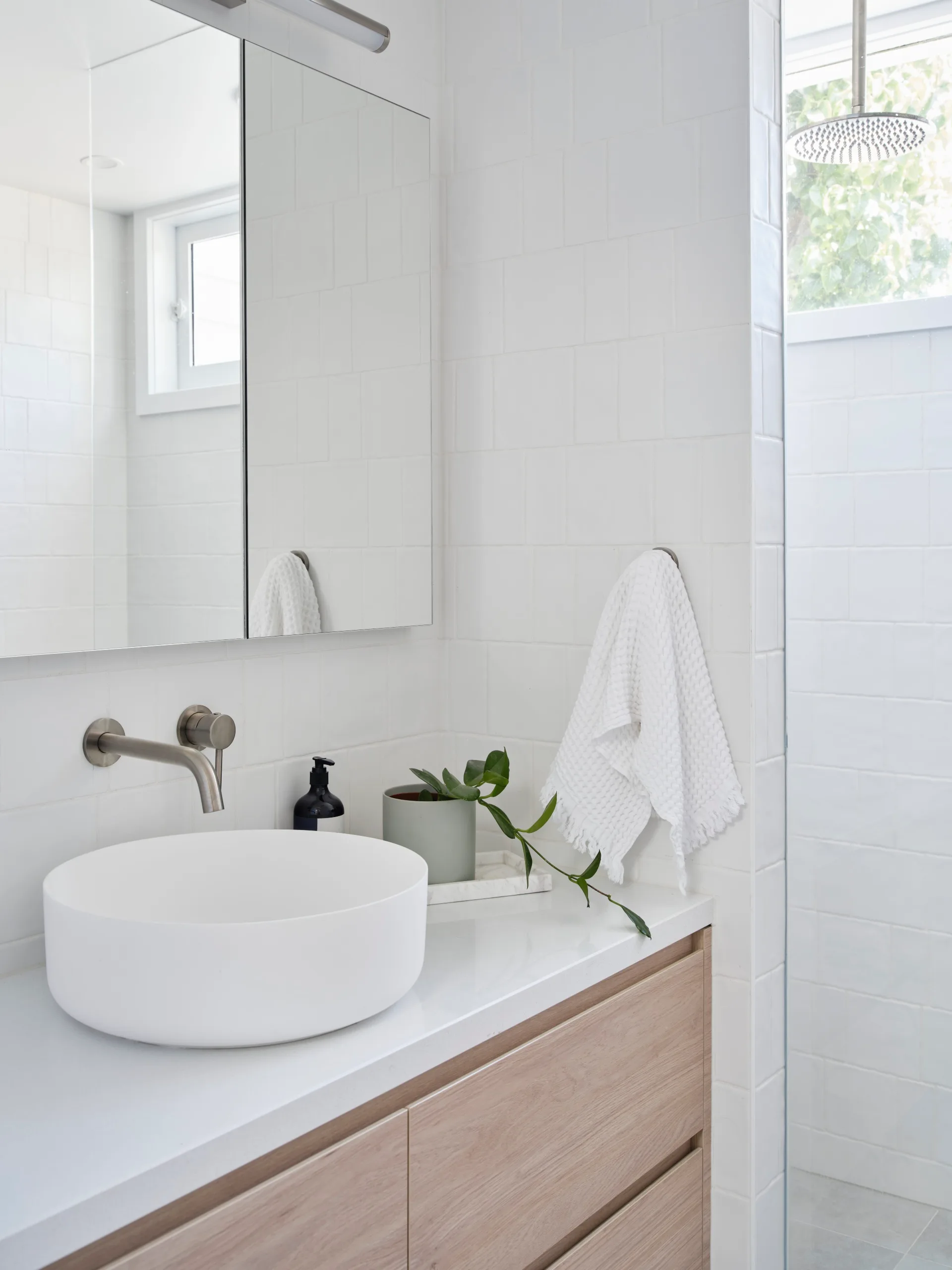
Part of the brief to Lauren was to add a second bathroom and the house now includes an ensuite for Skye and Andrew. “Before we renovated, we just had one bathroom,” says Skye. “So, it was all four of us in the one bathroom, and the floor was sinking around the toilet.” Now, not only are the structural problems solved but the look of the space has been modernised too. NAV Designer Surfaces Navurban in ‘Balmoral’ adds warmth to the bathroom vanity, encasing the Abi Interiors ‘Celine’ basin in matt white.
Laundry
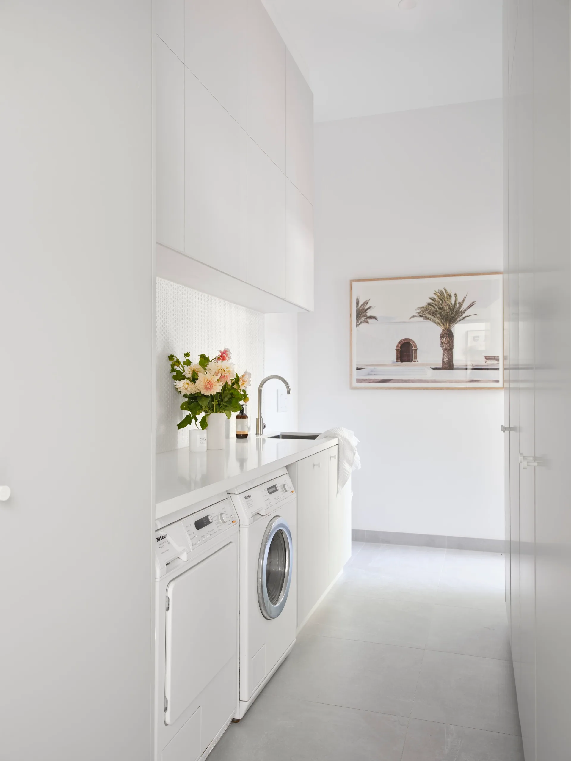
The new laundry design has “changed my life”, says Skye. “Originally there was just going to be cabinetry on one side, but I said to Lauren that wasn’t enough. We’ve put in these two massive drying cupboards – with Nobo heaters that we got from Bunnings that just plug in. The cupboards have bottom racks and top racks. It’s fantastic. It does everything, even the bed linen.”
The structural work was more expensive than the couple originally estimated. “And you don’t necessarily budget for it,” adds Skye. “Then halfway through the build, we decided to put a new roof on as well. Because once you get stuck into it, it’s all or nothing. And we just went, ‘Let’s just do it; we’re here now’.” While they were able to manage with the unexpected costs, putting aside a nest egg for unforeseeable complications is a good idea.
Lessons learnt
Skye was pleased she spent time in the unrenovated house to get to know the light, or lack of it. “A lot of people say live in your house before you renovate it, which we certainly did – for 12 years!” she adds. While they knew the home needed restumping (something they discovered as early on as their first inspection), gaining intimate knowledge about the flaws (and benefits) ended up being invaluable.
Interior design: Lauren Bartlett-Bragg, Norsu Design, norsudesign.com.au.
SOURCE BOOK
Builder: Habitat Construction & Developments, @habitat_construction, 0417 366 623.
Draftsman: Roy Hodgson Design, rhdesign.com.
