Advertisement
Home Home Tours

A cramped apartment redesigned as a luxurious mountain retreat

Spatial sorcery maximised every inch of this alpine apartment.
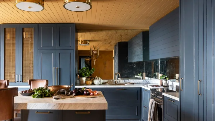
A yellow and dark blue kitchen with timber floors.Photography: Martina Gemmola / Styling: Belle Hemming

Cosiness is exactly what you want from an alpine retreat, but when ‘cosiness’ means ‘cramped’, it loses its appeal somewhat. This was the primary challenge faced by interior designer Kate Walker of KWD when she began redesigning this two-bedroom Mt Buller apartment to fit a family of five – including three exceptionally tall sons.

Advertisement
A marble-topped dining table in a yellow and blue kitchen and dining room.
This holiday home in the Victorian alpine town of Mt Buller, belonging to a family of five, has been transformed with a raft of smart techniques by interior designer Kate Walker. (Photography: Martina Gemmola / Styling: Belle Hemming)

“With my understanding of snow life – days spent on the slopes and evenings spent at home – I knew having five tall people in a tiny apartment was going
to be a challenge. Careful consideration had to be given to the layout, the storage, and how everyone would integrate with the space,” explains Kate about the project.

Dark blue shaker-style kitchen cabinets.
“The kitchen has a commercial feel, where we cleverly used mirrors to amplify the reflection and make the space feel much bigger and more open,” says Kate. (Photography: Martina Gemmola / Styling: Belle Hemming)

With dated finishes and low ceilings, the apartment was ripe for reinvention, so Kate went ahead with a full gut and refit, replacing every element. Priority one was making smart use of every inch. “During the ski season, we head up every few weeks with our youngest child who is 15 years old, and often we take his friends. Our eldest ones tend to head up there themselves and enjoy time when school and university permit,” says the homeowner.

Advertisement
A bowl of chestnuts on a marble table.
Nothing says winter like a bowl of freshly roasted chestnuts. (Photography: Martina Gemmola / Styling: Belle Hemming)

With an often-full house, the second bedroom needed to work incredibly hard, so Kate designed bunk beds that stretch the length of the room to sleep four full-size adults.

Kitchen

The family are keen travellers, who love a quirky yet luxurious boutique hotel. “We wanted it to feel like we were overseas in a dark and moody chalet,” the homeowner shares. Kate answered this call in typically bold KWD style, with a saturated colour palette of deep blue and mustard, and spaces that are drenched in colour.

A yellow and dark blue kitchen with timber floors.
“We created a hosting kitchen where we imagined friends would join them for après drinks. We designed an obligatory bar, which is concealed during the day and opened in the evening, with beautiful brass grilles that glow in the evening light,” says Kate. (Photography: Martina Gemmola / Styling: Belle Hemming)
Advertisement

The honey-toned ceiling brings cocooning warmth to the kitchen, without visually lowering it. The cabinetry (in Dulux Prestige Blue) allows plenty of room to move around a marble-topped island bench, which turns the space into the social centre of the home.

Vinyl brown bar stools at a marble table.
Brass details add another layer of warmth to the palette of deep blue and Manhattan Grey marble. (Photography: Martina Gemmola / Styling: Belle Hemming)
A basket beneath a marble-topped dining table.
Warm timber flooring reflects the colour of the walls and ceiling, painted in Porter’s Paints Biscotti. (Photography: Martina Gemmola / Styling: Belle Hemming)
A brown and plaid vinyl bar stool.
The bar stools were custom designed for alpine-chic comfort, with leather-look vinyl, contrasting plaid (GP & J Baker ‘Nevis’ fabric) and smart stud detailing to finish. (Photography: Martina Gemmola / Styling: Belle Hemming)
Advertisement

“We knew we had to look at the apartment differently, and to be creative with the layout and play with the illusion of space and height.”

Kate Walker, interior designer
A vinyl barstool beside an abstract artwork.
A close up of the artwork titled Passion by Lisa King Taylor, which is on display in the kitchen area. (Photography: Martina Gemmola / Styling: Belle Hemming)

The look is a balance of comfort and luxury, but the true success of the design is in its usability. “By looking outside of the standard response to kitchen, dining and living design flow, we were able to amplify the usability of the space, increase the circulation, and find a way for five very tall people to be able to congregate and live harmoniously in a small, but perfectly formed, alpine apartment,” says Kate.

Dark blue shaker-style cabinets and a marble benchtop with pumpkins.
The cabinets in the kitchen are finished in Dulux Prestige Blue. (Photography: Martina Gemmola / Styling: Belle Hemming)
A navy kitchen cabinet with bronze mesh inlays.
Chic metal grilles add personality and texture to the kitchen cabinets. (Photography: Martina Gemmola / Styling: Belle Hemming)
Advertisement

Living room

Shades of navy and blue-black are brightened with brass accents in a look that’s pure luxury, while a complex gold hue has been taken from walls to ceilings in the main living space, creating a visually warming space to recline once the snow-sodden boots have been shed.

A mustard yellow living room with a leather sofa and marble table.
The artwork, titled ‘Passion’, is by Lisa Taylor King. (Photography: Martina Gemmola / Styling: Belle Hemming)

Kate describes the custom-designed wool and silk rug as “artwork for the floor”, and with the other textures in the apartment – cushions plus throws in a basket from Inartisan – the living area is a cosy space to hunker down in while snow falls outside.

A mustard yellow living area with brown leather sofas.
Warm biscuit tones create a sanctuary within the open-plan space. Walls in Porter’s Paints Biscotti tone with sheer drapes, custom leather sofas from Arthur G and a ‘Circus’ pouf in Yellow from Mr & Mrs Designer (try Top3 by Design) in the living area. (Photography: Martina Gemmola / Styling: Belle Hemming)
Advertisement
Soft mustard living room curtains.
The living room curtain matches the tones in the rest of the home. (Photography: Martina Gemmola / Styling: Belle Hemming)

Main bedroom

“With the masculine feel throughout the apartment, tailored to the four male occupants, we wanted to introduce a touch of femininity to the master bedroom with some unexpected, beautiful florals,” says Kate.

A moody blue bedroom with mustard yellow curtains.
Lucy Montgomery fringed cushions. (Photography: Martina Gemmola / Styling: Belle Hemming)
A bird statue on a timber bedside table.
Little pops of mustard in the drapes and plaid Roman blinds connect the colour scheme to the adjoining living room. (Photography: Martina Gemmola / Styling: Belle Hemming)
Advertisement

Embracing one or two hero hues and swathing a space with them creates rooms that are just right for snuggling up in. “We didn’t want to design a space that was too literal in its alpine flavour,” says Kate of the mustard and rich blue used. “These saturated colours are not normally associated with an alpine environment, but they are so warm and inviting. The mustard almost glows.” Visit Porters Paints.

We love… colourful spaces
A line of coat hooks on a dark blue wall.
The deep hue of Porter’s Paints Blue Steel sets a moody tone. (Photography: Martina Gemmola / Styling: Belle Hemming)
A moody blue bedroom with a soft blue bedhead, side table and coat hooks.
The custom bedhead from New Image Upholstery and Polite Society bedlinen in the main bedroom are all about comfort. (Photography: Martina Gemmola / Styling: Belle Hemming)

Bathroom

The single bathroom was another challenge, needing to work for multiple people, all heading out or coming back from the ski slopes.

A moody blue and yellow bathroom with a marble-topped vanity.
A backdrop of moody blue hues includes vanities in Dulux Prestige Blue with Azul Bahia granite tops. (Photography: Martina Gemmola / Styling: Belle Hemming)
Advertisement

“We designed a three-way bathroom, so three people can be getting ready at the same time. One person can be showering privately, one person can be brushing their teeth at the vanity, and one person can be in the separate powder room,” says Kate. “We prioritised face-height storage, like hotel storage, understanding that the apartment is a weekender/holiday home so permanent storage wasn’t necessary.”

A stone-topped vanity with brass tapware.
The blue colour scheme is punctuated by warm brass and gold-tinged accents (Photography: Martina Gemmola / Styling: Belle Hemming)

“The highlight of the apartment is definitely the materiality. The natural stone is magnificent, as is the custom joinery.”

Kate Walker, interior designer
A moody navy bathroom with snowflake mosaic floors, a stone-topped vanity and fluted glass.
Kate gave the mountainous location a nod with the mosaic-tiled floor in the bathroom. “It introduces a sense of a hotel lobby and amplifies the feeling of a high-end powder room while being very practical. The snowflake motif playfully reflects an alpine flavour,” she says. (Photography: Martina Gemmola / Styling: Belle Hemming)
A black-tiled shower with bronze tapware by a shower niche.
The bathroom is really three spaces rolled into one, to allow simultaneous use when the apartment is full of people – reeded glass helps to turn the shower into a semi-private space, the main vanity is in the centre of everything, and a powder room opens off to one side. (Photography: Martina Gemmola / Styling: Belle Hemming)
Advertisement
Snowflake mosaic bathroom tiles.
The snowflake mosaic-tiled floor in the bathroom. (Photography: Martina Gemmola / Styling: Belle Hemming)

Bunk room

The challenge of sleeping a houseful of grown adults (the homeowners’ three sons are all over six-foot tall!) was ingeniously solved with custom-sized bunk beds and mattresses that stretch the full length of the bedroom.

A dark blue bunk room with a white mounted moose.
Wall and ceiling surfaces in Porter’s Paints Black Blue are punctuated by statement pieces: the Northern ‘Moo’ moosehead wall light and a handy zebra-print folding stool from Alfresco Emporium. (Photography: Martina Gemmola / Styling: Belle Hemming)

Interior Designer: KWD, katewalkerdesign.com.au, (03) 5974 1800.

SOURCE BOOK
Advertisement

Related stories


Advertisement
Advertisement