Giggles, love and inevitable messy chaos colour any household filled with children. Stay-at-home mum Natalie and her husband Josh, who works in asset management, live in Sydney’s Eastern Suburbs in a new build designed to contain the ebb and flow of life with their three spirited young ones – Gidon, eight, Rafael, six, and Cara, three.
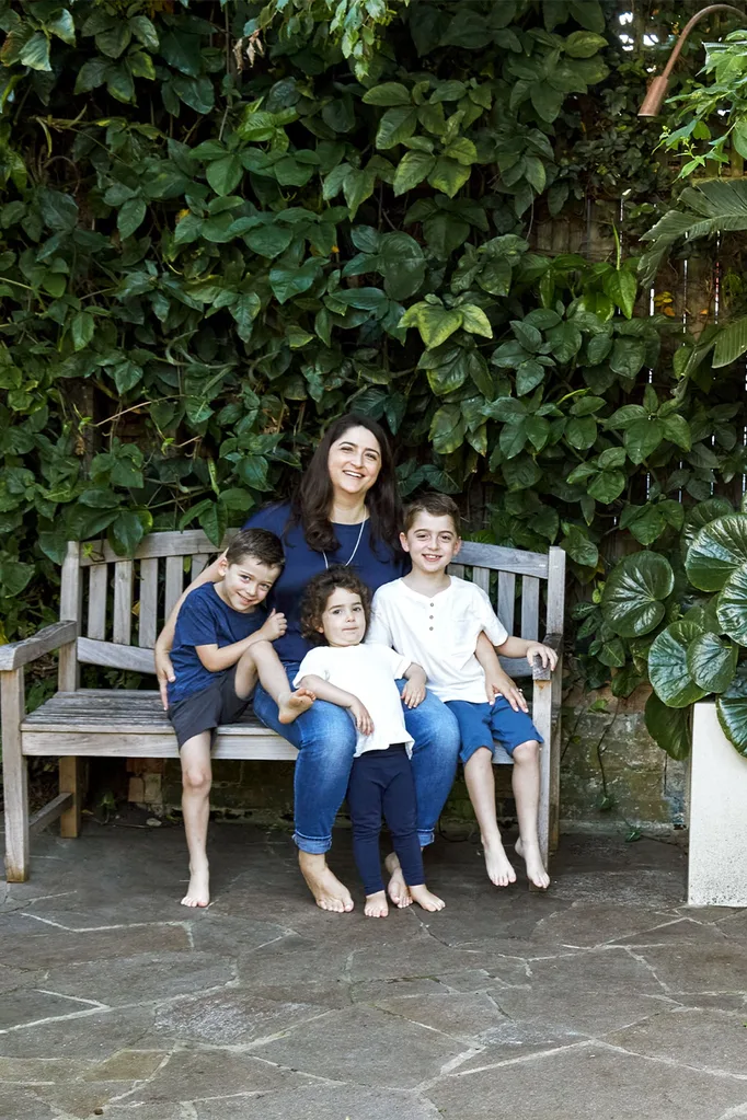
Who lives here? Natalie, a stay-at-home mum, and her husband Josh, who works in asset management, and their three children Gidon, eight, Rafael, six and Cara, three.
The secret to a smooth construction? Natalie: “We tried to have as many decisions made before the build began.”
Where do the family gather the most? “Around the really large kitchen island. Arts and crafts often happen while I am preparing meals.”
What do you love about living here? “We have large windows and glass doors that look out onto greenery, so it feels like our little oasis in the middle of hectic Sydney.”
Can you describe your style? “It’s natural and organic for Josh and me. That’s our happy place.”
“When we bought here in 2009, we were a couple with no kids,” says Natalie. “As we started our family, we realised the house wasn’t working for us, and we needed to make a change.” As long-term residents of the area, the couple loved the easy access to everyday conveniences and green spaces but required more bedrooms, off-street parking and a flexible layout to accommodate their changing needs.
After deciding to rebuild on their narrow block, the couple met with multiple architects in 2016 and felt the most comfortable with Jodi York of Studio York Architects. “We found a real connection with Jodi and knew that she would contribute not only her skill but also would put her heart into designing our home,” says Natalie.
Functionality and child-proofed surfaces were top of mind for Natalie and Josh, which Studio York Architects delivered with a measured approach and an eye on the future. “Children are young for such a relatively small window of time,” says Jodi. “Even if you are caught up in that stage when you are doing the renovation or build, you need to create an adaptable home for the life stages ahead.”
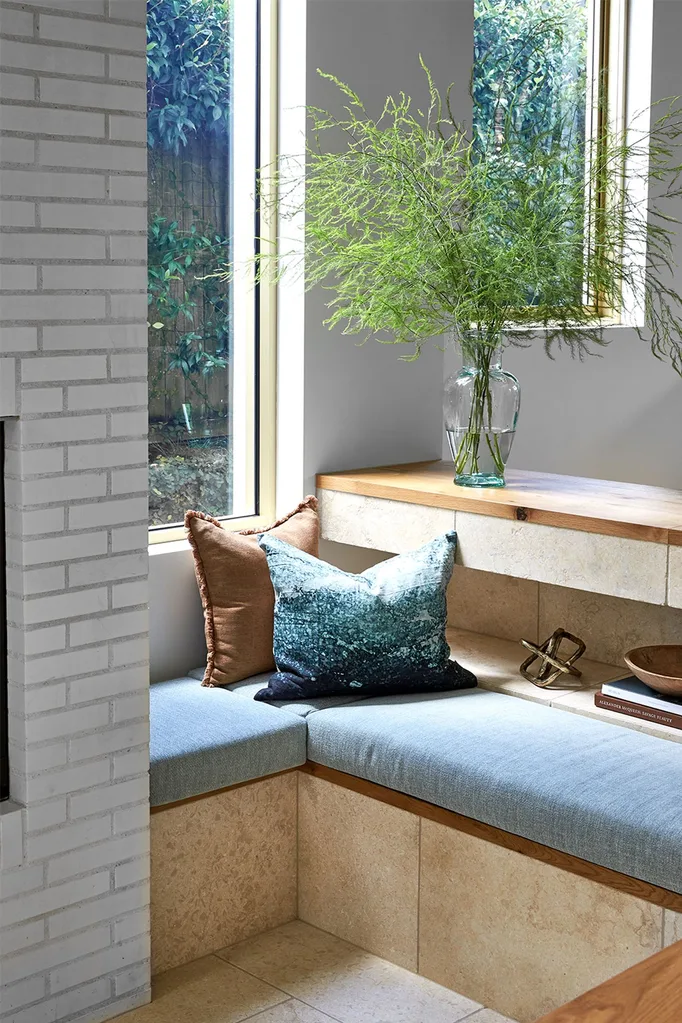
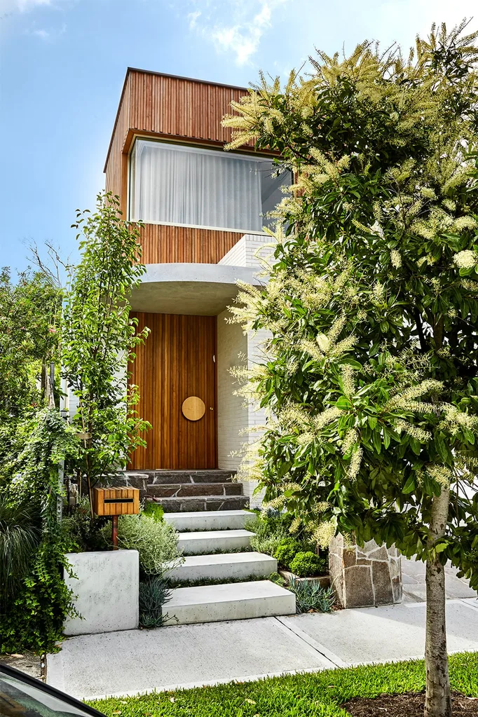
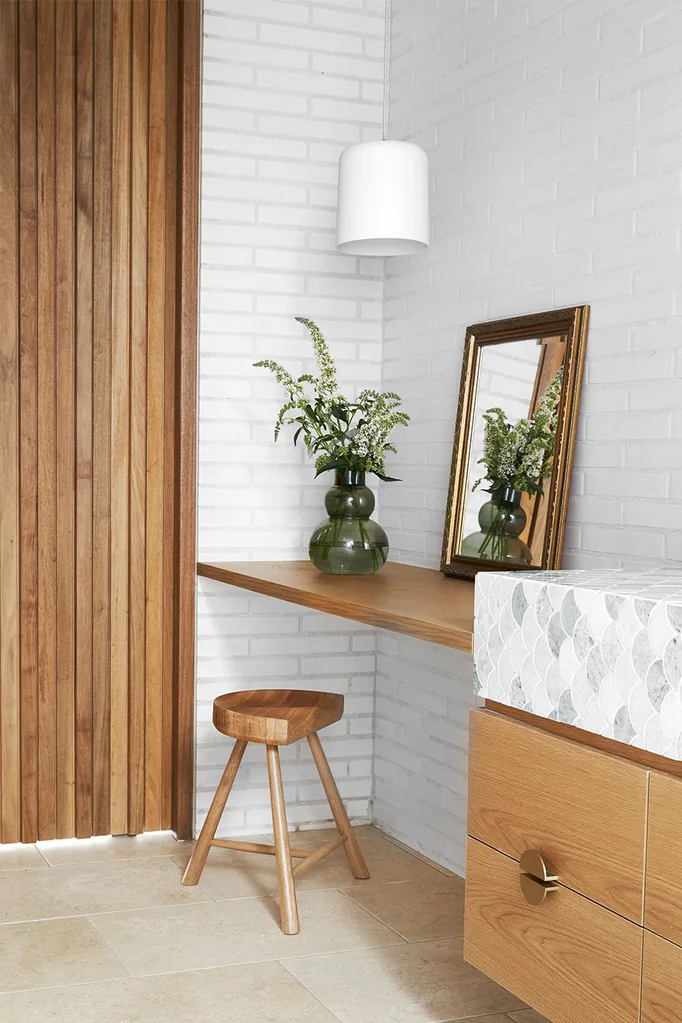
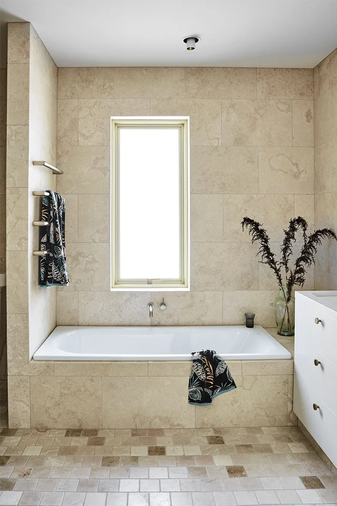
Hardwearing materials make up the gentle palette of the sun-soaked interiors. A tumbled limestone tile from Teranova covers the floors, the bathroom walls and the kitchen splashback and offers easy maintenance and the versatile, organic look that Natalie and Josh love. This nod to nature is apparent before you walk through the custom-designed front door. On the exterior, timber cladding, cream brick and crazy paving soften the sharp, contemporary lines and lend a modern retro look that conjures Australian mid-century architecture.
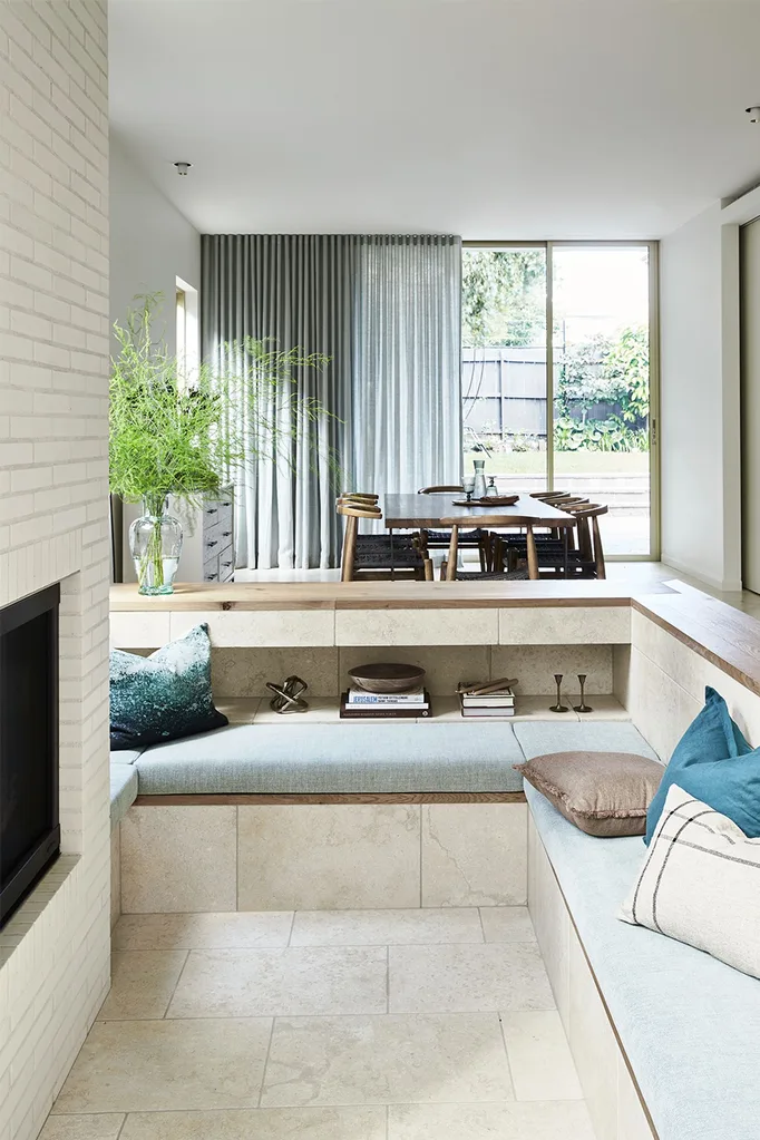
The sunken living space by the kitchen also brings the past into the present. “When Jodi suggested it, she said don’t think about the ’70s sunken lounge, let’s look at more modern versions,” Natalie shares. “Once we got a better understanding, we loved it. It’s a really good solution for us wanting separate spaces within a larger space.” To that point, a TV zone is hidden behind sliding doors adjacent to the dining area. “We didn’t have the footprint to create separate rooms, so we split the back area to create a space that is separate but still in close proximity,” Jodi explains.
The build began in mid-2019 and was completed toward the end of 2020, hitting the pandemic lockdown speedbumps that all construction sites encountered. “It was a pretty smooth process because the architect and builder did a really good job of collaborating and sorting things out, and we trusted them,” Natalie explains.
Jodi’s highly appreciated design guidance has resulted in a comfortable, sophisticated family home. “She was really good at assuring us that you can have a beautiful house that also accommodates children,” says Natalie. “Our house makes us feel happy and content. We got everything on our wish list, and we love it.”
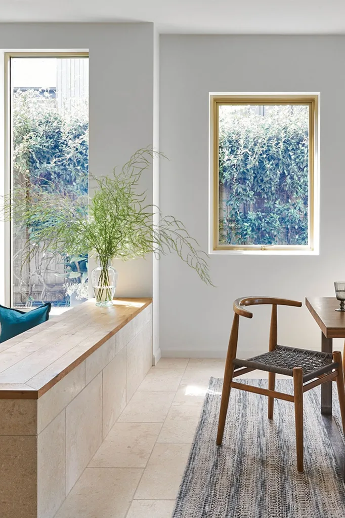
Adding Palm Springs chic to Sydney, this space combines Crema Limestone from Teranova with Solid European Oak flooring in Chamoisee from Tongue & Groove. “Everyone gravitates here,” says Natalie. “It was designed as the adult hangout space, but all the kids love it.” Satin aluminium window frames in Champagne from Universal Anodisers add a luxe touch. “We wanted a thin profile that wouldn’t distract from the green outlook,” shares Jodi of the low-maintenance choice.
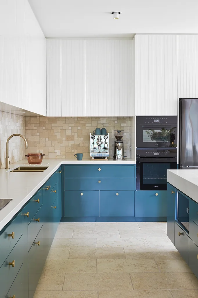
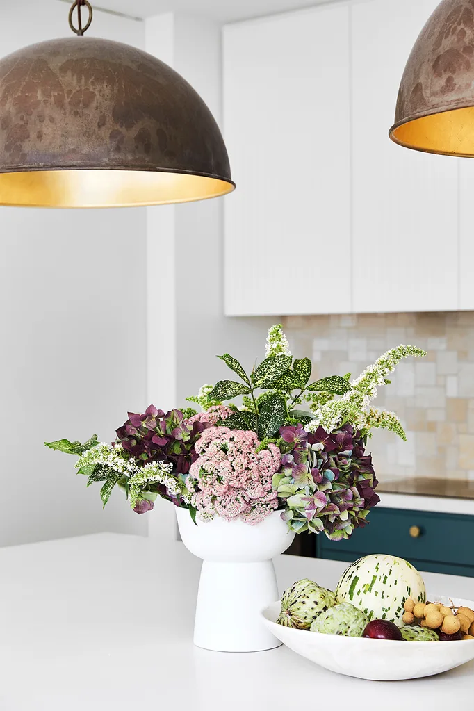
Partial to neutrals, Natalie admits that she was nervous about selecting a bold hue, “but once we decided on using the mug colour as inspiration, I was really comfortable with it,” she shares. “There’s no regrets.” It brings personality to the limestone floor and splashback, Smartstone benchtop and V-groove uppers in Dulux Whisper White. Brass touches have been added with tapware from Brodware, Lo & Co pulls, and ‘Gallileo’ pendant lights by Il Fanale from Light Co. The barstools from Fenton & Fenton add a textural layer.
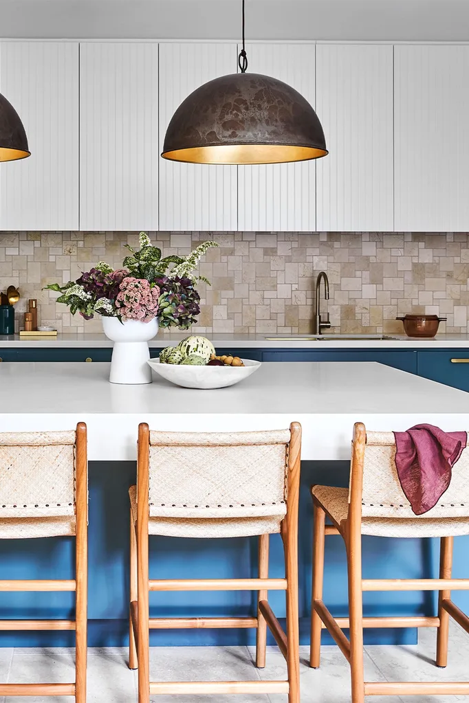
“We went with colour in the lower cabinets only so it didn’t overwhelm the space, as it is quite bold.”
Jodi York, Architect
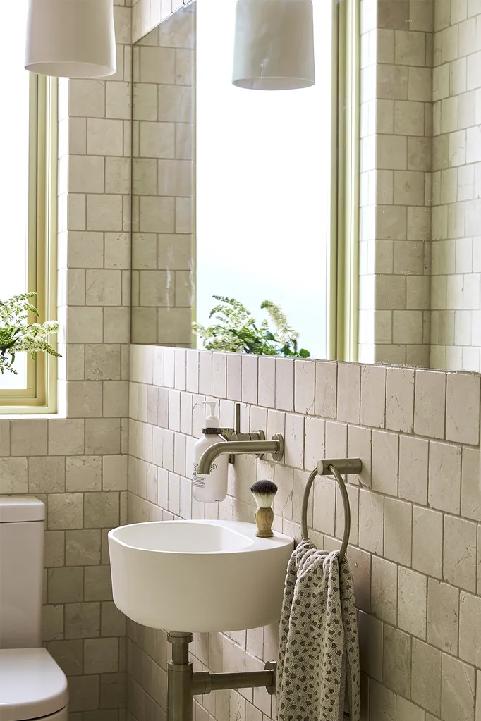
The classic powder room features Crema Limestone tiles from Teranova, which are also used in the kitchen and sunken living area. Adding to the vintage feel is the round sink from Candana.
The family bathroom is a hive of activity at bathtime so it had to be low maintentance, but Jodi made sure it still had style. Towel rails from Candana provide plenty of room for hanging the children’s towels, while a tap from Brodware is a luxe addition.
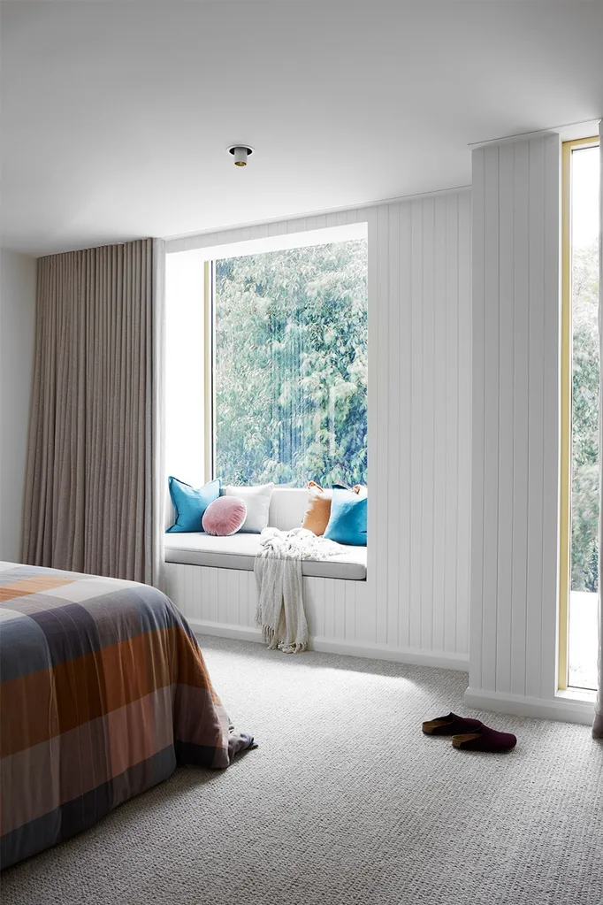
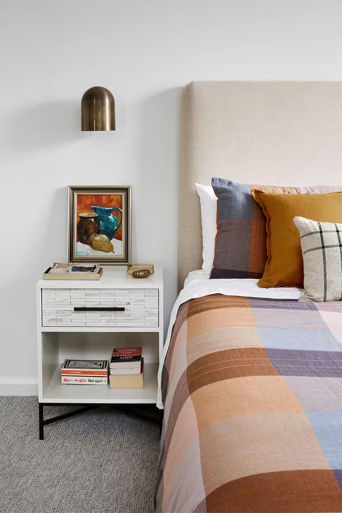
A quilt set from Adairs and a striped Country Road cushion add a touch of colour to the beige linen bedframe from Lavender Hill Interiors in the main bedroom. Brass accents are seen throughout with an elegant wall sconce from Nightworks Studio throwing soft light on the frame of a vintage painting on the bedside table from West Elm. “We have a beautiful established tree in our backyard, so Jodi suggested a window seat that looks out onto the foliage. It’s a relaxing spot to read or lie down and daydream,” says Natalie.
“Jodi pulled together something that really reflected our style and the way we wanted to live.”
Natalie, homeowner
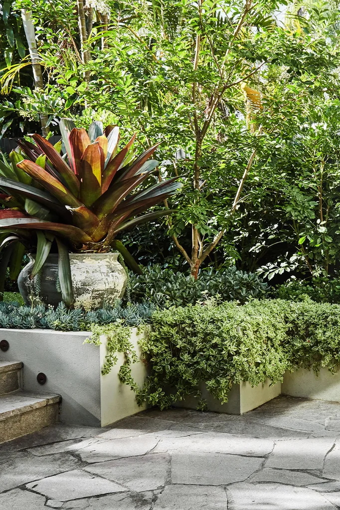
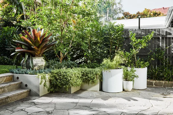
Here, giant purple bromeliads in an urn (for similar, try Watertiger) tower above hardy blue chalksticks and a ‘Livingstone daisy trailing red’ spills over the wall. A young crepe myrtle tree can be seen in the background and beneath it is an Indian hawthorn.
SOURCE BOOK
Architecture & interiors: Jodi York, Studio York Architects, 0413 455 528, studioyork.com.au.
Builder: Jason Boyle, JBC Constructions, (02) 9664 7430, jbcconstructions.com.au.
Landscape design: Marcia Hosking (since retired) and Nicholas Hosking, 0405 188 904.
 Photography: Sue Stubbs / Styling: Jessica Bellef
