After living the high life in the fashionable hub of Notting Hill, London, for four years, Charles and Sarah received a reality check upon their return to Australia in 2007. Landing in Australia with their baby boy, Will, in the midst of a property boom, the couple’s dream to buy a family home took a while to materialise.
“The market was so competitive that we missed out on quite a few places,” recalls Sarah. “We were staying in a one-bedroom flat that a family member very generously made available to us. We didn’t have a bath so we used to bathe Will in a plastic tub on the living room floor. It was a bit of a shock after coming back from London!”
Who lives here?
Sarah and Charles, both lawyers, and their children.
How did you tackle renovating your home? Sarah: “I treated it as a job and it was very much a priority of mine. So when the builder said they needed something such as the tiles, I would get them immediately. I didn’t want to be the reason the project was held up.
Best decorating tip for small spaces? “Make everything count but do it in a way that’s not obvious. You’ve got to have a bit of restraint as well – if I wanted more storage in the bathroom, I could have put in a big vanity.”
Biggest surprise in the renovation? “How well it went! We had good people around us. I tried to be as involved as I could but I knew when I needed to get in the experts.
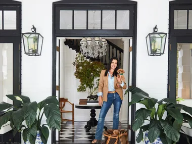
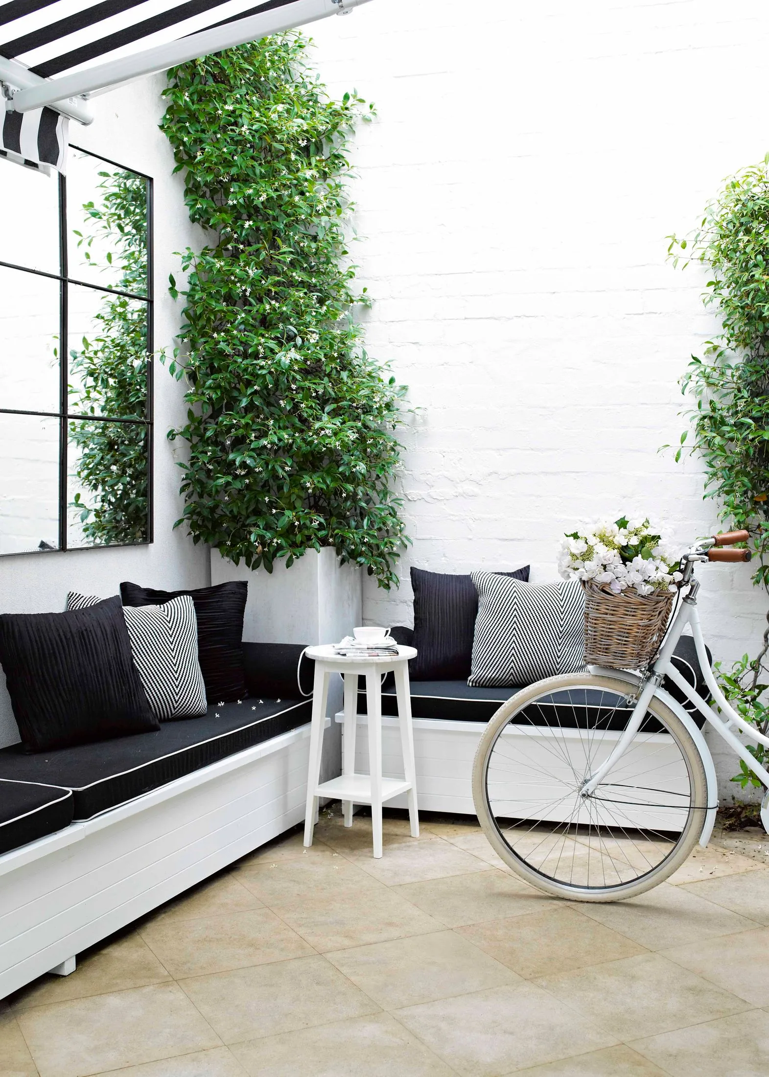
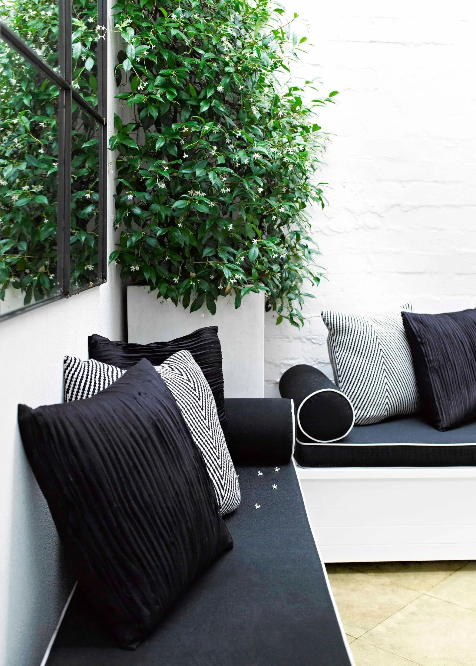
With the help of a buyer’s agent, the young family eventually found themselves ensconced in a perfectly positioned two-storey 1880s terrace that had everything the couple wanted: a functional layout, three decent bedrooms, an overgrown courtyard that had potential, and most notably – a rare feature for a home in this locale – it was freestanding.
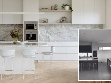
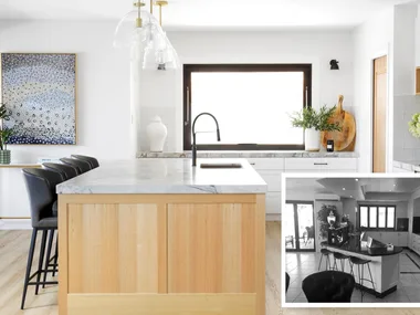
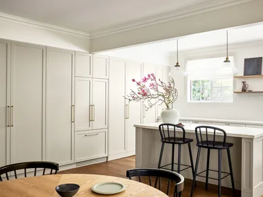
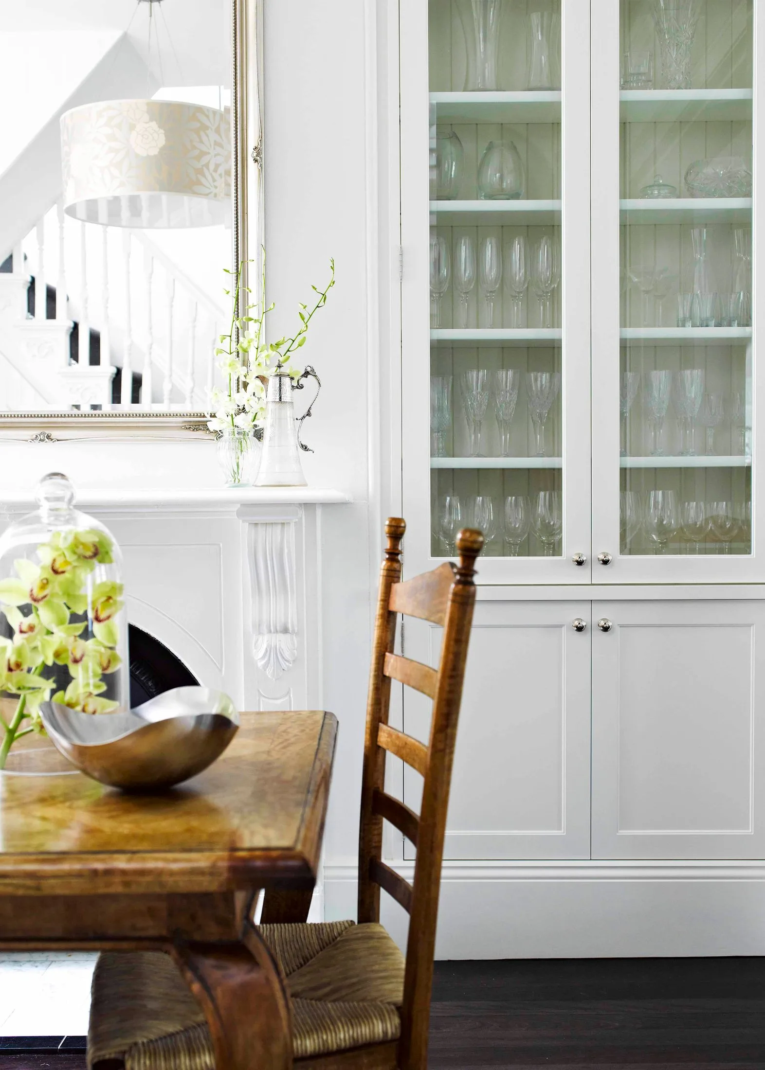
However the look of the place left a bit to be desired – “It was a bit of a dump,” admits Sarah – and the couple couldn’t afford to renovate straight away. So they went about making minimal changes for maximum effect, including repaving the outdoor areas, repainting the walls and kitchen cupboards in Dulux Vivid White and updating the kitchen handles and tapware.
“It’s amazing what a coat of white paint and some new handles can do,” says Sarah. “I bought fixtures knowing that we’d be renovating, so things wouldn’t be wasted. I knew what style I was planning to renovate in and knew these things would work well.”
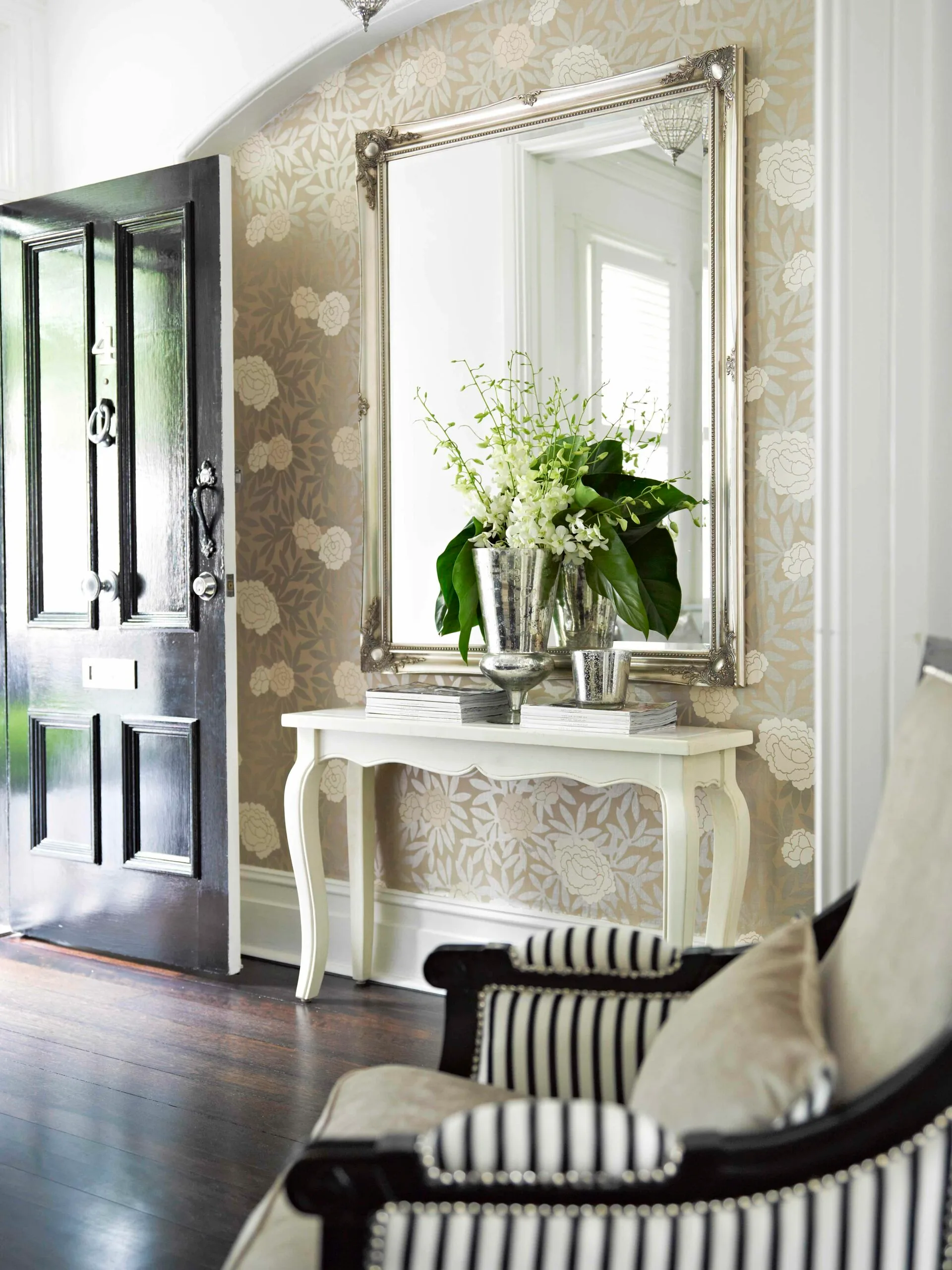
Decorating styles come in many forms and for Sarah, it’s all about the classics. Although born and bred in country NSW, she happily takes style cues from her time in London’s Notting Hill. “The home does look quite European – we did a lot of travelling in France. We still wanted modern features, though, to give the house a fresh look,” says Sarah.
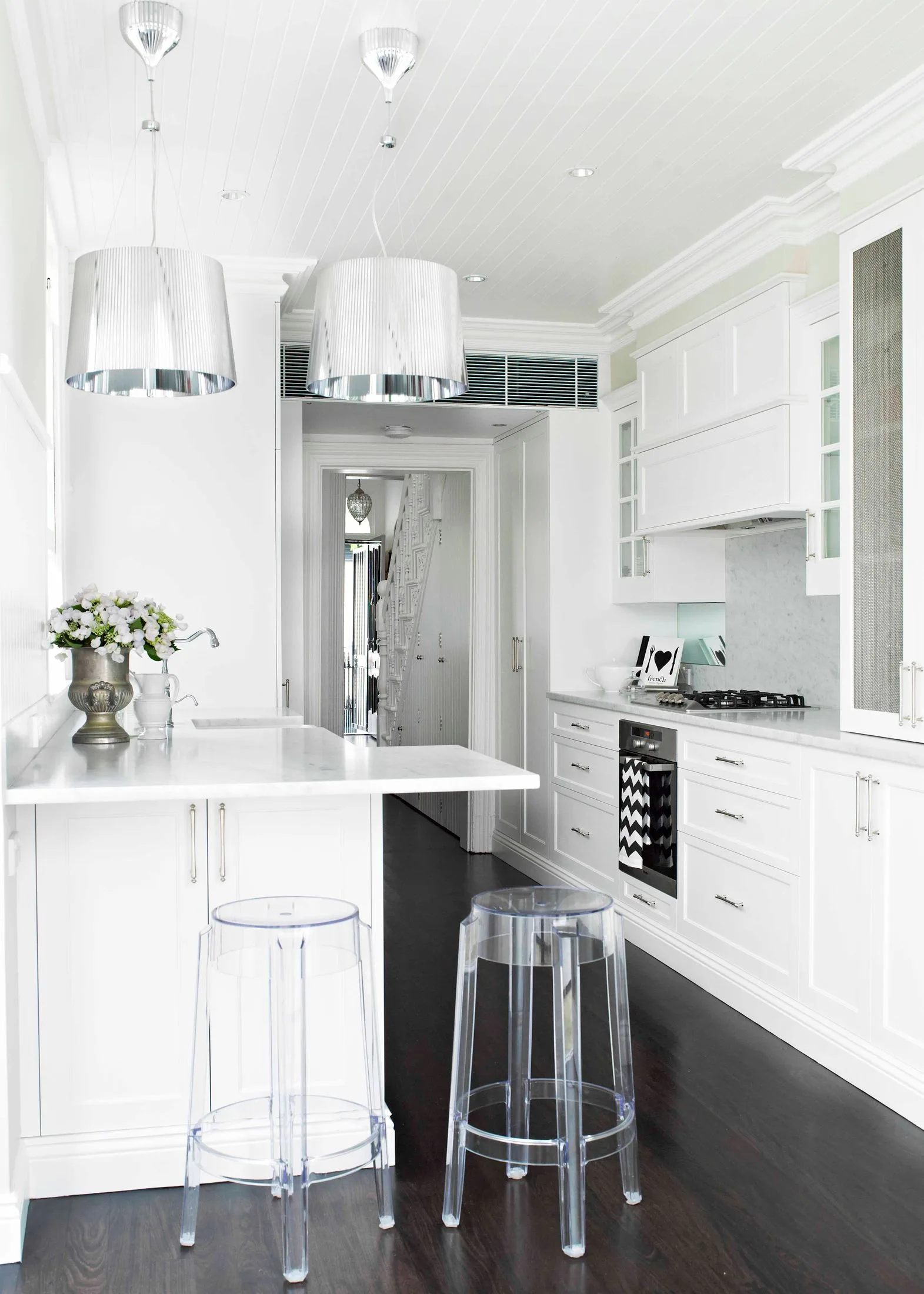
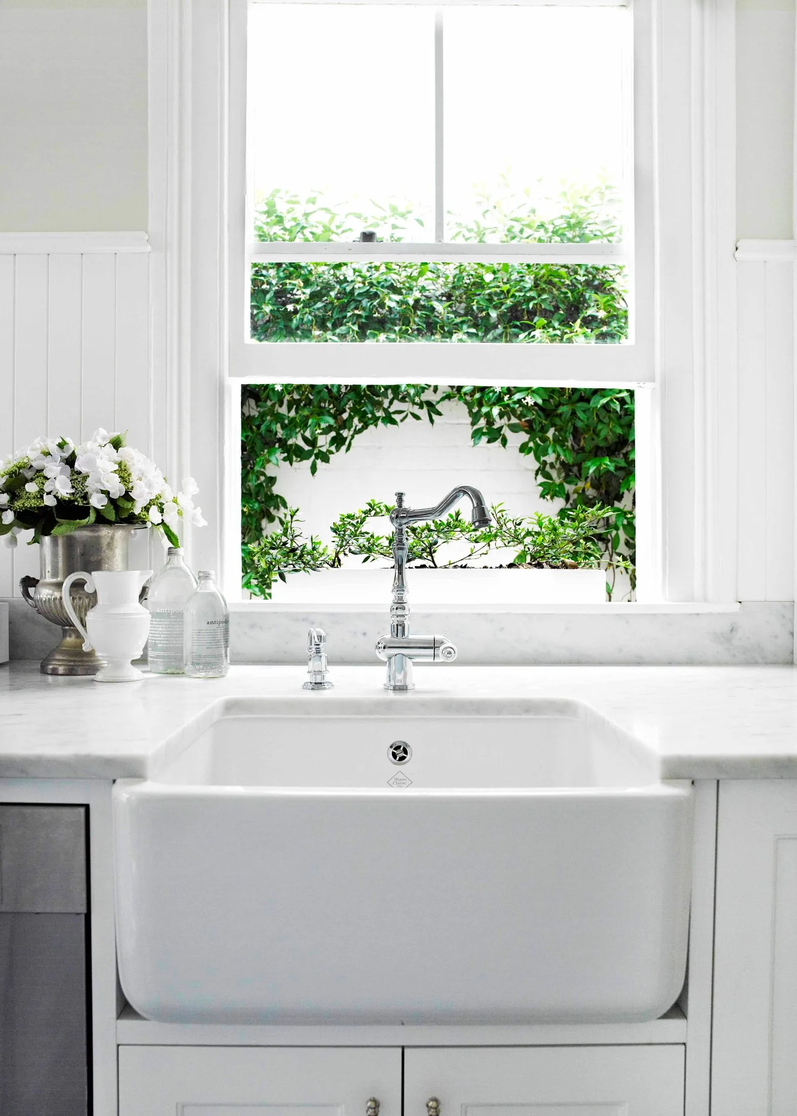
Sarah drew on all these elegant influences during the year-long planning period and four-month renovation, as well as a team of experts: interior designer Belinda Smith of SMT Studio, who designed the home’s joinery; “fantastic” joiner Eddie Chedra and interior designer Bree Oliver, who helped with the finishing details.
“We just wanted a design that was simple and sympathetic to the house,” says Sarah, who was careful to maintain the home’s distinct spaces and as many original features as possible. “You see some terrace houses where the only original feature is the facade. There doesn’t seem to be any structure. I like having the living room and the dining room and the kitchen.”
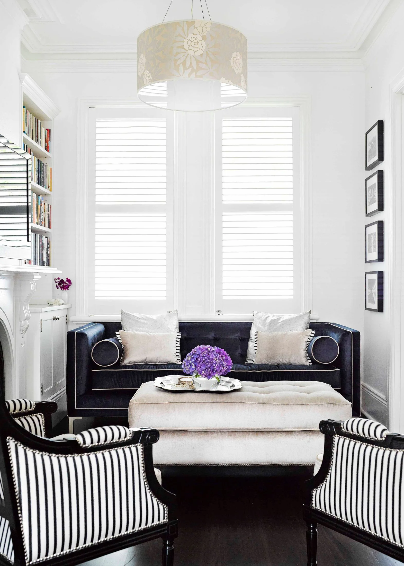
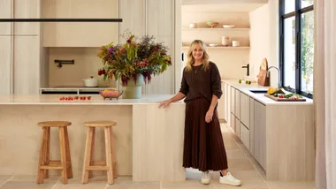
As dark floors flow from the entry through to the inviting living space into a polished kitchen and courtyard, it’s difficult to imagine that the block is just 102 square metres. “You can’t get away from the fact that it’s a small house,” says Sarah, “so we’ve fitted a lot in.”
Materials and paint colours reoccur, while clever space-saving ideas are in abundance, including cupboards that hide computer cords, built-in wine storage for 60 bottles under the staircase and sneaky kitchen cabinets. Her secret to keeping the space so streamlined?
“I’m quite particular about what I keep,” she says. “That’s why my attic’s so full! It’s the same with my wardrobe – if I buy a new pair of black ballet flats, the old ones go.”
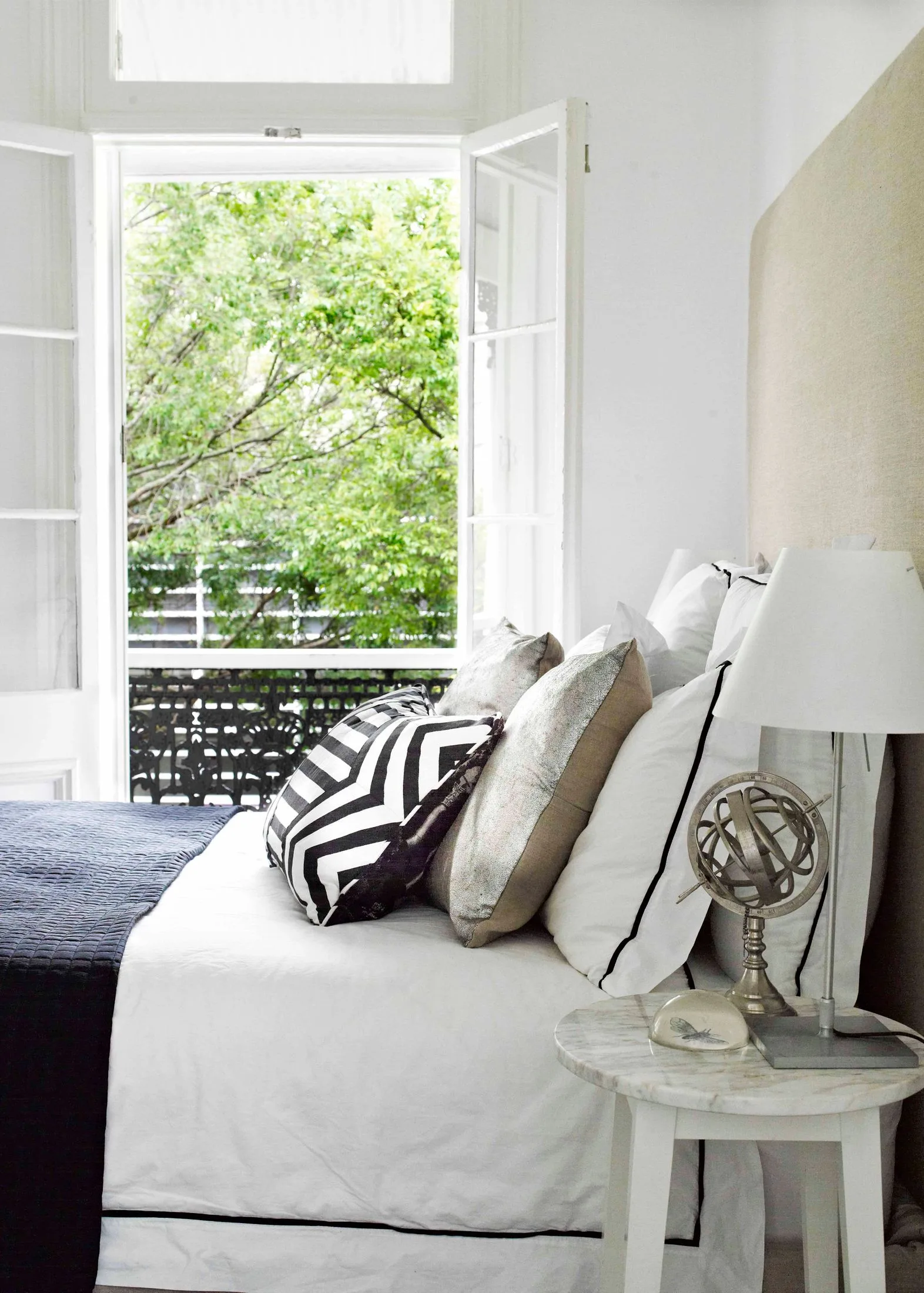
It’s this simple philosophy that has kept this family’s home sophisticated and liveable, and while Sarah admits the couple’s initial decision to buy a home on such a small block, close to the city, was “very much a decision for us as opposed to the kids”, the choice of style over size has proven to be beneficial.
“We have a park literally a minute’s walk away,” she says, “and with the children at this age when we still need to keep an eye on them, it’s actually quite easy. I can hear exactly where they are in the house!”
 Photography: John Paul Urizar | Styling: Bree Oliver
