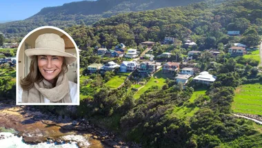
A decade ago, when homeowners Kristie and John bought their tiny cottage overlooking the bay in a covetable pocket of Sydney’s north, it was a classic case of the worst house in the best street. Back then, they had one small child – three more followed – and one big dream for what their family home could become.
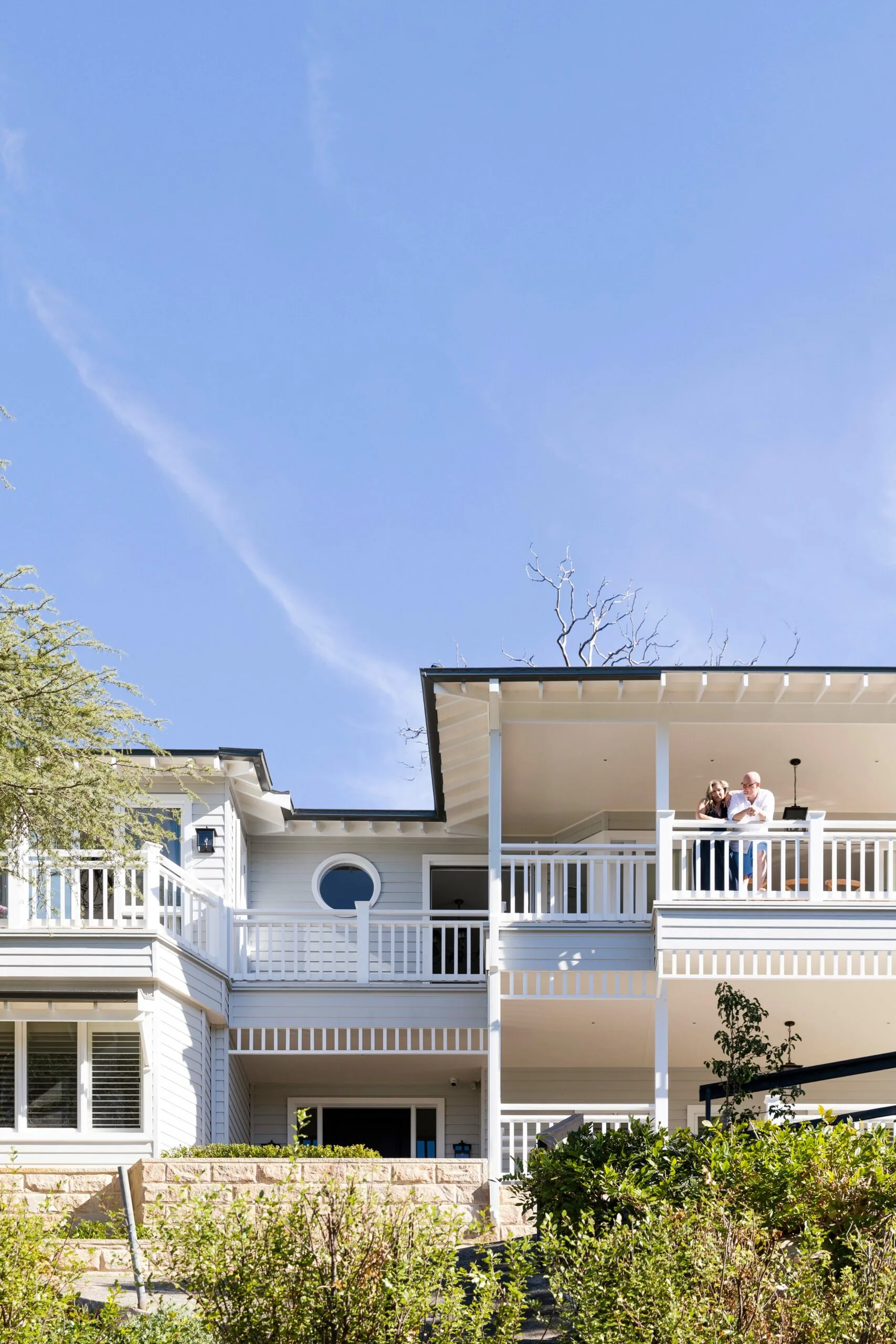
Who lives here? Kristie, a homewares buyer; her husband John, a technology consultant; their children, Isabella, 14, Lachlan, 12, Olivia, nine, and Hamish, seven; Lilli, a miniature labradoodle, Cloud the rabbit and Ruby the guinea pig.
The plus of living in the house before renovating? John: “Living there helped us understand how the sun moves in winter and we’ve now got four of our five bedrooms that get sun in the morning and everyone wakes up feeling good with a bit of vitamin D.”
Anything you’d do differently with the renovation? Kristie: “In retrospect, the only regret is not putting underfloor heating in the downstairs laundry. We did that in both bathrooms upstairs that were brand new and it’s fantastic.”
Favourite spot for entertaining? “When we have friends over, we’ll go from the upstairs balcony to the downstairs balcony and the pool level is in between so we can see the children swimming.”
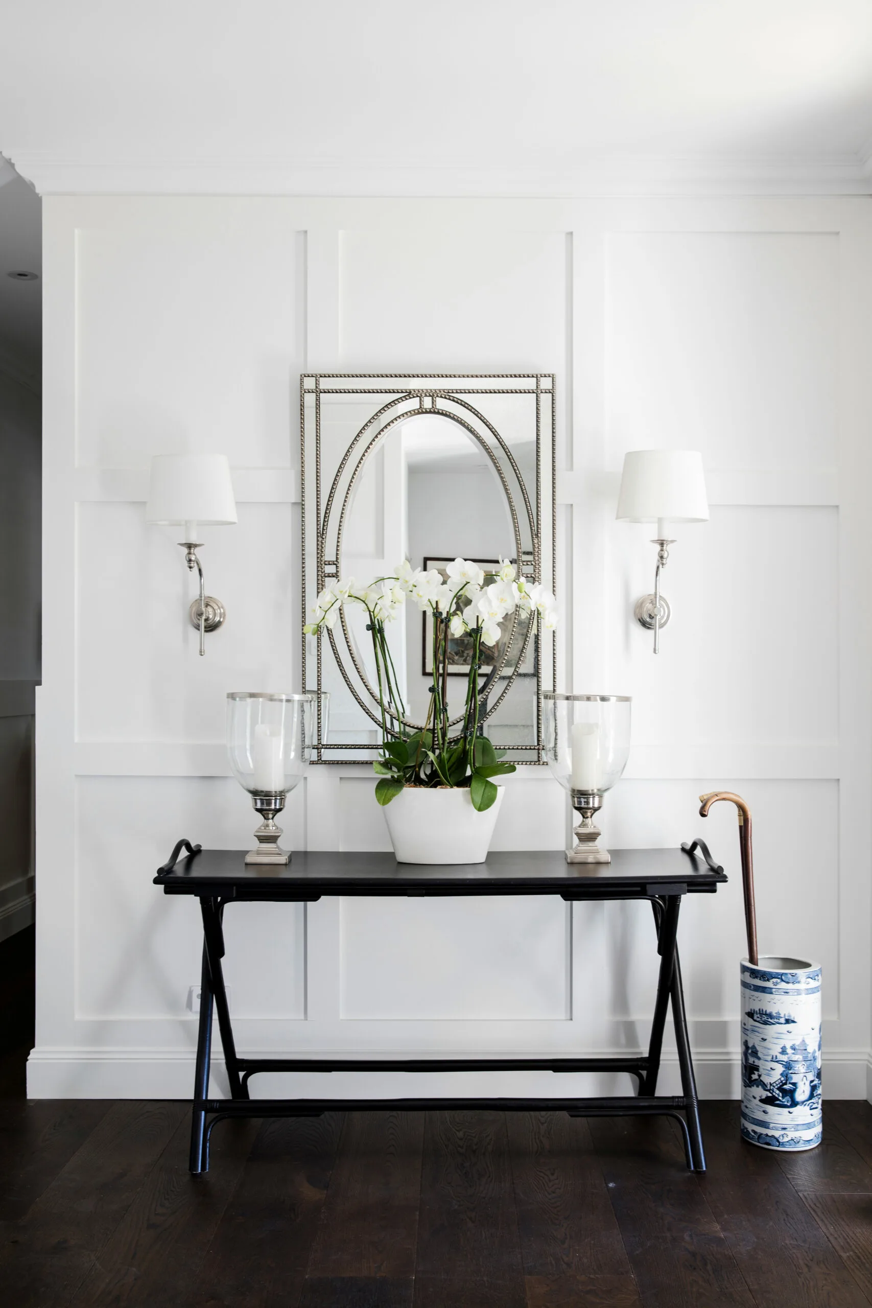
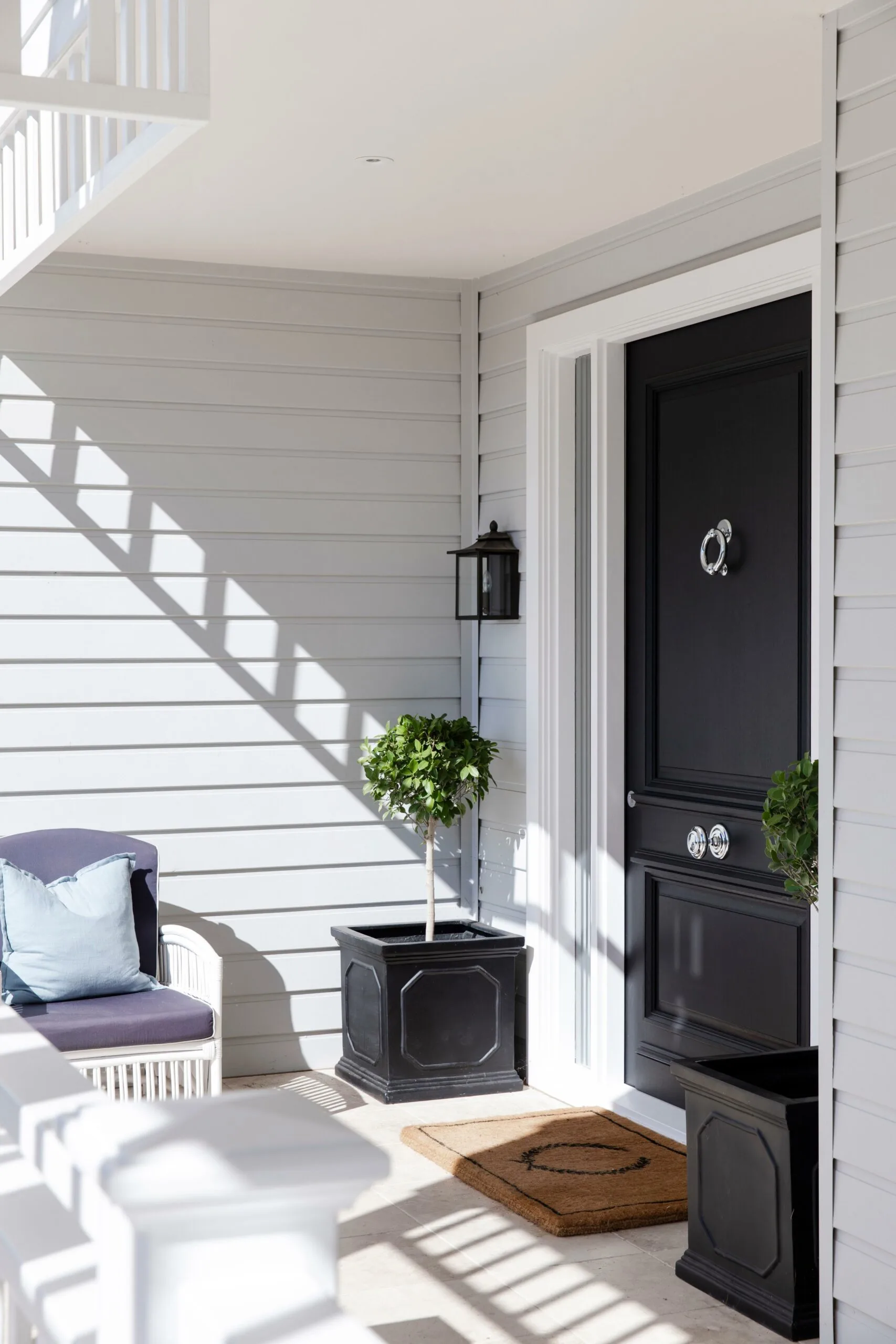
FOYER For Kristie, the success of her home comes down to the finer things, including Hamptons-esque wainscoting that welcomes guests at the entrance to the home. “The thing about my personality is that I’m very determined and I’m a finisher,” she says. “Details really are the finishing touches.” Black accents, care of a simple side table, form a chic contrast to the mainly white canvas.
An awkward floor plan, a block with limited access and no redeeming architectural elements highlighted the need for an overhaul, but that turned out to be a huge challenge. One architect designed their perfect house at three times their budget (“He broke my heart,” recalls Kristie); another advised them to knock it down; a third suggested selling up. Undeterred, she started researching her perfect home – mood boarding, planning and buying special pieces. Her heart was set on a Hamptons look (she has every copy of Home Beautiful’s Hamptons special issues) and she wanted to get every detail right.
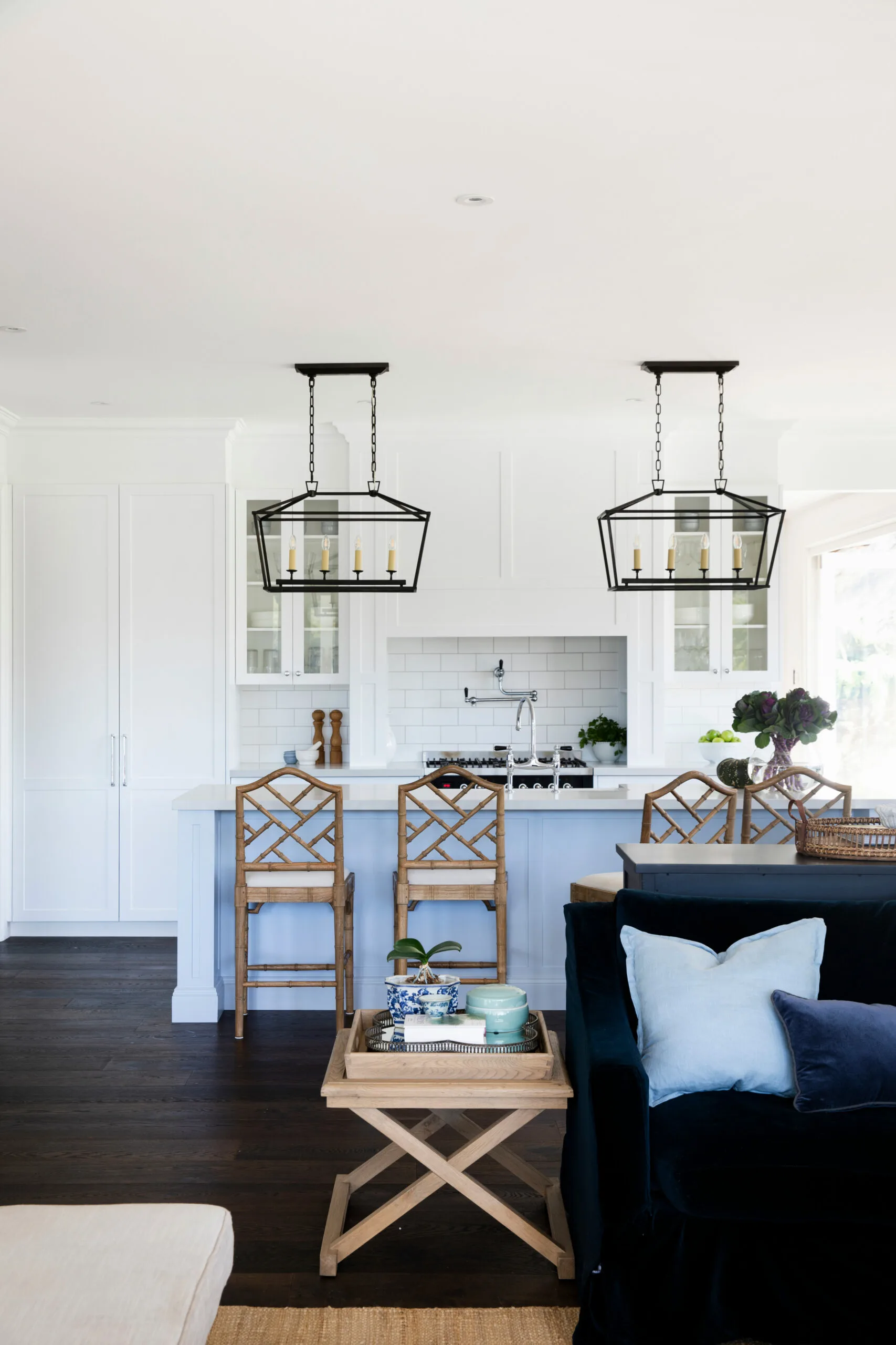
KITCHEN The kitchen was a long time in the making. Kristie bought the light fittings – ‘Darlana’ linear lanterns from Circa Lighting in New York – and stored them for almost a year before they were installed. The soft blue in the island bench is Dulux Elusive Blue, aptly named because it took the owner a long time to settle on. “I saw an image on Pinterest a couple of years ago and it was of a shopfront with stunning black and white awnings, and a really pale blue colour on the brick,” she says. “I took an image of it and it became my colour palette for almost the whole house.”
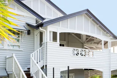
Eventually, the couple found their perfect match in builders Cape Cod Australia and their designer Barbara Szymanski, who came up with practical solutions to create their dream home without knocking down the original. “The foundations were amazing,” explains the owner. “In the 10 years that we lived here we didn’t even get a crack in it. We knew that they were really solid double-brick walls.” The family rented a house down the street and monitored the build over the 12 months it took to complete.
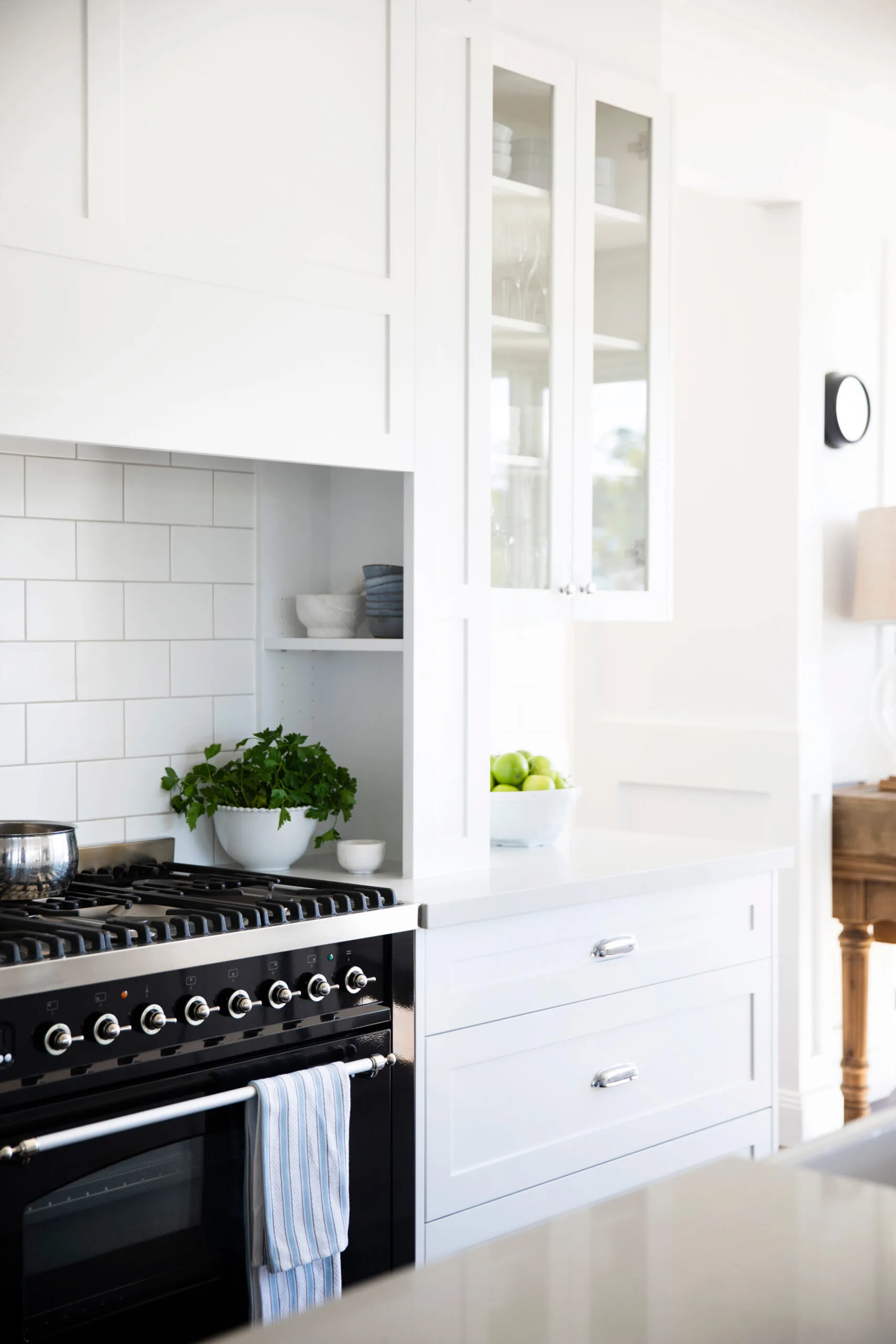
An eight-burner cooker ensures cooking with ease when feeding a family of six.
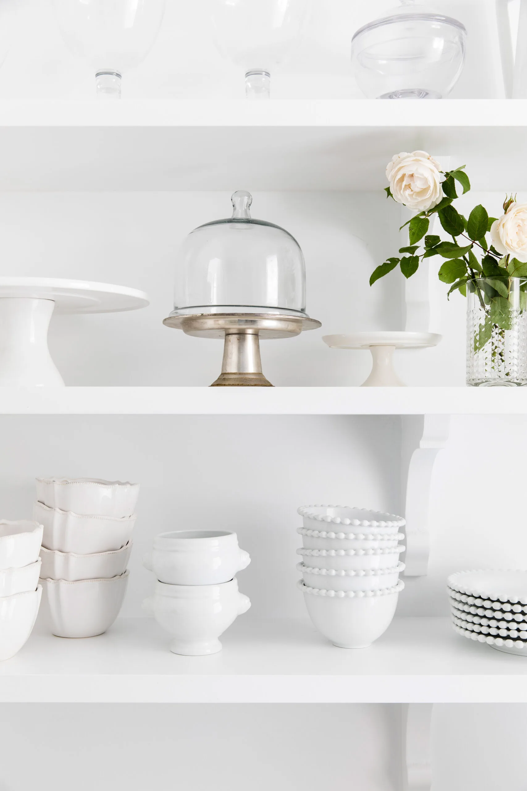
BUTLER’S PANTRY White walls and open shelving feature in the butler’s pantry. For a similar collection of white wares, try Maxwell & Williams.
Key changes included the existing top floor, which was extended and reworked to include an open-plan kitchen and living area, along with a master suite and a second bedroom. The ground floor contains three more bedrooms for the children, along with a laundry and main bathroom. “I was there constantly,” says Kristie. “I just quite liked going and thanking everybody. I think having a positive attitude is contagious.” Her presence ensured a smooth build and kept things organised. “Most things were chosen a good six to 12 months in advance,” she recalls. “I didn’t leave it to chance.”
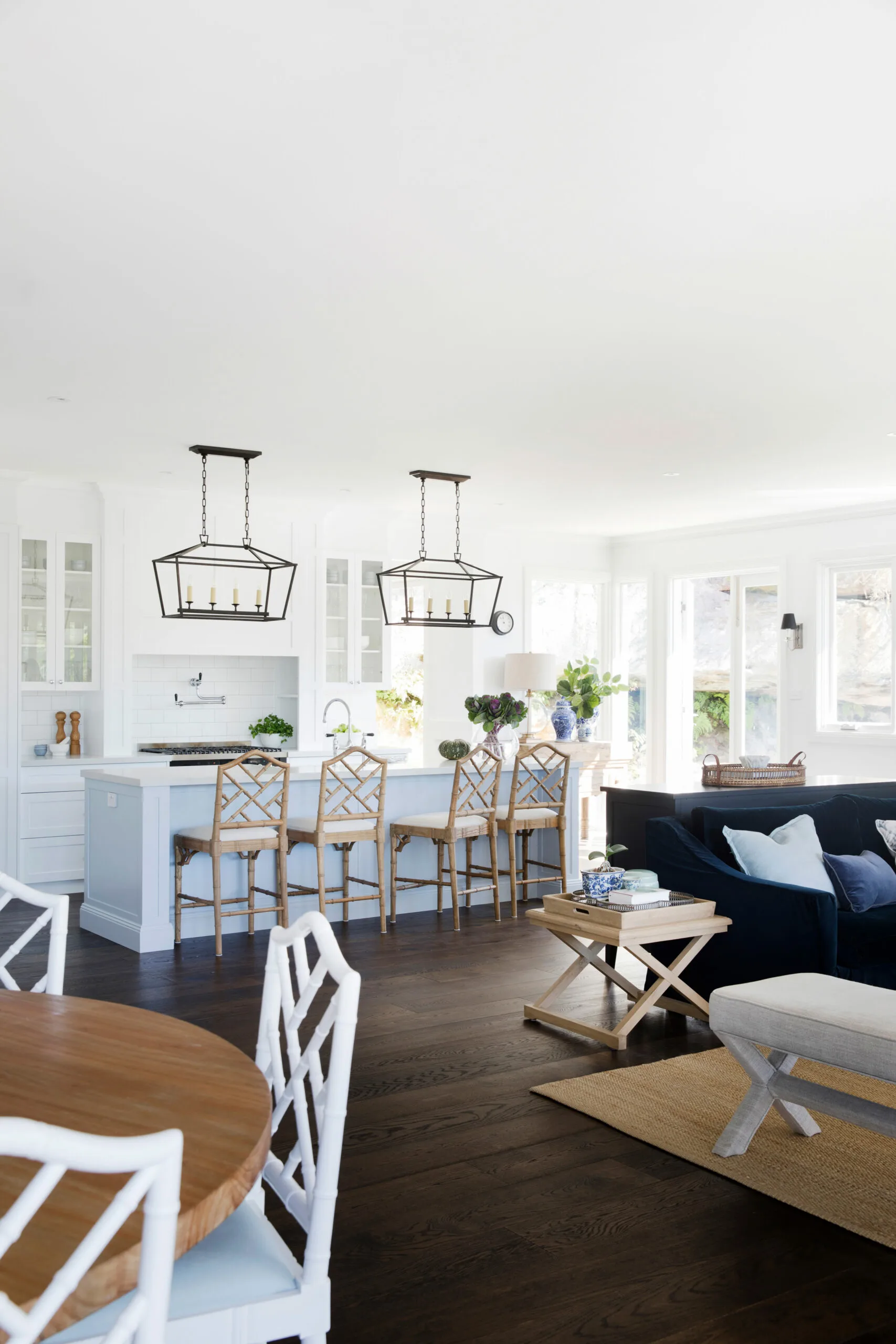
The couple sourced most of the pieces for the new house, from the front door (custom-made by a company in the NSW Southern Highlands), to furniture, taps and tiles. “The reality is that we worked every weekend for a year,” recalls John. “We would get stuff delivered on Friday and we would haul it up ourselves on Saturday and Sunday so that it was ready for the builders on Monday.”
Their dedication paid off – the build was finished on budget and the family moved in earlier than expected. And it didn’t take long for them to savour the sunny results. “We only lived here for about three or four days before John had an overseas trip and I was here with the kids,” recalls Kristie. “I kept waking up and walking into our beautiful living area with the sunshine and I just couldn’t believe it was our house. There are so many mornings like that.”
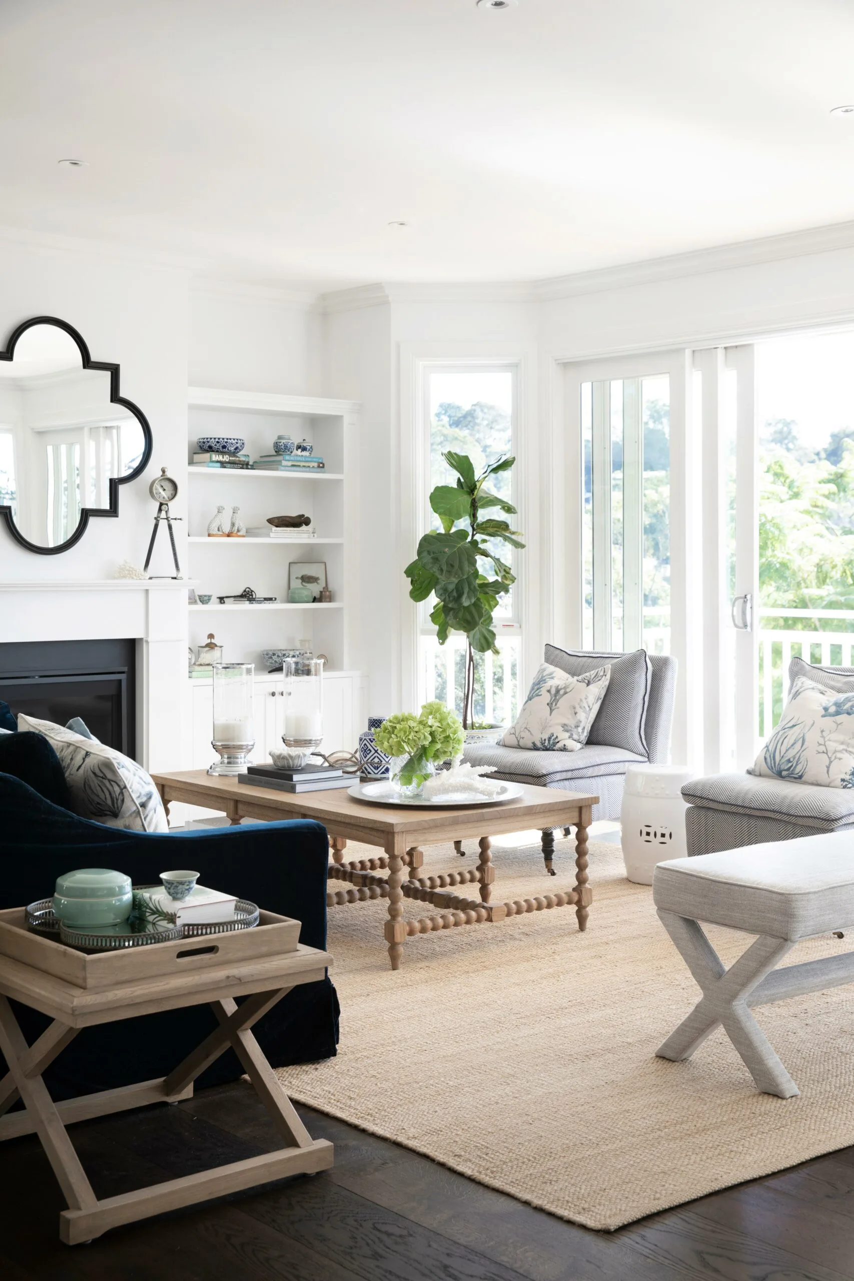
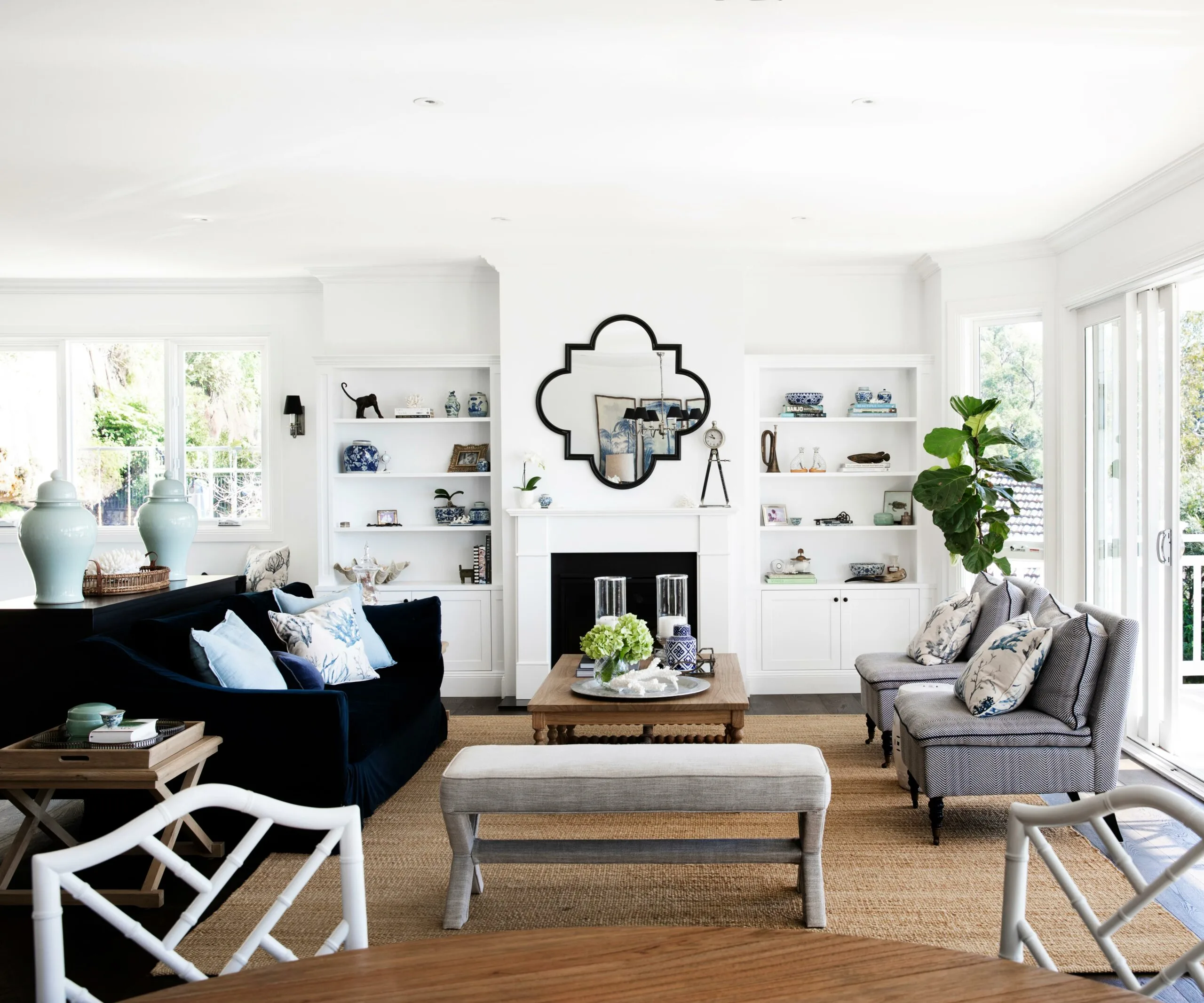
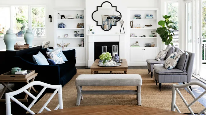
LIVING ROOM Positioned on the top floor, the open-plan living room is a magnet for the whole family and takes full advantage of the breathtaking views. The top floor boasts beautiful cathedral ceilings, a detail the homeowners love. “It’s things like that that make our house our home,” says Kristie. A dark timber floor – for similar try the Brown Black from Royal Oak Floors’ Architect Collection – was installed throughout to make the area one cohesive space. A navy Canvas and Sasson sofa provides a counterpoint to the crisp, white cabinetry, painted in Dulux Lexicon Quarter – which is the same white that’s used throughout the house.
The family spends most of its time on the top floor, which features a combined living and dining area plus kitchen. Kristie and John made a last-minute decision to include a cathedral ceiling here, which helps make the space even more grand and light-filled.
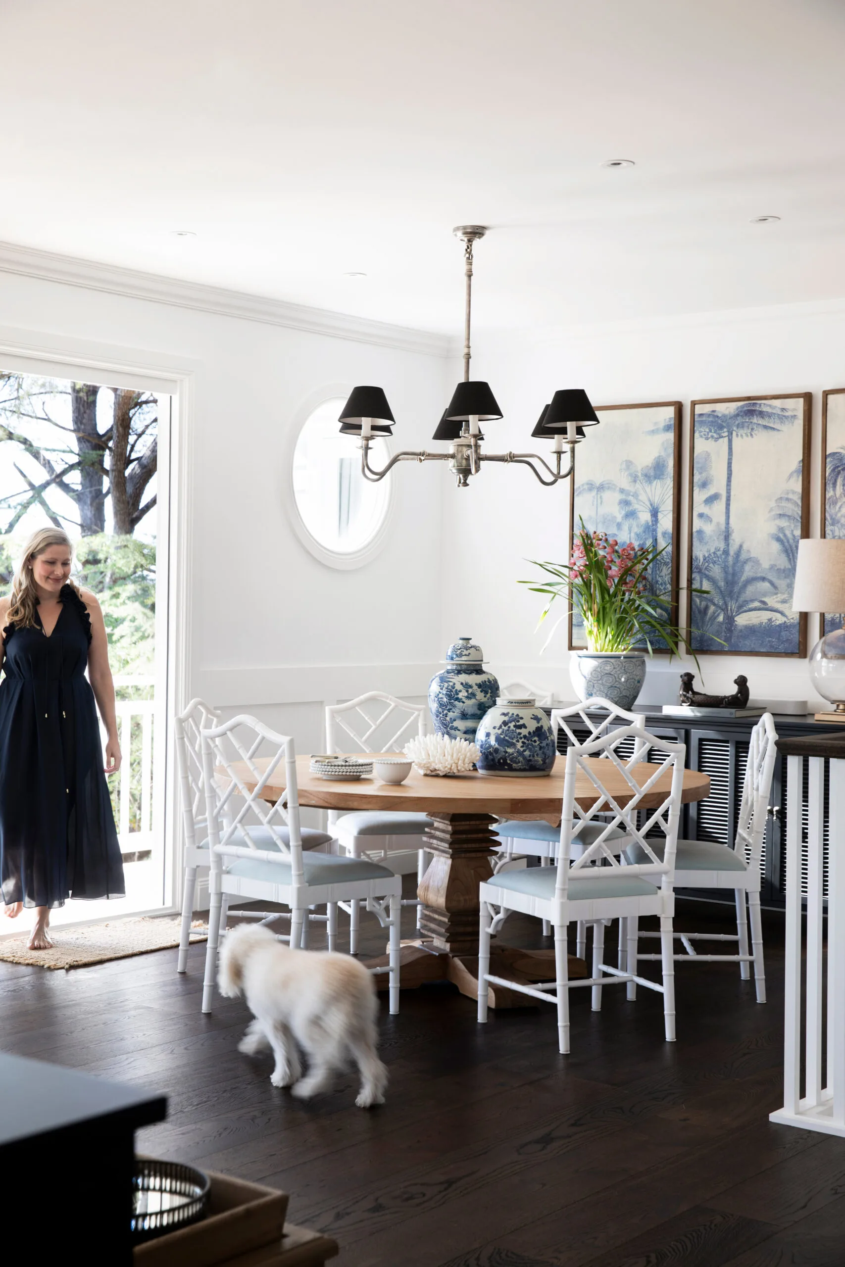
DINING ROOM A ‘Newport’ round table and ‘Chippendale’ dining chairs in White, from Abide Interiors, was the sociable choice for the family of six, and a white pendant light from Emac & Lawton makes a statement.
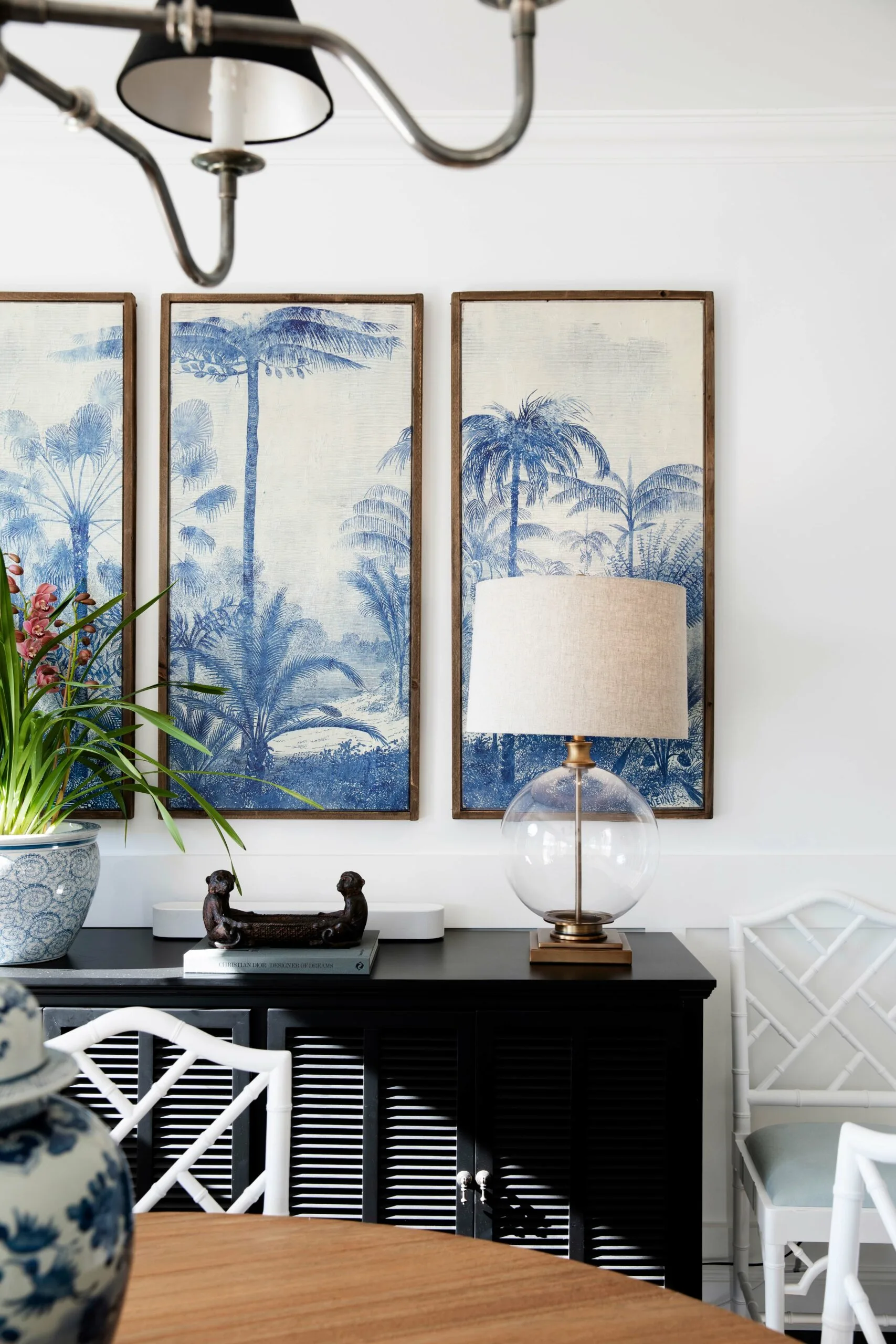
DINING ROOM The classic ‘Louvre’ sideboard in Black from Canvas and Sasson, provides a contrast to the white dining chairs and an opportunity to display favourite finds.
The casual lounge is a welcoming retreat is tucked away behind the main entertaining space on the top floor. “I call it the TV room because I didn’t want a TV in the main area of the home,” says Kristie. “It’s another room where we have the beautiful raked cathedral ceilings and it’s cosy, but feels really luxurious.”
“We’re a really busy family, everyone’s got all their activities, but sometimes, like on a Sunday afternoon, we’ll do something really daggy such as watch a David Attenborough doco, or a movie with popcorn, if it’s raining.”

CASUAL LOUNGE The family often gathers here on the leather sofa from Alliance Furniture Trading and chic white stools for down time.
(Credit: Photography: Chris Warnes / Styling: Fiona Gould)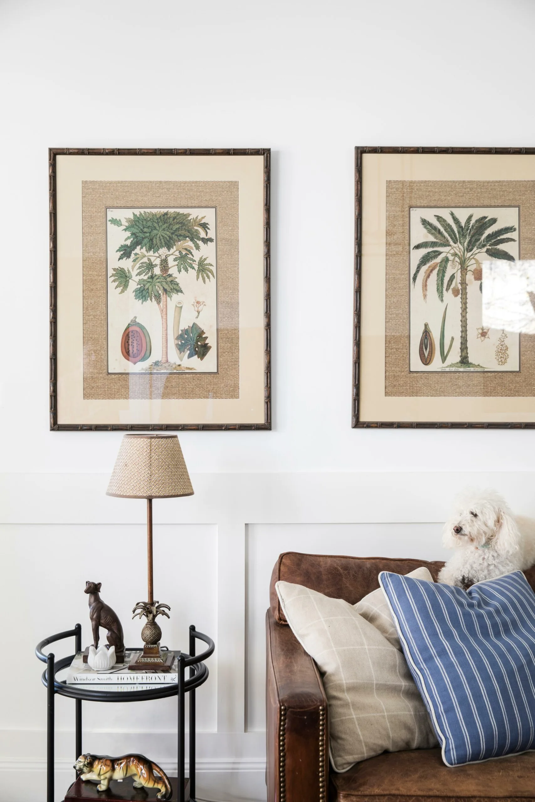
“All these spaces sort of evolved in a sense – we didn’t realise how lovely it was going to be,” says Kristie. The stunning artworks that evoke a boho sensibility are from Coral Coast Living .
The wainscoting was a last-minute decision and Kristie spent six months hand-painting it in Dulux Lexicon quarter throughout the house. “The guys who did the timber carpentry work did an awesome job of it,” says John. “But then the painters were going to cost some ridiculous amount in paint, so Kristie did it instead.” She adds, “It really was a labour of love.”
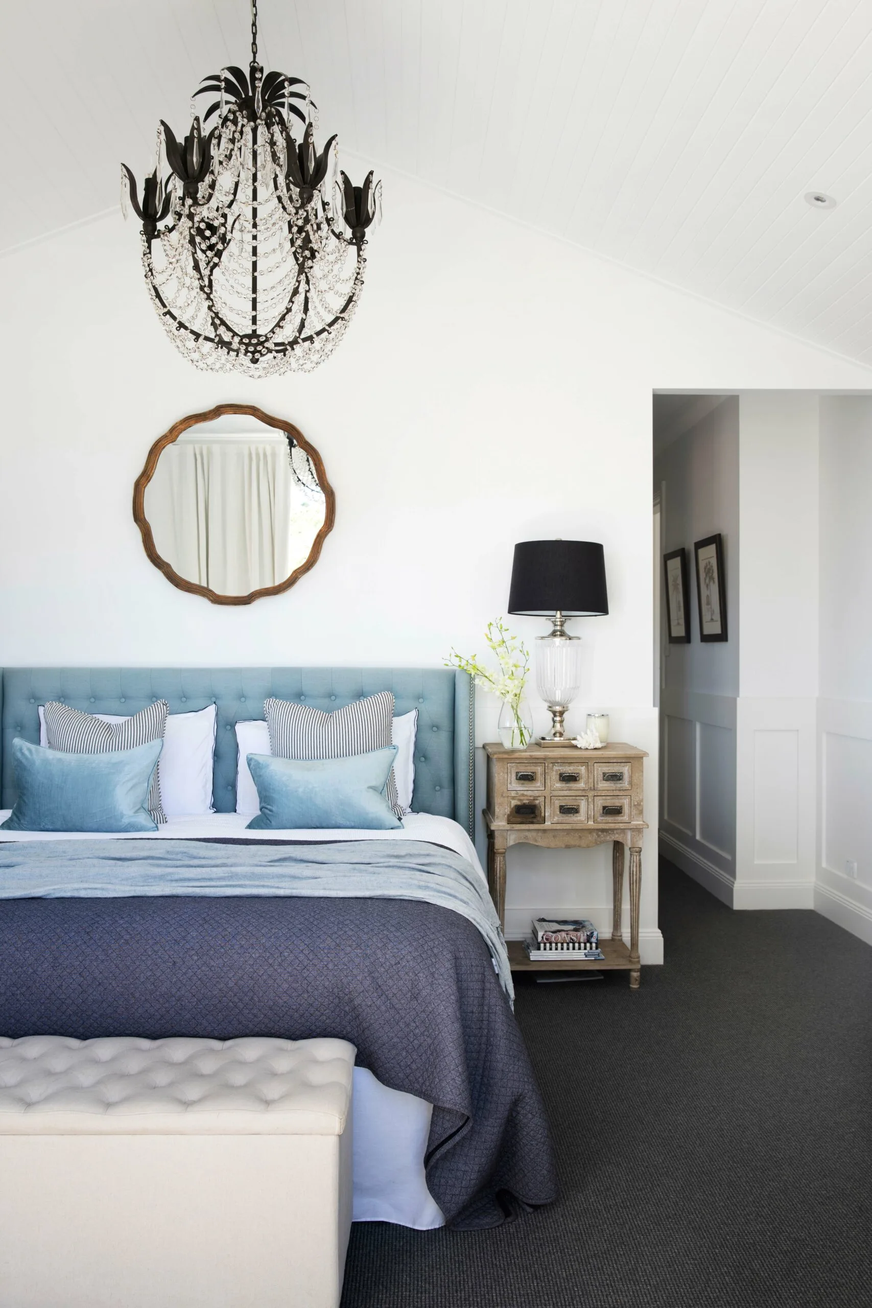
MAIN BEDROOM A spectacular chandelier from Alfresco Emporium takes centre stage in the couple’s luxurious space. “I love my bedroom just because it’s a beautiful sanctuary and I’ve got four kids to escape from!” says Kristie with a laugh. “It’s got this beautiful outlook and it’s just a lovely light and bright room.” She sourced the divine bedhead from Mayvn Interiors and paired it with a mirror from Freedom and bedside tables from Coral Coast Living.
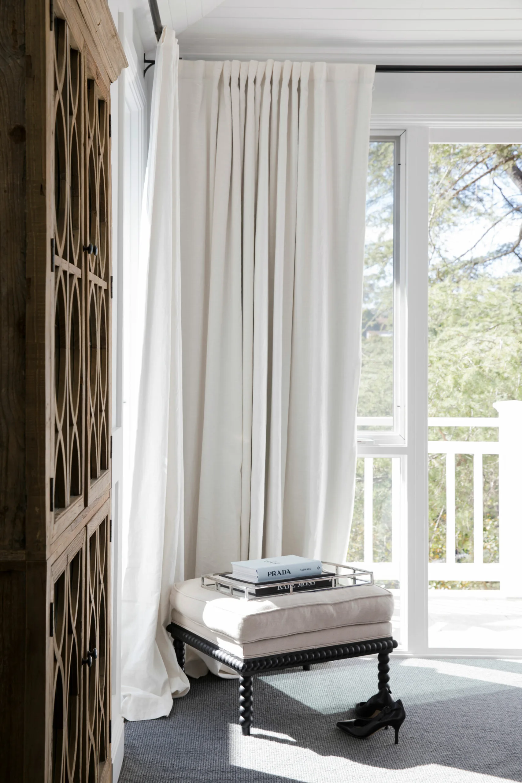
The charming ottoman is positioned for a perfect view. The couple decided on what John calls an “upside-down” floor plan for their home, with the living spaces and main bedroom on the top floor to take advantage of the spectacular view. “We wanted to make the best of that – although we stole some of the space for our room, the parent’s retreat,” he explains.
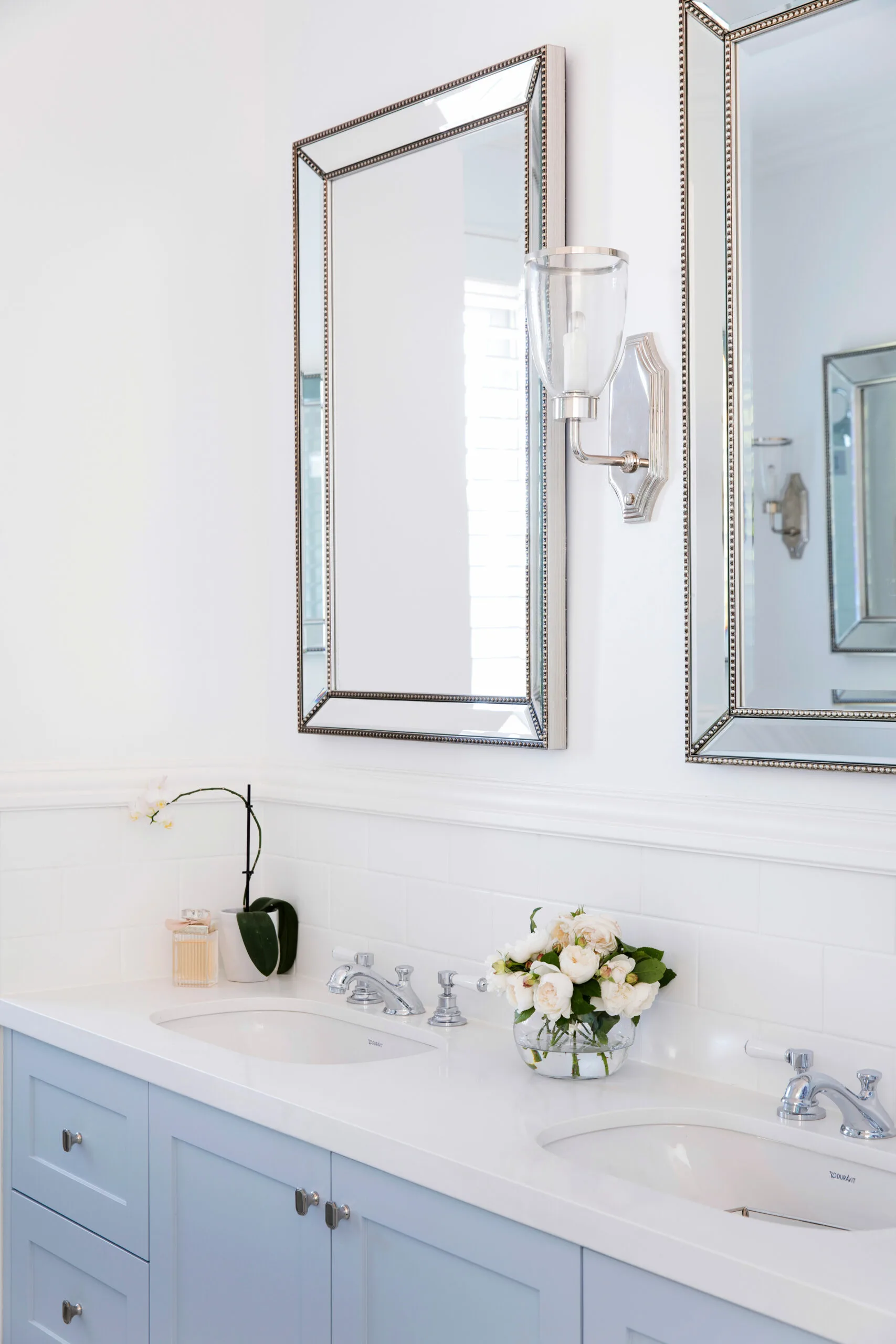
ENSUITE The vanity in Kristie and John’s bathroom was custom made and painted in the same soft blue as the kitchen island (Dulux’s Elusive Blue), with traditional Brodware tapware and sinks which were sourced from Just Bathroomware. The sconce lights from Emac & Lawton are a chic addition.
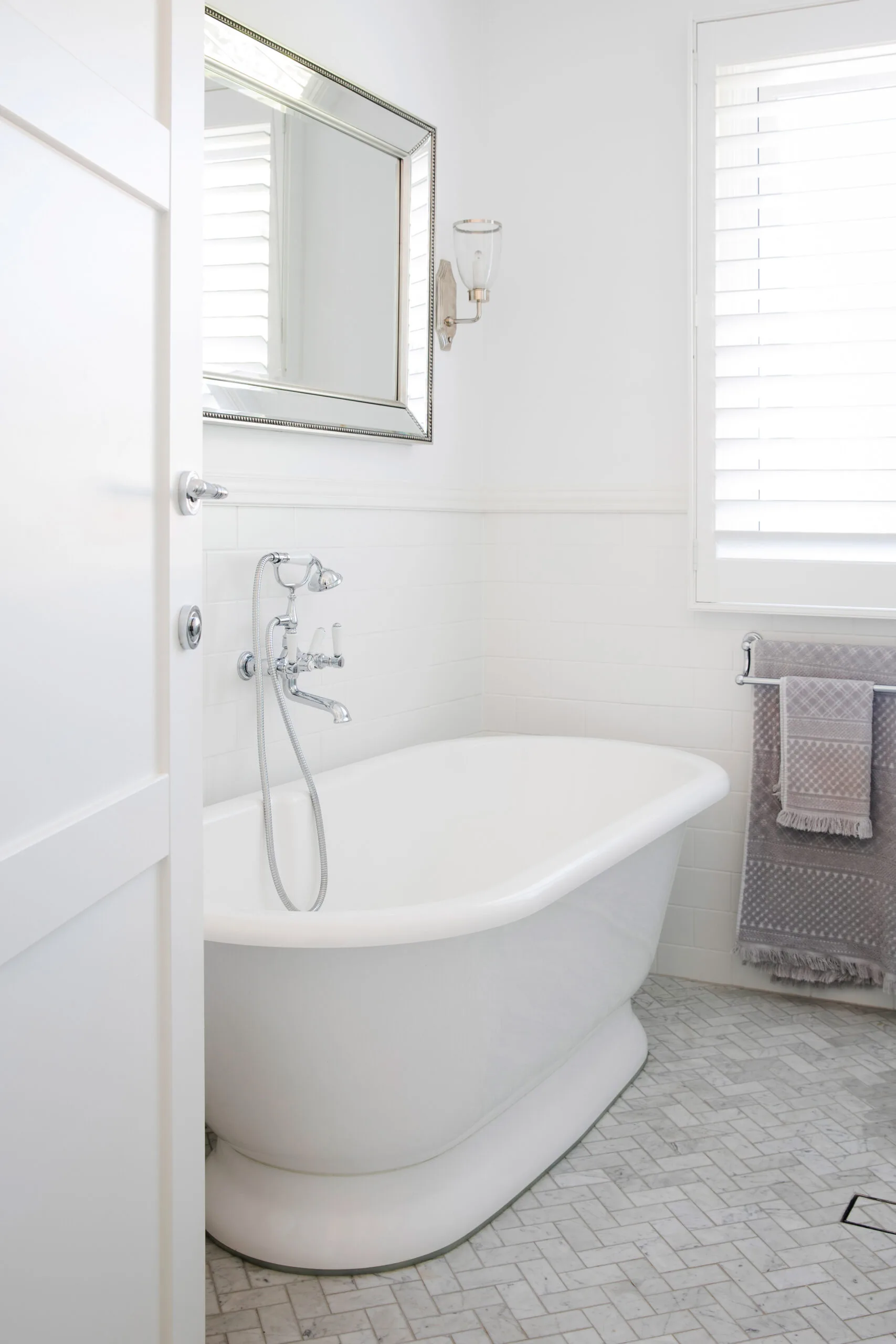
ENSUITE The classic bath by Victoria & Albert makes a masterful suite statement, with tapware from Brodware to match the elegance of the bath’s shape. The look is completed with the Carrara marble tiles from Tiles4Less, which have been laid in an of-the-moment herringbone pattern.
The navy-blue paint colour in Hamish’s room was hard to choose. “We went through nine million paint samples,” says Kristie with a laugh. “I kept driving around to every possible paint supplier in Sydney, and John kept saying, ‘No that’s not the one, too purple, too dark’. So we came up with Sydney Harbour by Porter’s Paints, which we just loved. The fact that it’s called Sydney Harbour meant we were sold.”
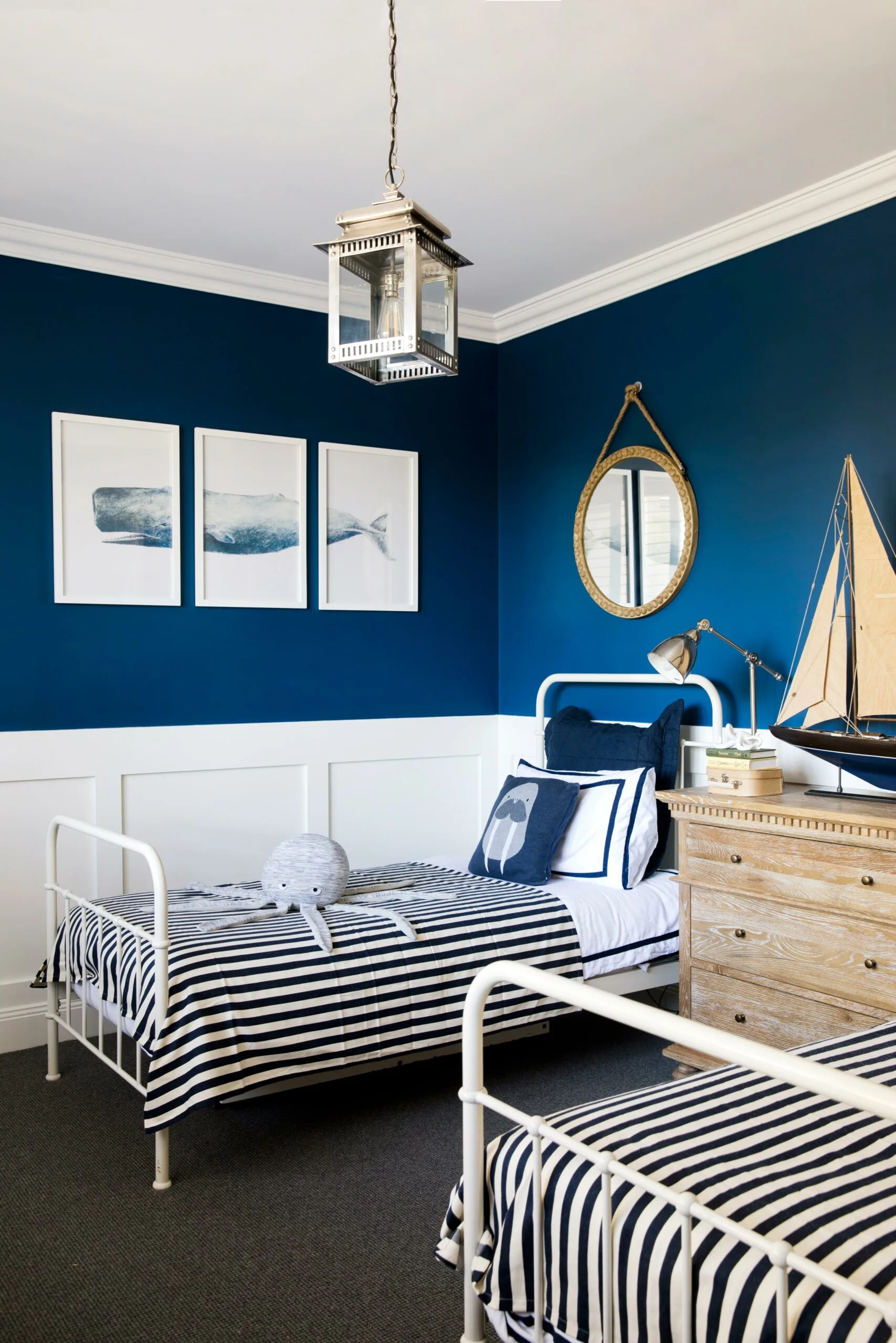
HAMISH’S BEDROOM Sweet beds from Adairs are matched with linen made from The Boathouse at Palm Beach tablecloths as a nod to the 12-year-old’s nautical themed room. The print is from One World Collection.
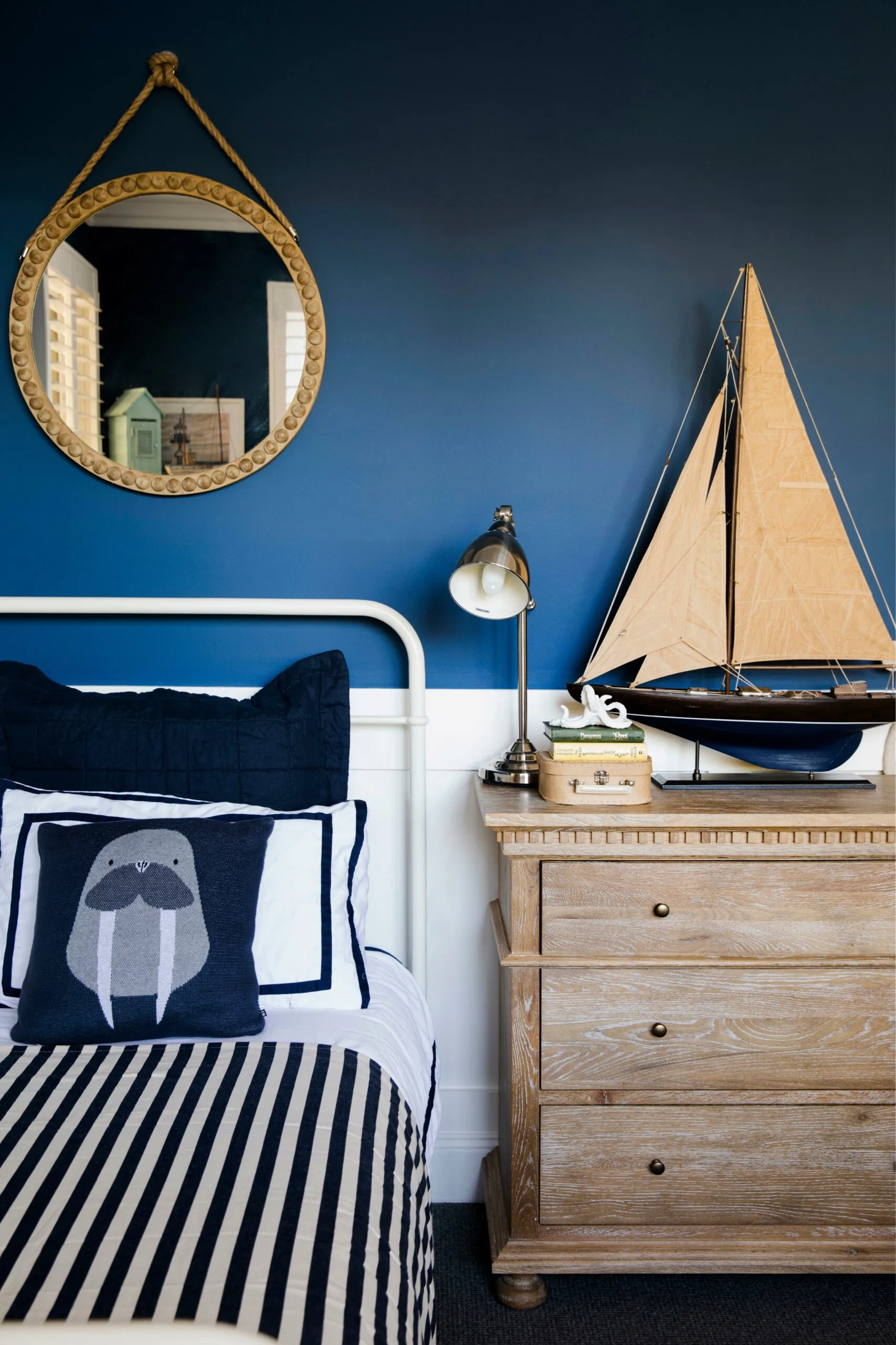
The vintage-look model ship was found at Coral Coast Living.
In Olivia’s room added personal layers come care of a Winnie-the-Pooh print that belonged to Kristie as a child, a mouse artwork (artist unknown) that originally belonged to Lachlan and a chair that was bought when Isabella was born, 14 years ago.
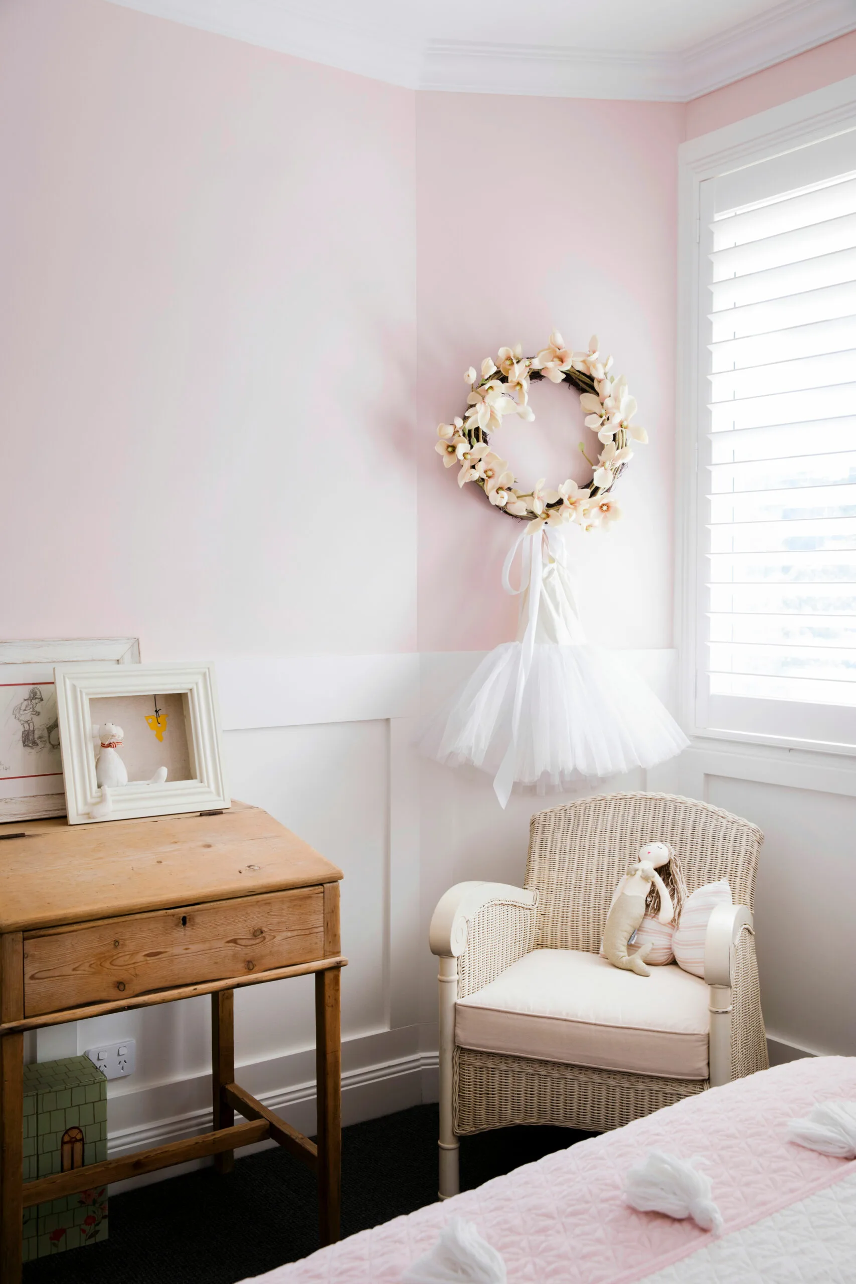
Olivia’s room features a beautiful vintage desk, which was found at an antiques store in Bowral.
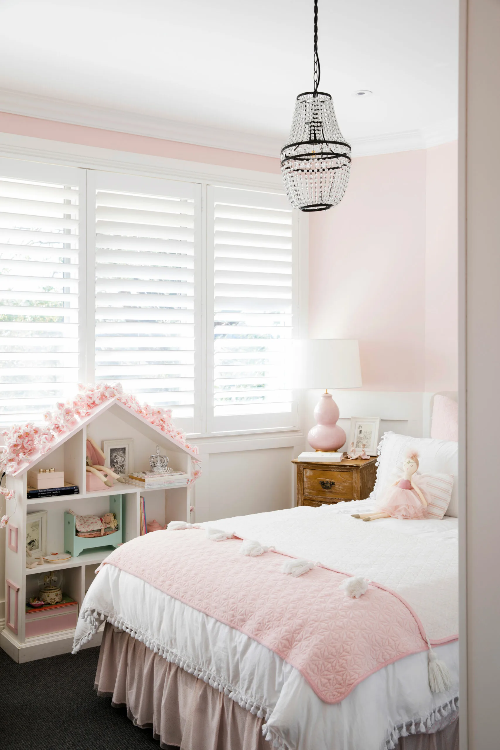
Nine-year-old Olivia has a dream bedroom, painted in Fairy Pink by Dulux.
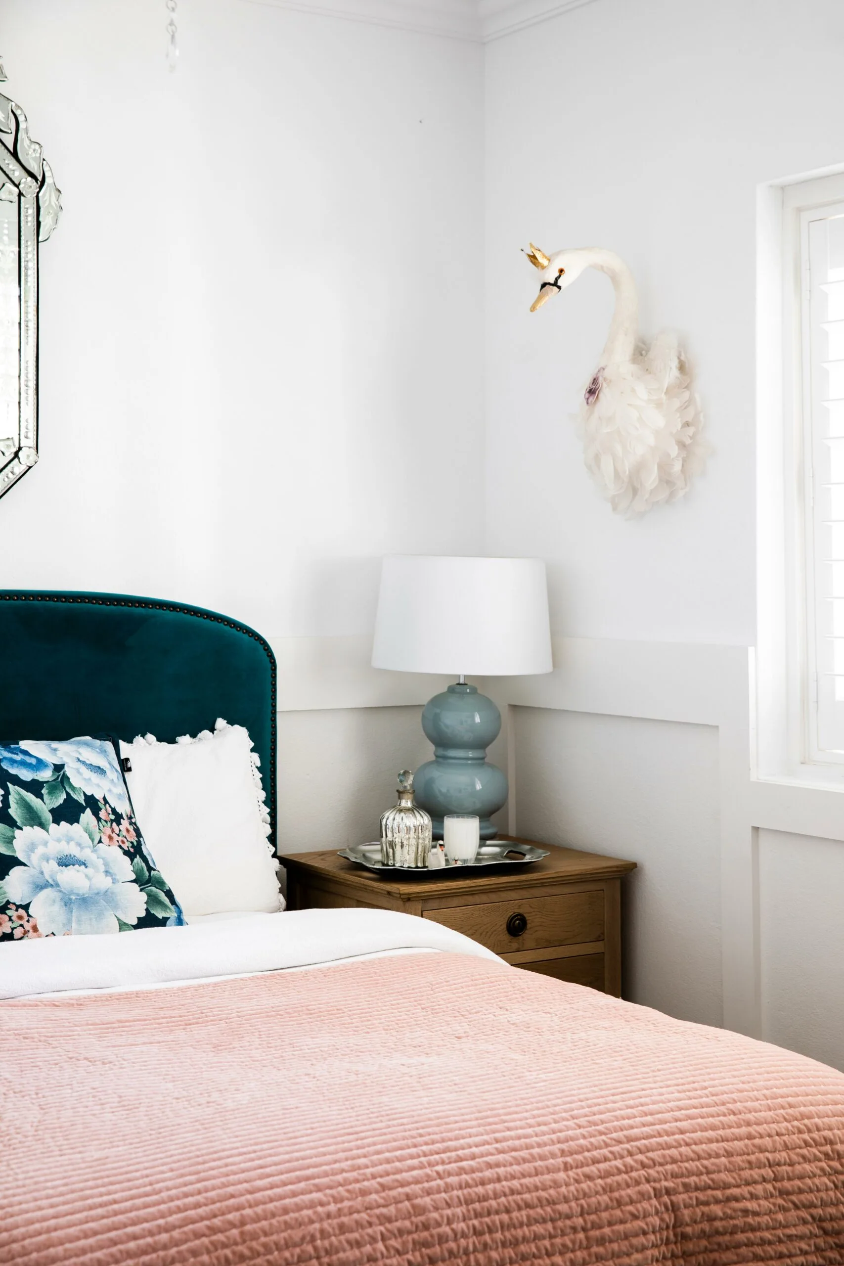
“I took the project on like a job and I would go out and visit showrooms every single day” ~ Kristie.
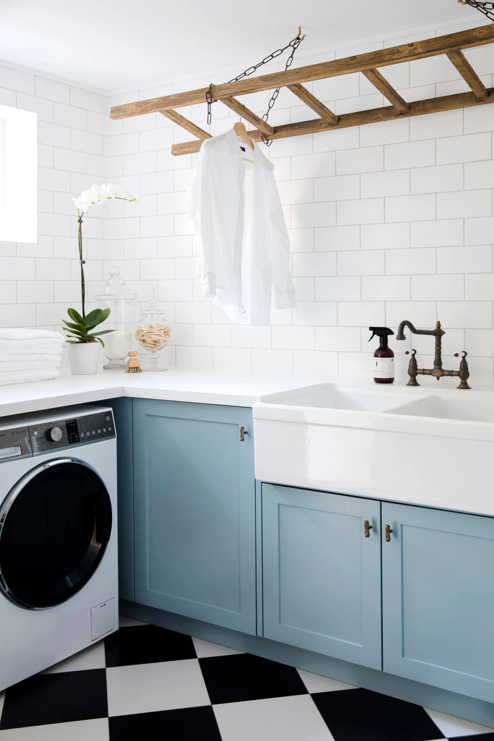
This luxurious laundry takes its colour cues from the kitchen and has a fabulously inventive accessory: a ladder from Provincial Home Living that doubles as a drying rack.
The front porch was reworked into a casual poolside dining area and is now John’s gin-and-tonic spot, says Kristie. Kristie sourced all the exterior lights from Pottery Barn in the US, and had them shipped over.
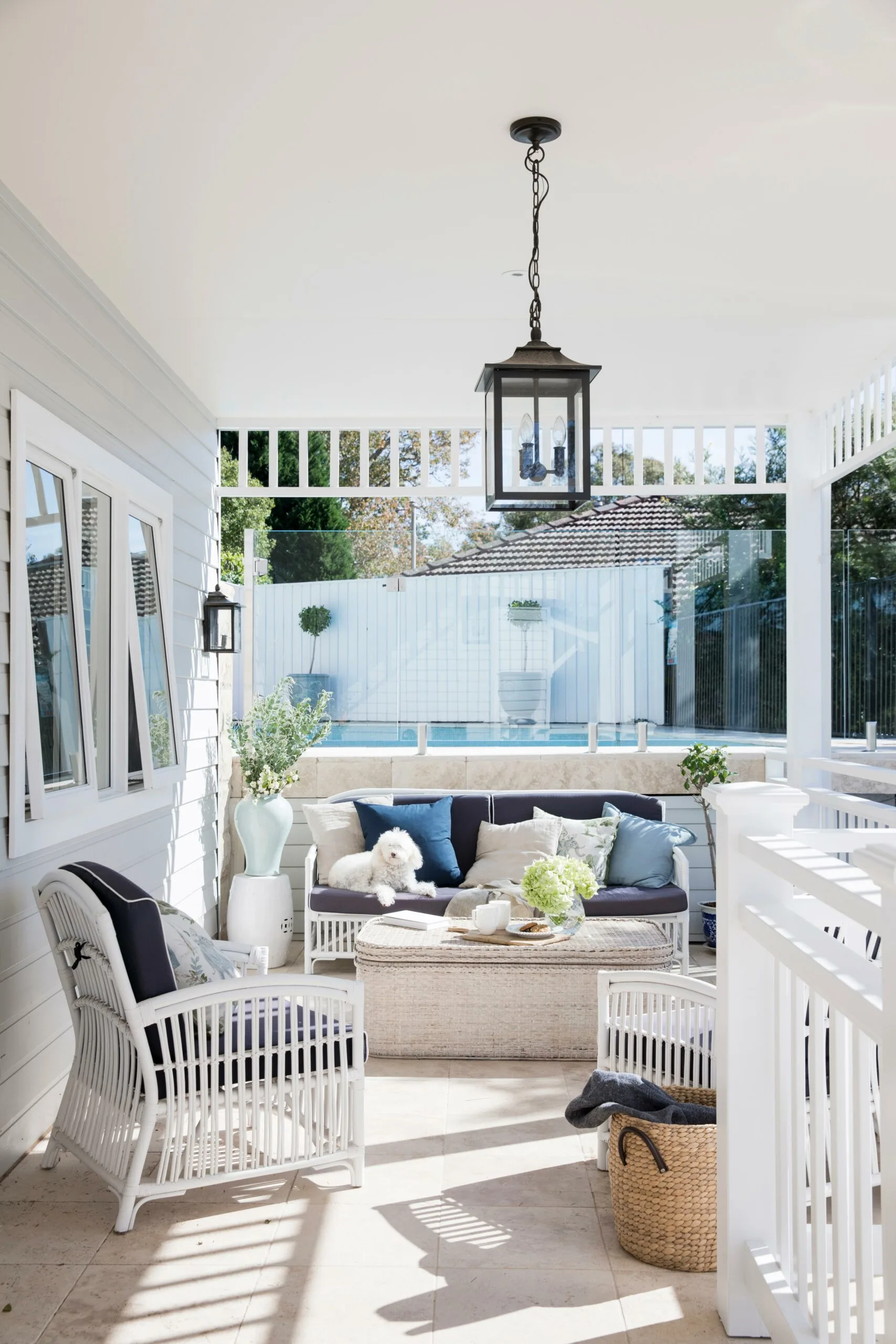
OUTDOOR DINING Lilli, the miniature labradoodle enjoys the view over a coffee table from Alfresco Emporium that doubles as a storage basket. “It’s great for storing outdoor cushions and the kids’ goggles and pool paraphernalia,” Kristie says. The classic sofa and armchairs from Decor Etc (bought through Coral Coast Living) are an elegant match to the furniture choices inside.
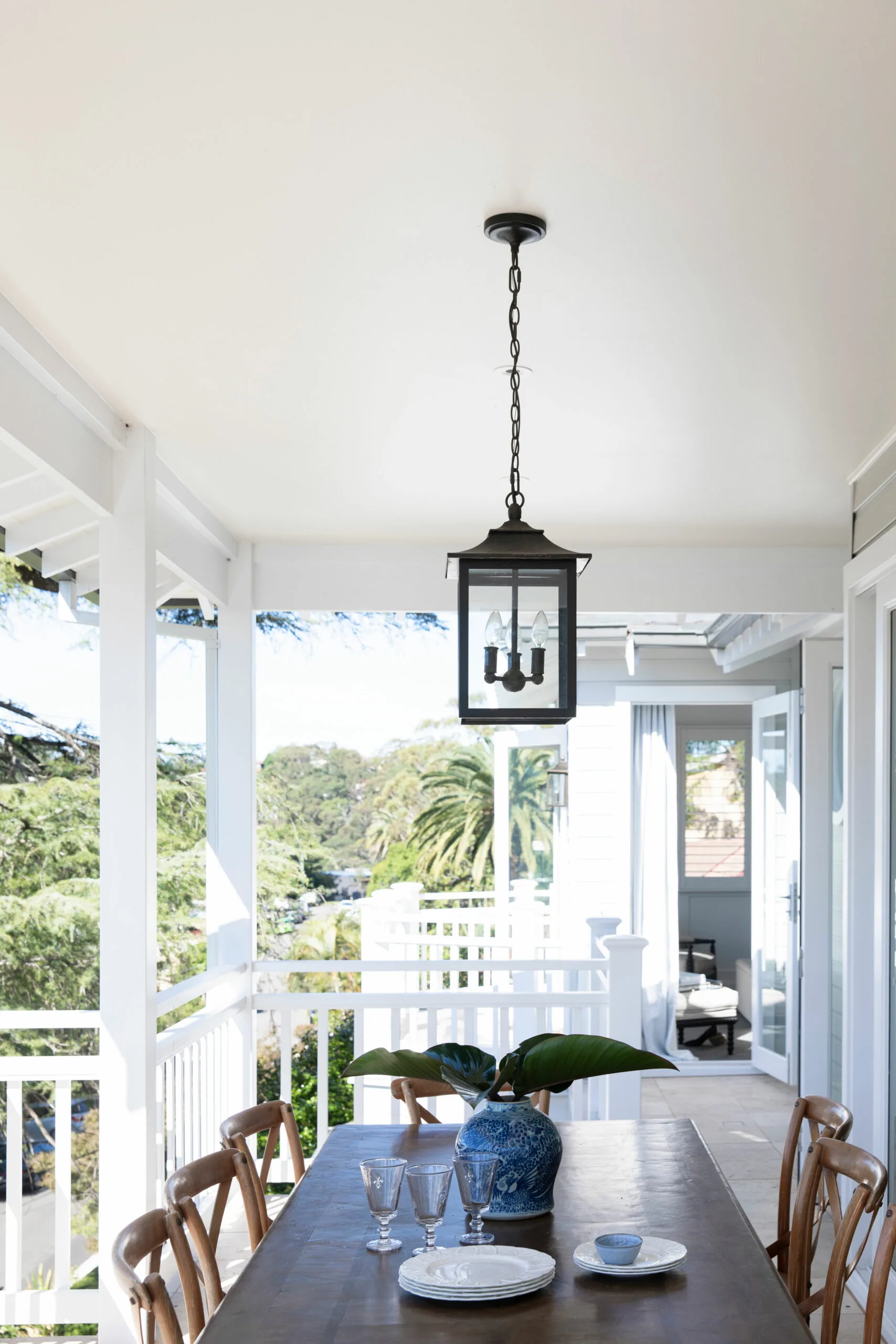
The outdoor dining space on the upper level captures the afternoon light when entertaining.
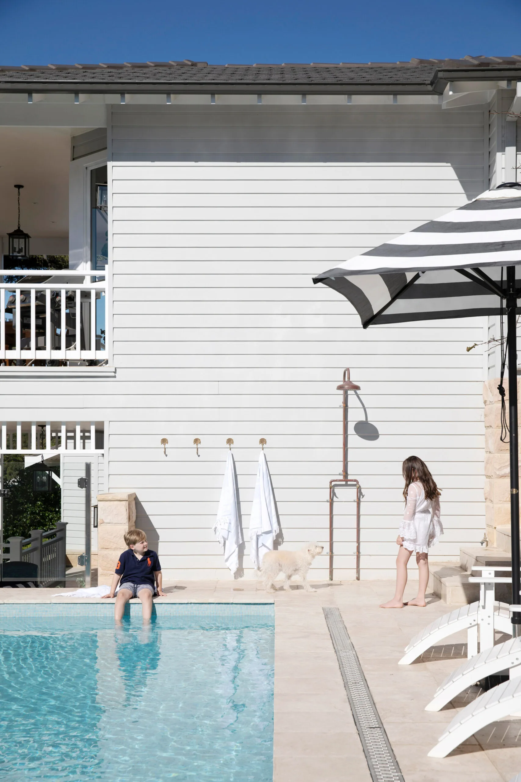
The renovated pool features travertine tiles and glass mosaics from Amber Tiles.
SOURCE BOOK
BUILDING & DESIGNER Cape Cod Australia, capecod.com.au.
COLOUR CONSULTANT Ann King, annking.com.au.
 Photographer: Chris Warnes

