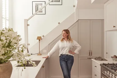
It’s official. I’ve finally finished my renovation. Amazingly, the build only took six months, but we started planning it a couple of years ago so it feels a long time in the making. After nearly 20 years as an interior design journalist, and with some cosmetic renovations under my belt, I thought I was well equipped for ripping off three quarters of my Victorian worker’s cottage and rebuilding a home that was tailored to me and my family. But, there’s nothing like practical experience to outweigh booksmarts and there were things I learnt along the way.
Connect with trusted tradies. Receive instant quotes for your next job with hipages.

Many people don’t realise, before choosing a builder, you’ll spend tens of thousands of dollars on reports for your DA – excluding any architect or designer fees! I live in a heritage area, so our designers at Sydesign engaged a town planner to prepare extra documentation to ensure our plans got approved quickly, which they did. It was money well spent.

“I love how the charcoal awnings feel a bit European and add drama to the exterior”
Elle, HB editor & homeowner
How to keep your renovation on budget
The most important thing is to choose the right builder. I worked with Nic Ryan and Tim Davis from Rise Architectural Builders. I’d seen their work and we had several meetings before even signing a contract, so I felt completely comfortable handing my house keys over to them. Our renovation was completed on budget and two months ahead of schedule, and though we were lucky not to uncover any nasty surprises in our 125-year-old house, there were other contributing factors:
1. Be honest about your budget
At the beginning, our builder Nic went though the costs with me item by item so I knew exactly where our money was going and what contingencies might look like. I was clear with our budget so he knew what he had to work with. For example, when it came to choosing the roof, I showed Nic what I wanted, he smiled and said “you can’t afford that,” but then he showed me some beautiful options within my budget.
2. Select your PC items at the start
I chose prime cost (PC) items and most of what I wanted, from floorboards to tapware, before engaging our builder. After the “what can I afford?” discussion, this meant he could order everything so it arrived on schedule. Delays cost time and money!
3. Buy locally made and stocked
We renovated just after the Covid lockdowns when it was hard to get a lot of materials. For that reason, we chose products that were either manufactured in Australia or in stock at local warehouses. For example, our doors and windows were made locally by Jeld-Wen, and our external awnings by Wynstan. This meant lead times of weeks rather than months.
4. Light wisely
At the framing stage, I had a meeting on-site with the electrician where we discussed the lighting plan. I rarely use overhead lights, so we limited those to a few key areas and put in small downlights on gimbal so we can angle them towards artworks. Instead, we focused on some beautiful pendants and wall sconces from The Montauk Lighting Co to add ambience.

As in the bathroom, I’ve used an oversized wall mirror in the dining area to reflect the light and greenery in the courtyard it faces. It’s a wonderful way to add depth, movement and light to a tight space that would otherwise feel flat. The key is to go for a massive mirror so you don’t even notice it’s there, it just looks like an extension of the room. But be warned, large mirrors need to be considered at the
structural framing stage because they’re heavy!
How to plan storage in your renovation
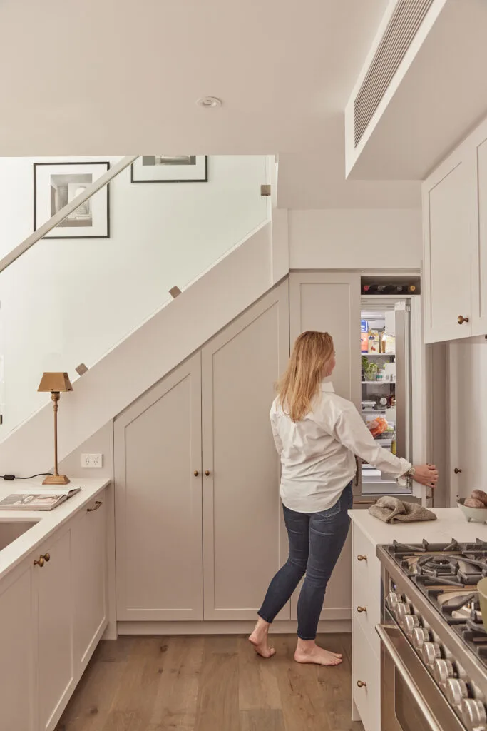
My kitchen isn’t a big one, but people are often surprised to discover how much storage there is behind all the joinery. And it’s no coincidence. I measured the height of cans, jars and baskets, as well as glasses, stacks of plates and small appliances, then designed the space to fit everything in. For example, instead of having three drawers each 200 millimetres high, I went with 150, 200 and 250 millimetres to fit all my pantry items, from tinned tomatoes to flour canisters. I also used a couple of other clever hacks: children’s wall-mounted book shelves (try Etsy or Ikea) make the perfect condiment racks mounted inside my pantry doors, and they look chic. And, for overhead cupboards, typically they come with only one shelf, so get an extra one put in so you can fit tumblers in the middle and wineglasses on the top and bottom. Most cupboards come with bracket holes, so this is an easy retrofit for an existing kitchen, too.
How to tailor your kitchen to your needs
Start with the appliances
They will dictate how your kitchen is laid out. It’s been a dream of mine to have a big Ilve cooker – it’s the reason we renovated the whole house! (We had to knock out walls to redesign the kitchen and one thing led to another.) But being exposed to so many options, I wasn’t sure which brands to go with for the rest of the fit-out. Thankfully, the product experts at Winning Appliances gave me guidance.
I took my floor plans into their showroom and met with one of the team. He asked me questions like ‘how many people live in the house, what do we like to cook, and do we entertain?’ Along with my budget and the measurements from my plans, these questions helped narrow down which appliances would be perfect for me. What’s great is anyone can go in store to get this advice. Mixing and matching is the ultimate way to create a kitchen tailored to your lifestyle. And, in case you’re interested, I chose an integrated Fisher & Paykel French-door fridge and freezer, integrated V-Zug dishwasher and a Whispair
extractor fan, which is so quiet I sometimes forget to turn it off.
Choose materials realistically
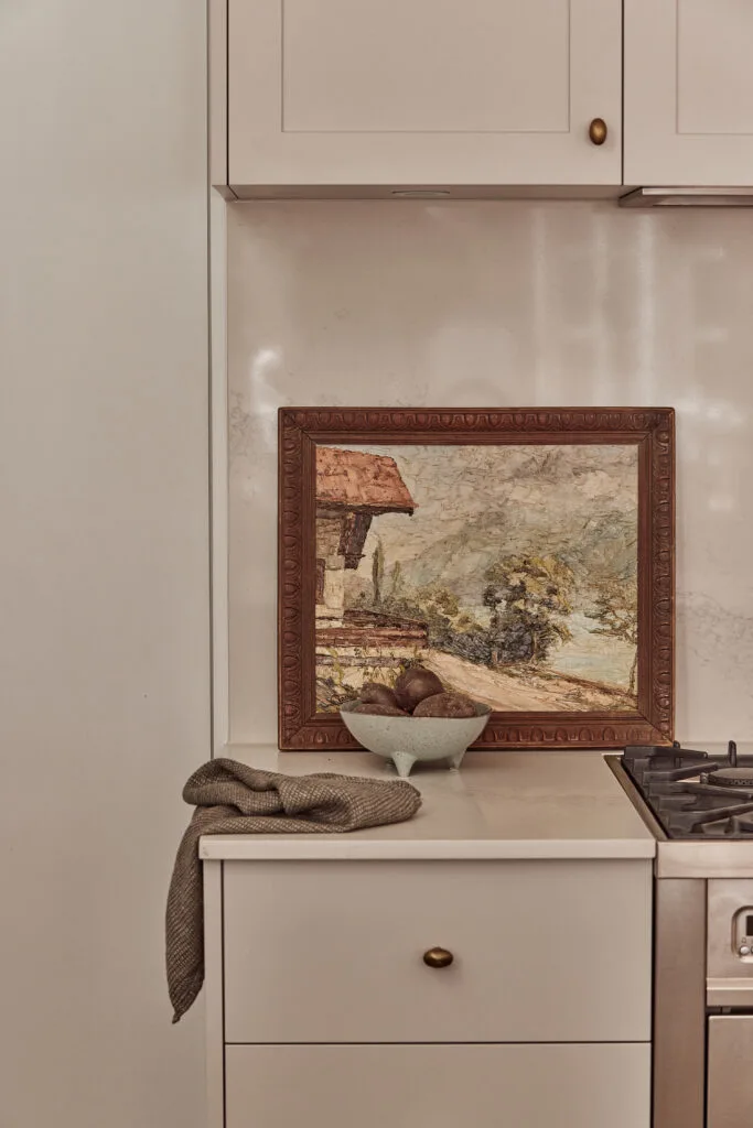
I love the look of natural stone, but in reality, I also love tea, red wine and curry. Plus, I’m a messy cook. So I chose a Caesarstone benchtop and splashback in ‘Calacatta Nuvo’, which is much more forgiving
and easy to maintain than marble. I did learn, however, that if you have your heart set on marble but you, too, are a messy cook, you can get what’s known as a ‘bulletproof’ finish on the stone, but it’s pricey at about $1000 per square metre. Speaking of withstanding the knocks of daily life, my joiner recommended we take the stone down the side of the kitchen in a waterfall design since it faces a high-traffic hallway.
It wasn’t what I originally envisaged, but now I love it – and with a toddler in the house, it has certainly paid off!
“The oven is the reason we renovated the whole house”
Elle
Living room
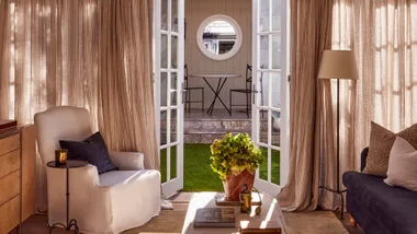
Being a Victorian-era worker’s cottage, our home doesn’t have any expansive views, so I sought to create ‘moments’ that would draw the eye throughout each space. For example, we kept a courtyard next to our dining area, which bounces natural light into the centre of the home and provides a spot of green. Beyond the living room is our small but perfectly formed backyard and greenhouse. We chose artificial grass installed by Aarons Outdoor to ensure a year-round green view. The bi-fold doors frame the dining setting from Yardware, another elegant vignette.
How to maximise space in a small living room
When working with a small footprint, one way to make a room feel larger is to play with height. We demolished the rear of our house so we were able to raise the roof height. Floor-to-ceiling linen curtains from Tuiss further enhance this trick of the eye. Another idea is to install tall skirting boards, like the heritage style we chose from Intrim Mouldings. You can do the same thing with modern profiles, too.


Main bedroom
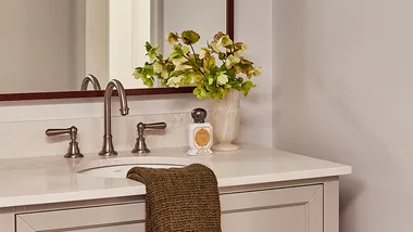
In the bedrooms and bathrooms, I wanted to see if I could create a bespoke look using off-the-shelf products – namely, the joinery. In the bathrooms, I chose vanities from Vanity By Design, which you can have custom-coloured. In the bedrooms, the wardrobes and daybed surround are made from Kaboodle Kitchen’s pantries. We use them all the time in our Home Beautiful photo shoots, so I knew the quality was great and loved that they have a paint-your-own option, since I wanted the joinery to be the same colour as the walls.
My builders integrated them under a bulkhead and up on a plinth so I could wrap the skirting boards around the room. People are surprised they’re from Bunnings!

“I chose a calm colour palette for my home, instad playing with texture in my surface and furnishing choices.”
Elle

Bathroom

In the bathroom, a Caroma ‘Liano’ bath sits against a backdrop of Carrara slim chevron mosaics and ‘Elegante’ terrazzo tiles in Nimbus from National Tiles. A Cabinet Maker’s picture light in Antique Nickel
from The Montauk Lighting Co lights up a custom mirror and Neu England tapware in Brushed Nickel from Brodware. (Photography: Alana Landsberry / Styling: Corina Koch)

Follow the line I designed our main bathroom to follow a grid, which is a wonderful way to visually enlarge a room. For example, the wall mirror is in line with the Caroma ‘Liano’ bath below and the beautiful marble chevron tiles from National Tiles surrounding it. However, this room wasn’t easy. Despite my floorplans, it wasn’t until the room was framed up that the builders pointed out the bath and vanity I’d chosen were too big. We simply went down a size for each, which gave the room more breathing space, making it look larger.

Son’s bedroom
I ummed and ahhed about how to decorate my son’s bedroom. He’s two, but I don’t want to have to redecorate every couple of years so I – controversially – went for quite a grown-up scheme. His bedroom, along with the guest bedroom downstairs, is dark for most of the day so I chose a muddy grey wall paint that feels calming and cocooning. No amount of white paint will make these rooms feel brighter! It actually has the opposite effect, making them look stark. Accents of burnt orange and olive green bring richness, and timber and wicker pieces add more warmth.


Courtyard renovation ideas
1. Rework what you have
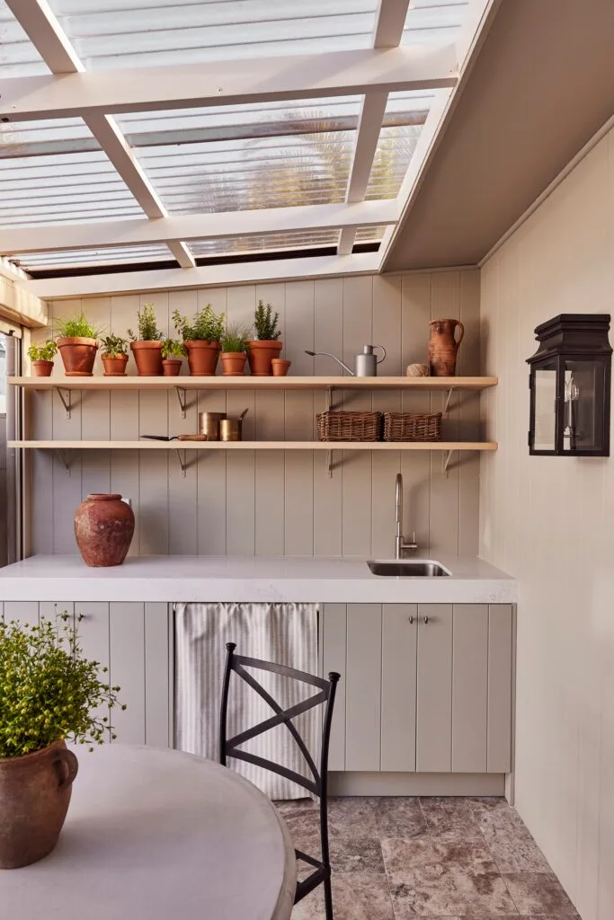
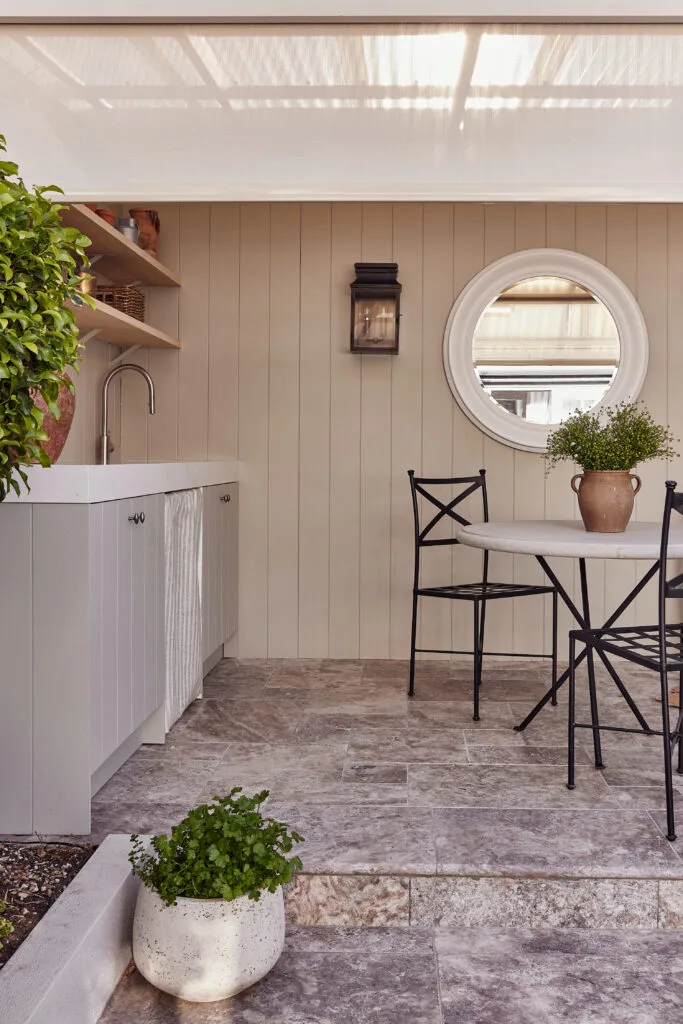
When we bought the house it had a charming cabana complete with outdoor kitchen in the backyard, but we never used it. It was going to cost too much to remove the structure, so we repurposed it instead. Now, the space functions as a greenhouse, dining area, storage shed and laundry. All beautifully styled, of course!
2. Update with exterior cladding
After stripping everything out of the cabana the walls looked a bit shabby, so as a simple fix we clad them in EasyVJ150 panels from Easycraft. I loved the look so much I had all the joinery (again, more Kaboodle Kitchen units) clad in the same panels and painted the lot in the soft Porter’s Paints French Green for a cohesive finish.
3. Hide ugly tiles with new pavers
The great cover up The tiles from the cabana were in good condition, but didn’t suit the new aesthetic, so we laid beautiful travertine pavers in Oyster Grey from National Tiles over the top. They patina beautifully so they’ll age well.
4. Herb garden awning
I’d always wanted to grow my own herbs and veg but we have possums in our neighbourhood and they eat everything. So, to make sure they don’t get into the greenhouse, we had a Zip Style awning from Wynstan installed on the open side. We opted for the fabric Nougat 508 with hardware in Paper Bark and it’s absolutely brilliant – you can see through it, and it lets the airflow in for the plants, but keeps the wildlife out. Not to mention the mosquitos if we’re dining alfresco.
5. Exterior lighting
The greenhouse is an extension of our home, so I wanted the lighting to be beautiful. We chose a gorgeous pair of bronze outdoor sconces by Diane Bergeron from The Montauk Lighting Co. I love supporting Australian design.
6. Exterior awning
I’ve always loved the classic look of awnings over restaurants in the high streets of European and British towns and cities, so I used this as a reference when designing the exterior of my house. I showed the team at Wynstan what I had in mind and they recommended their Pivot Arm awnings. They give you fabric samples so you can colour match to the rest of your exterior finishes – we chose
Monument 542 to complement our render in Dulux Colorbond Dune. Plus, they’re made in Australia so the process is quick and easy. And having just experienced some very hot days here in Sydney, they sure keep the heat inside to a minimum, too!
Architect: Rise Architectural Builders, riseab.com.au
Awnings: Wynstan, wynstan.com.au
SOURCE BOOK
