Colour authority Pantone has revealed what colour stories will be popular in 2018. According to their forecaster, Lee Eisman, we should expect to see a fresh, new take on colour schemes. Hues will be mixed in novel combinations, there will be new directions and we will see a move away from a traditional way of colour thinking.
Lee Eisman, colour expert and consultant at the Pantone Color Institute, recently detailed Pantone’s eight new colour palettes at the International Home + Housewares show in downtown Chicago. They are:
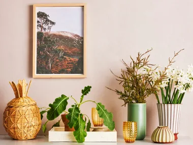
Verdure: This will see a new take on the continuing quest for the perfect green. Other tones include berry-infused purples and eggshell blue.
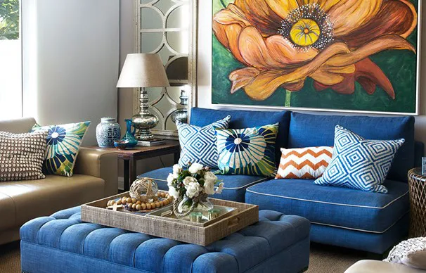
Resourceful: This palette will explore the clever reuse of material and complementary colours on the colour wheel, such as blues and oranges. It’s about striking warm and cool tones that capture the eye. There will be variations of orange (such as apricot and melon) and blues; everything from dazzling to dark and some neutrals too.
Playful: This will be “out of the ordinary, quirky, different,” says Lee. There is a strong yellow-green presence in this palette story, such as the Pantone Minion Yellow.
Discretion: Here, a strong focus will be on subtle blends, subtle harmonies and texture. “Pink has really taken hold in interior design”, Lee says, so expect to see variations of pinks and lavenders coming through.
Intensity: An eclectic mix of colours designed to evoke a sense of strength, power and sophistication. Think punches of colour, such as Pantone Bossa Nova, as well as black and gold-orange hues.
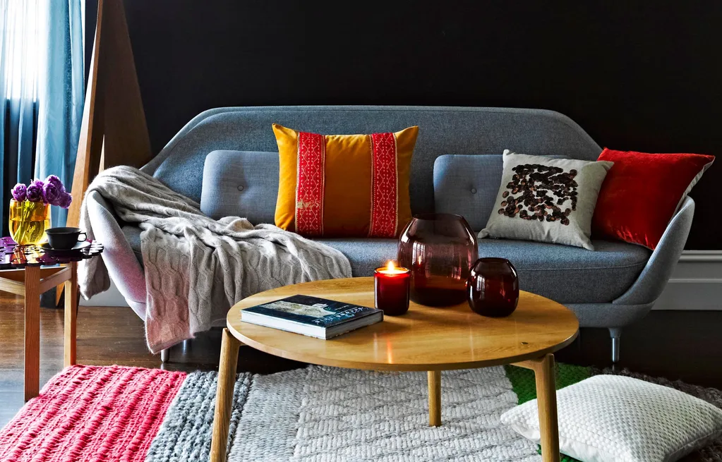
Far-fetched: A multi-cultural scheme with a mix of earthy tones and rosy tones. “The rosy tones have a way of amplifying the earthy tones and giving it a distinctively new look,” Pantone’s Lee explains.
Intricacy: A palette focused on metallics, which Lee debuts as the new neutrals, and texture. There will be a range of gilded beiges, silvers and rich golds in addition to the yellow-green tones, such as sulphuric yellows, and reds to add punch.
TECH-nique: Speaks to a glimmery palette, such as bright turquoise, pink and purple, with a nod to technology.
Have you seen Pantone’s Autumn 2017 colour scheme? Take a peek at what’s trending now.
 Brigid Arnott
