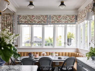
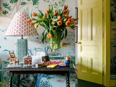
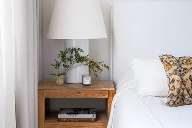
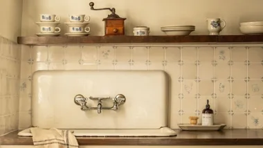
We’ve often speculated on the psychology of colour and how it affects our moods. Red for fiery temperament, orange to stimulate joyful conversation and soft blue to calm things down. Now in a world first, venerable paint brand Taubmans has gone the extra mile to conduct a study to assess the impact of colour on a range of emotions.
In consultation with The Florey Institute of Neuroscience and Mental Health in Melbourne, using virtual reality (VR) technology, the Taubmans Colour Emotion Study is the largest study of its kind to date and has discovered the top colours that cause a range of emotions within several real-life environments.
Australian Virtual Reality company, Liminal VR, and a team of psychologists and neuroscientists worked with Taubmans and 745 participants using the latest VR headsets to create three-dimensional immersive experiences to best capture emotional responses to a range of Taubmans colours in living rooms, waiting rooms and blank space environments.
“Colour is important. Yet how we perceive colour and attribute meaning to it can vary between individuals and between cultures,” says Professor Julie Bernahrdt. “Until now, we understood little about how we perceive colour and which ones the brain processes easier. There are many assumptions about how different colours effect our mood, however very few of these are underpinned by strong science.”
“We all instinctively know that the colours in our homes affect our moods,” says Taubmans Tim Welsh. “Now, Taubmans has research that scientifically proves that painting your walls in different colours can bring out a whole a range of emotions.”
For the study, each participant was given a Google Daydream virtual reality headset and controller where they submitted their responses to five Taubmans colours across three room types.
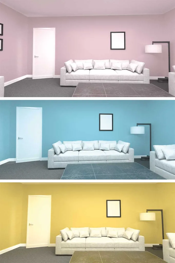
Candidates were required to rate each colour by indicating how they felt selecting one of eight options ranging from excited and cheerful to irritated or tense.
“The right colours will make you feel relaxed and calm, or cheerful and excited, yet pick the wrong colour scheme, and your walls risk making you feel bored, sad, tense and, worst of all, irritated,” Tim continues. “We plan to use the Taubmans Colour Emotion Study to help our customers pick the right Taubmans colours to enhance Australian homes, lifestyles and moods.”
What colours help you relax in your living room?
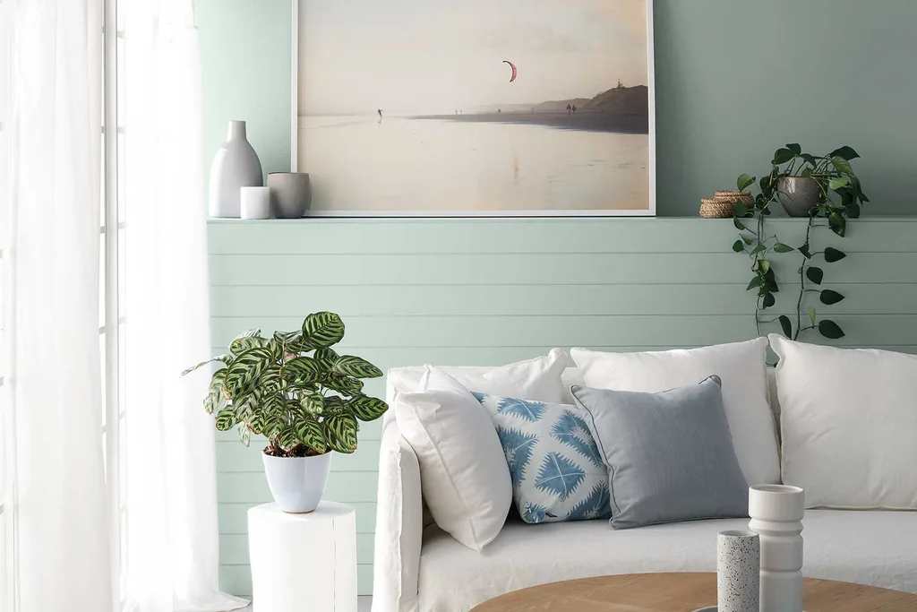
“As the place where we spend time with our families, clients often want to living rooms to have relaxed or calm atmospheres,” says interior designer and colour consultant Grace Garrett. “It’s no surprise that softer pastel tones are universally seen to foster these emotions, especially given our coastally skewed population.”
Over 41% of participants voted Taubmans Seagull, a soft grey-green colour, the most relaxing, closely followed by Taubmans Faded Lilac and Taubmans Padre Blue*.
Other findings showed participants chosing the gentle eggshell tone, Taubmans Morning Fog as the most calming shade, followed by Dawn Break and Candy Cream.
What shades give you energy?
The study showed that yellows, oranges and the occasional pinks were proved to be the most likely to make us feel excited and cheerful and the most exciting colours, were found to be daring tones like In The Pink or a rich orange such as Orange Embers.
“Use these colours sparingly, and consider smaller spaces, painted shapes or feature walls as well as looking beyond the living room.”
Grace Garrett, Interior designer and colour consultant
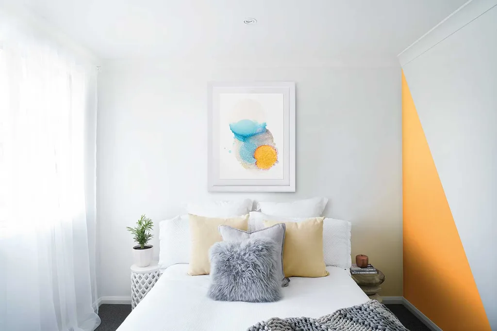
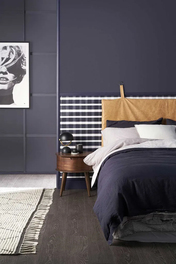
With a trend towards darker colours continuing in interiors – including Taubmans 2018 Colour of the Year, Black Flame rather than painting a whole room, Grace suggests using these bold tones as accents in doors, feature walls or for intimate spaces as they can make certain people feel a little sad.
“Using darker colours can make a room appear smaller.”
Grace Garrett
“Partnerships between science and industries such as Taubmans paints and Liminal VR are exciting and show that together we can do more to discover knowledge that can help us make evidence-informed decisions about colour in a multitude of settings,” concludes Professor Bernhardt.
*The statistics included in this story are from the prelimary findings and the final report will be issued by The Florey Institute in late 2018.
You might also like:
Colour crush: Mint and marble with a touch of black

