 Photography: Alana Landsberry & Nic Gossage / Styling: Lucy Gough & Corina Koch
As Home Beautiful looks ahead to the interior design trends for 2024, there are four major ones we can see taking over our hearts and homes. One of them is the romantically-named Pearl. The trend embraces calming tones and delicate details with a touch of iridescent luxe.
Brought to you by Luxaflex and CSR.
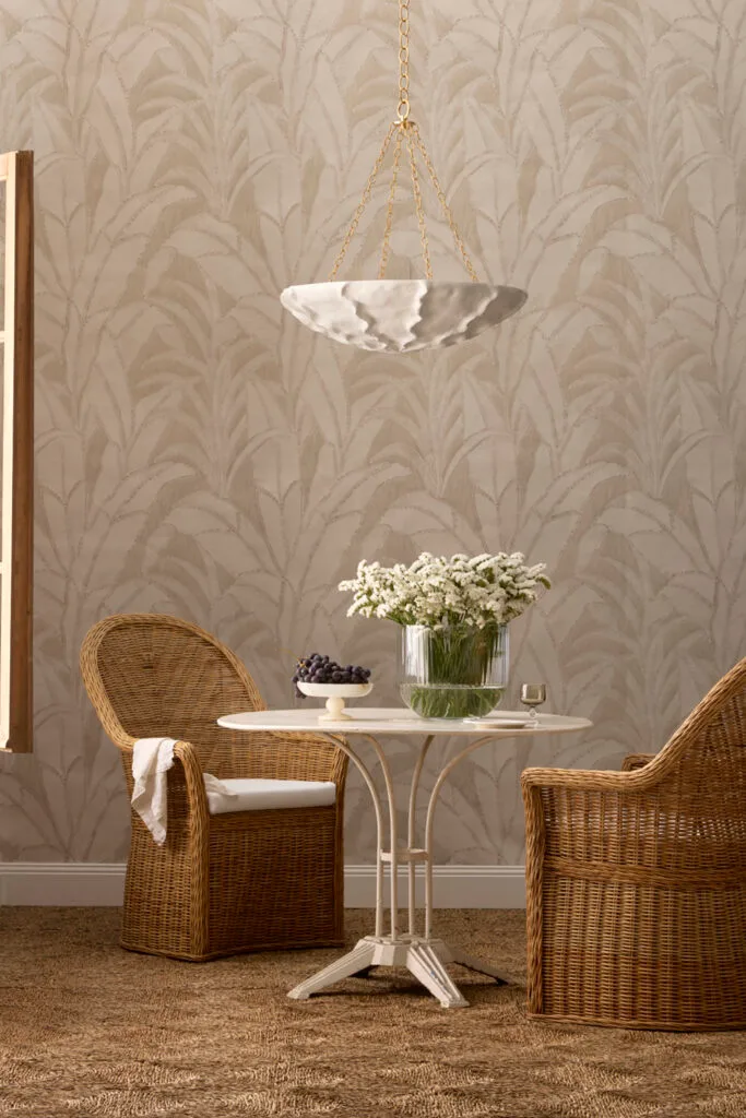
Interior design trend 2024: Pearl
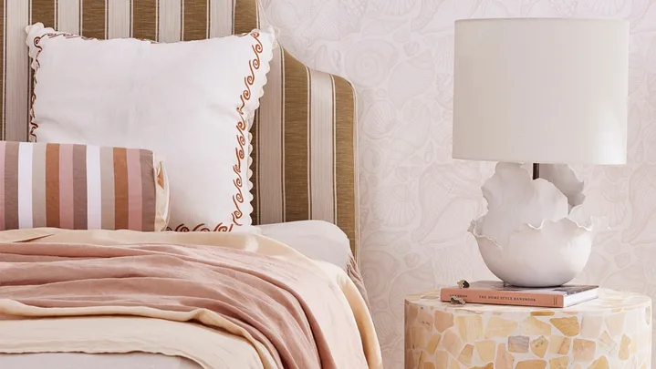
There’s a certain comfort to be found in coming home to a serene interior after a long day. Collapsing into luxuriously soft furnishings provides instant relaxation while light and breezy colours give a gentle resting place for the eyes. This is what pearl feels like… a deep, soothing breath, the tide washing over your feet.
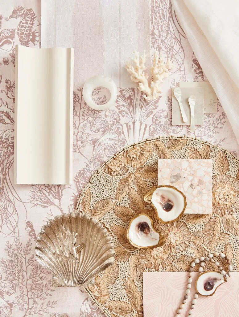
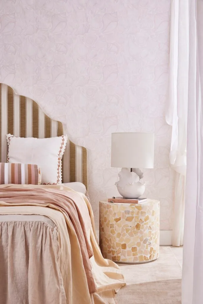
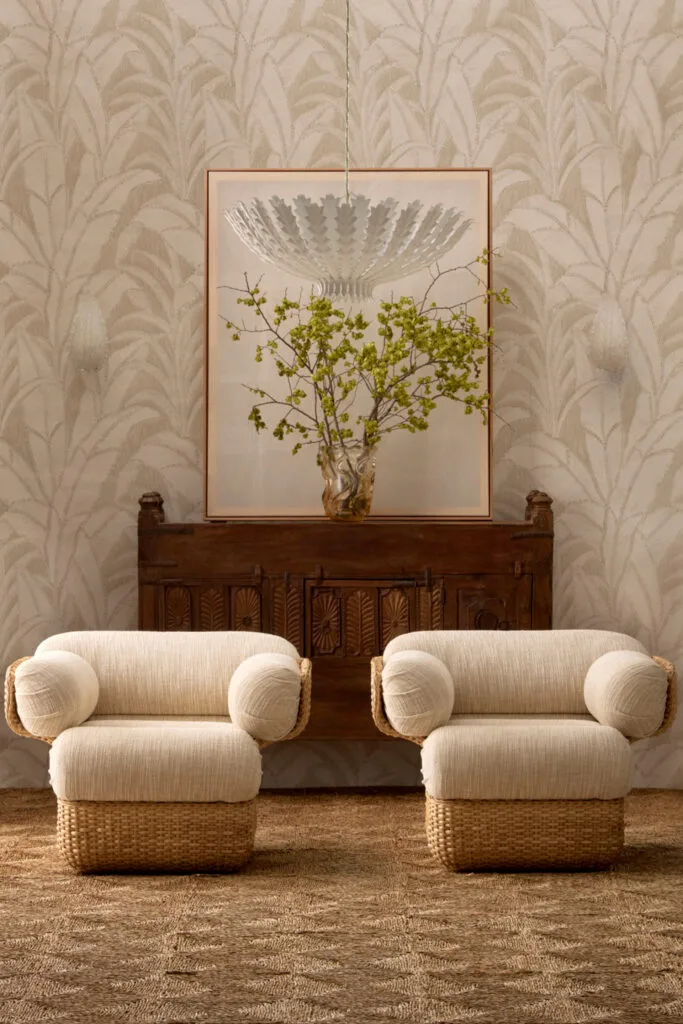
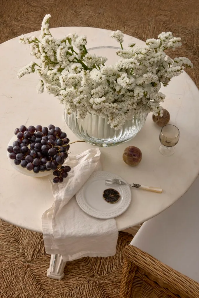
Pearl is demure, filled with neutrals, iridescent finishes and just a hint of blush. This light and airy palette is then anchored with pared-back vintage pieces and tactile surfaces such as wicker, sea grass and stone, introducing interest, personality and depth. And don’t forget the opalescent accents and smooth shapes, reminiscent of the watery jewels the style is named after.
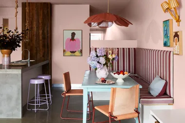
Textiles and soft furnishings, like bedlinen, cushions, upholstery and window dressings are an excellent way to incorporate this style in your home.
“Embracing delicate and traditionally feminine colours or patterns is a good way to introduce colour, texture and an element of interest to a room,” says Vera Meharg, group marketing executive at Luxaflex Window Fashions.
“People often shy away from printed curtains but selecting one that has a neutral base with hints or accents is a good starting point to venture into that space. Otherwise, a soft, solid colour such as a delicate pink can work.”
For other fabrics, think about a combination of materials such as linen, silk, cotton and wool, which all reflect light differently.
“Sea grass squares warm the light space.”
Corina Koch, stylist
When working with neutrals and softer shades, you need to consider creating more of a lived-in appeal. “You don’t want it to feel too contrived or stark white,” warns Corina Koch, stylist. “It has to be natural, inviting and warm.”
A good way to achieve this is to start small. You could collect a vintage Murano glass vase or mother of pearl cutlery for those opalescent colours then pair these items with a textured piece, such as a rug or soft furnishing. Another alternative could be an antique. “Pearl is light and breezy but it needs to be paired with texture for warmth,” adds Corina.
Styling tips
Include texture: When working with light and neutral tones, it’s important to anchor the space with textured details, such as woven rugs and furniture.
Add feminine touches: Small accents of glossy, shiny or iridescent materials can really enhance the feminine feel.
Explore more trends from the Home Beautiful 2024 Style Forecast
Shop the Pearl interior design trend
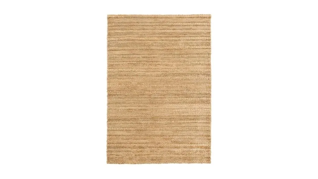
01
Eboni Chunky Braided Jute and Cotton Rug, Miss Amara
$1199
For feel-good texture underfoot.
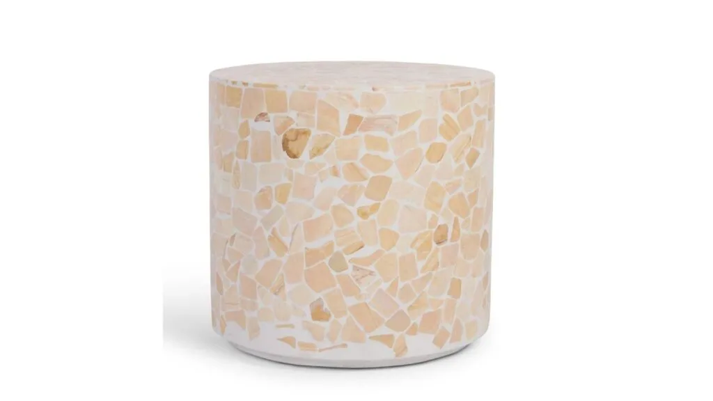
02
Mass Side Table, Freedom
$549
The kind of side table we’d revolve a room around.
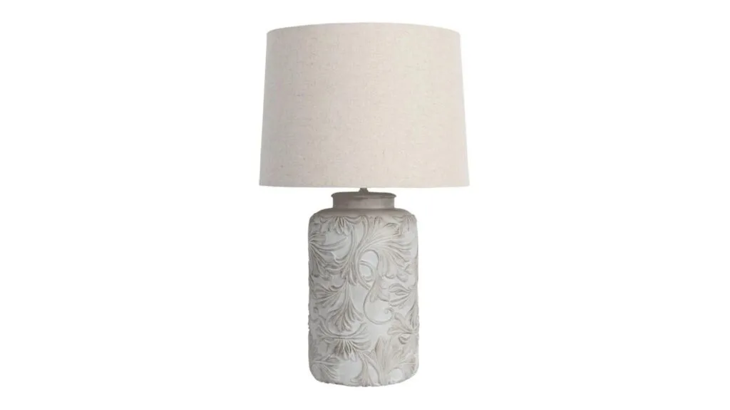
03
Oriel Lighting Andorra Table Lamp, Myer
$197
Exactly the lamp we need to nail this hyper-feminine look.
04
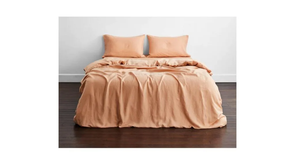
Terracotta 100% French Flax Linen Bedding Set, Bed Threads
$250
A bed linen update we’re peachy keen on.
05
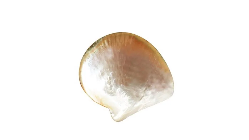
Caviar Collection Mother of Pearl Plate, David Jones
$29.95
How else would you serve caviar?