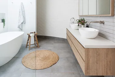
Kit kat or finger tiles may be the smaller cousin of subway tiles, but what they lack in size they make up in versatility, adding colour and texture while being water-resistant and durable – perfect for kitchens and bathrooms. Like the subway tile, kit kat tiles are a timeless trend with a slim design perfect for small spaces and large spaces alike, fitting into almost every style.
Here are seven gorgeous homes that show how best to use kit kat tiles in kitchens and bathrooms.
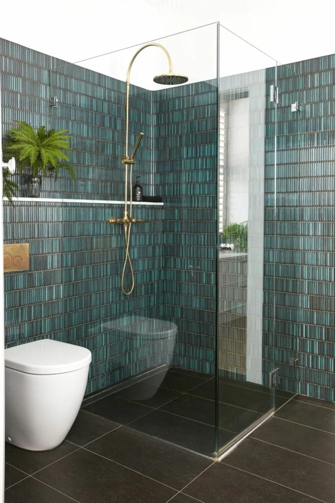
1. 1920s bungalow bathroom walls
When the owners of this 1920s bungalow on the Northern Beaches decided to renovate, it was a matter of blending old and new with a revamp incorporating its Art Deco features with modern functionality for the young family. Particularly in the bathroom, a swathe of emerald kit kat tiles makes for a handsome feature wall paired with chrome hardware, keeping a sense of 1920s elegance.
“I wanted Hollywood and specified these taps in chrome,” says the interior designer, Alanna. “I love old-style tapware in modern finishes.”
2. Art Deco kitchen island bench
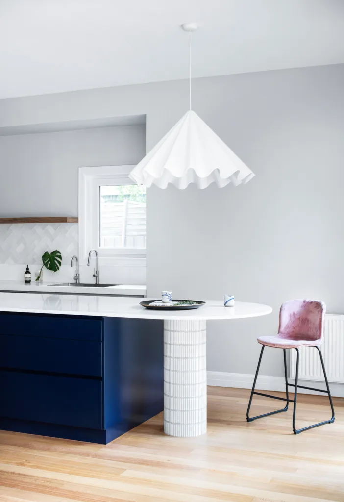
Texture was crucial to the renovation of this Art Deco home in Melbourne. Before, the kitchen had an awkward layout with a bulky island hindering access that transformed into a U-shaped design with a curved navy island topped with smooth quartz. While the island adds a bold pop of colour referencing its Art Deco past, white kit kat tiles wrap around the support column for a subtle but dramatic finish.
“I loved the idea of creating an interesting space using multiple textures, such as stone, timber and tiles, as well as smooth finishes,” says the owner, Christine.
Kit kat tiles are the perfect accent for small spaces and are available in sheets that can be trimmed down with a tile cutter so you can use them almost anywhere.
3. Minimalist bathroom feature wall
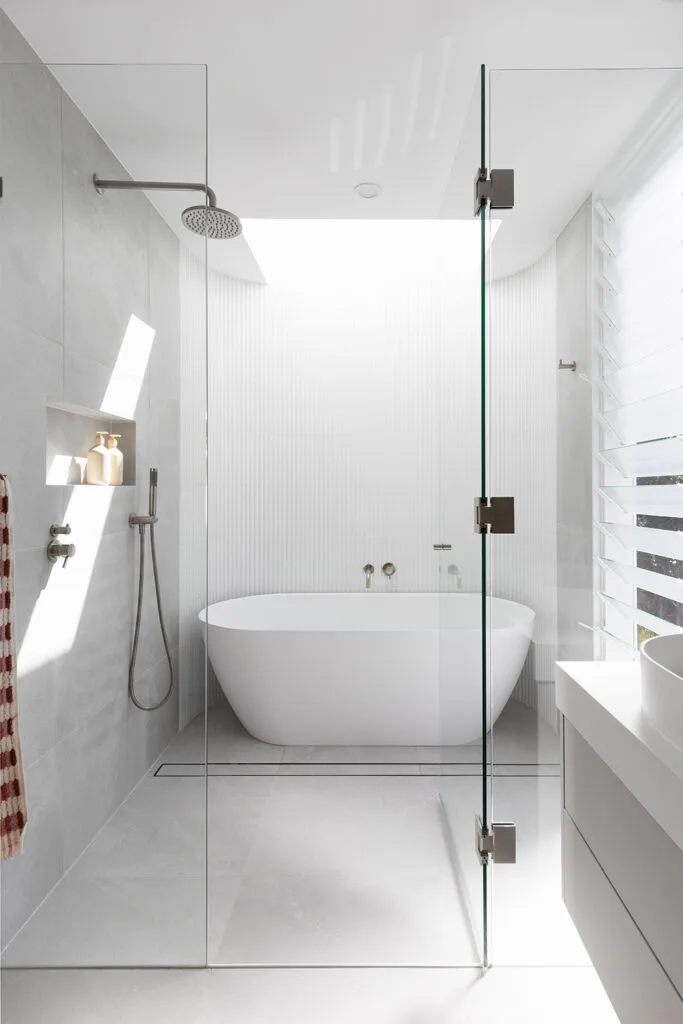
For this post-war Brisbane home, a complete rebuild was in order to create a low-maintenance contemporary style that fit the family of four.
“We designed the home so it had a relaxing modern vibe, centred around lifestyle – so weekends are spent enjoying it rather than maintaining it,” says owner Christal.
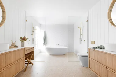
This included influences from Scandi minimalism and modern Mediterranean styles that prioritise light and functionality. In the main family bathroom, an all-white colour scheme with thin fluted tiles ensures the bath and vanity are the hero features without overwhelming the space. At the same time, a skylight overhead drenches the bathroom in light in this modern minimalist scheme.
4. Modernised family ensuite
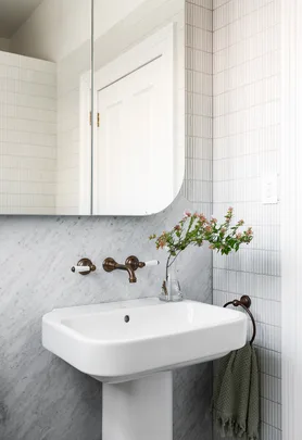
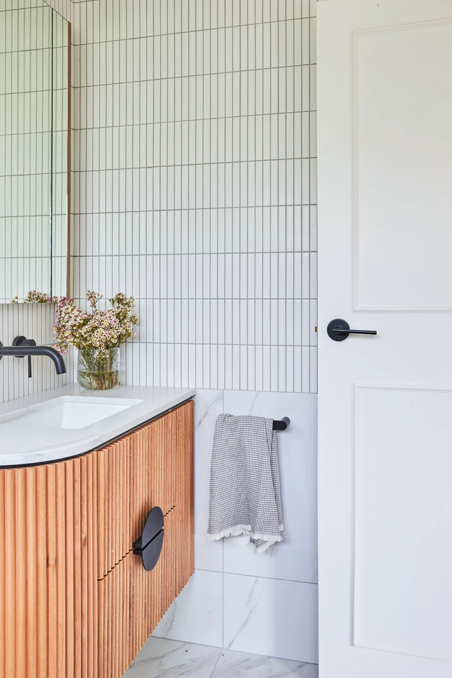
For this Federation era bungalow on Sydney’s North Shore, a renovation included an ensuite for the children with white kit kat tiles a cohesive but contrasted choice.
“Flat finger white gloss tiles frame the vanity and break up the larger format marble-look Mamo Grigio patterned tiles used below and across the floor,” says owner Erica.
5. Tropical Hamptons ensuite
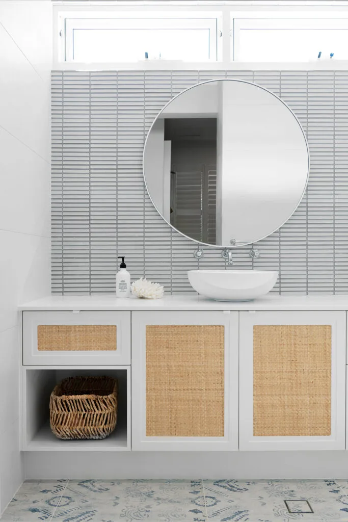
For this coastal Hamptons home in Perth, evoking a laid-back “island feel” was key to the bright colour scape that extends throughout the house and into the ensuite where white kit kat mosaic tiles are flipped horizontally to create the illusion of space. While vertical tiles create the illusion of height, small spaces can benefit from the width and depth of horizontal tile placement, especially in white colour schemes, for an uninterrupted view of the space.
As the backdrop to the ensuite mirror, the tiles have a visual but tactile presence that ties into the ‘Fusion Blue India’ floor tiles from Myaree Ceramics.
“This tile is my favourite tile ever and also features on the edge of the pool,” says owner Kristie. “All the surfaces are tactile, so it’s earthy and not clinical.”
6. Classic coastal kitchen
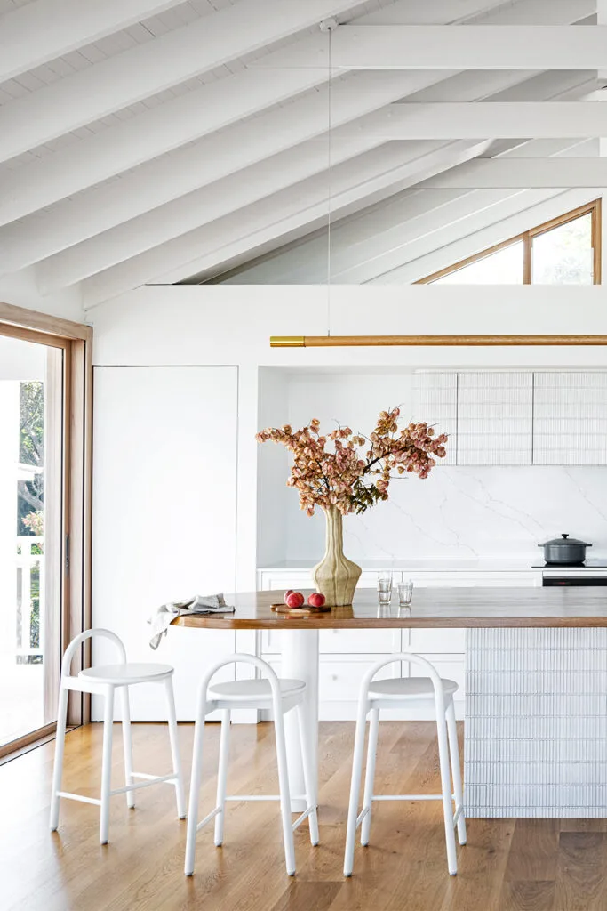
While kit kat tiles lend themselves to wet areas due to their water resistance, more and more the tiles are featuring in unlikely places, such as the kitchen cabinets in this classic coastal abode. A crisp white palette from floor to ceiling brightens the space, with white kit kat tiles on the overhead kitchen cabinetry, adding texture and depth to avoid the area feeling flat. For cohesion, the same tiles adorn the kitchen island with a timber bench top for a natural contrast.
7. All-white powder room
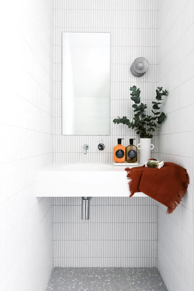
Decorating a powder room is always tricky, given the lack of square footage. Still, this contemporary duplex in Sydney used its small footprint to its advantage, using even smaller kit kat tiles to add height to the all-white powder room. The white matte ceramic tiles from Thynk Group are laid in a vertical pattern and match the rest of the home’s modern minimalist aesthetic, letting the natural landscape take front and centre.
“Being in such a beautiful part of Sydney and having a wonderful ocean outlook, we wanted to create a minimalist home that didn’t take away from the landscape,” says owner, Gamze. “Internally, our duplex feels so spacious and, with clever design and a heap of storage, we have created a great space for the kids.”
