A bathroom is one of the most expensive rooms in your house to renovate, so nailing what it takes to create a sensational sanctuary can feel slightly daunting (let’s face it, once those tiles are up there’s no going back). There’s a lot to consider: How to design a bathroom that stands the test of time? Can a shower be too big? And wallpaper. Yes or no?
Connect with trusted tradies. Receive instant quotes for your next job with hipages.

To point you in the right direction, we asked those who have designed as many bathrooms as they’ve taken showers to share their invaluable bathroom renovation ideas.
1. Size up your layout
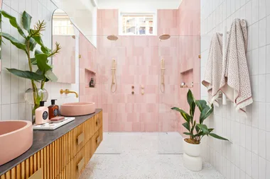
DON’T measure once, measure twice… at least! “Measure everything and mark it out with tape so you get a feel for the space,” says Mishell Wise, interior designer at Conway + Wise. “Understanding scale can be challenging, so make sure you plan your space carefully to avoid gaps and oversized or undersized fixtures.”

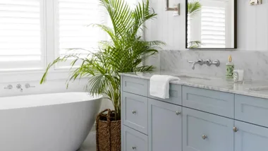
A common error, according to Ben Selke, co-director of Studio Barbara, is “creating showers that feel excessively cavernous, which can diminish the room’s appeal.” Another hotspot? “Vanity heights vary but the guideline is to keep them slightly lower than the standard 900cm kitchen benchtop. This might need adjusting based on the use of an above-counter sink.”
2. Go for bathroom wallpaper
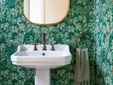
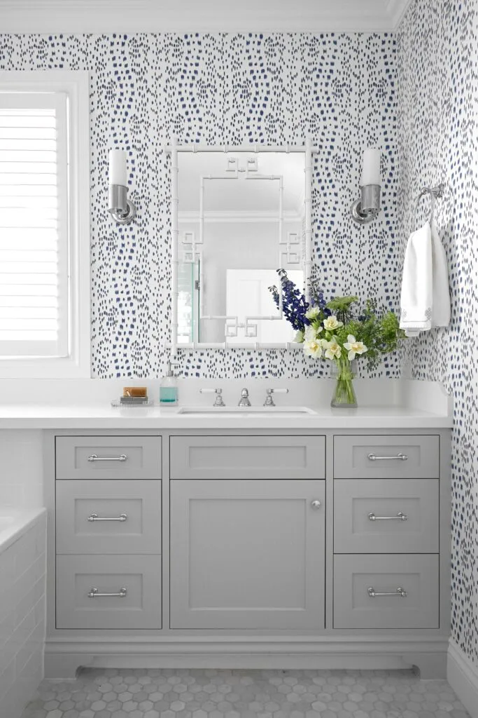
DO use wallpaper and panelling. “Using wallpaper that’s suitable for wet areas is a great way to add interest and personality to a small space, and since the designs are endless you can create a truly unique room,” says interior designer Sarah Yarrow of Sarah Yarrow Interiors. “I’ll often use it above a chair or dado rail and feature wainscotting or V-groove panelling below, which allows me to build a classic look with lots of character and a modern twist.”
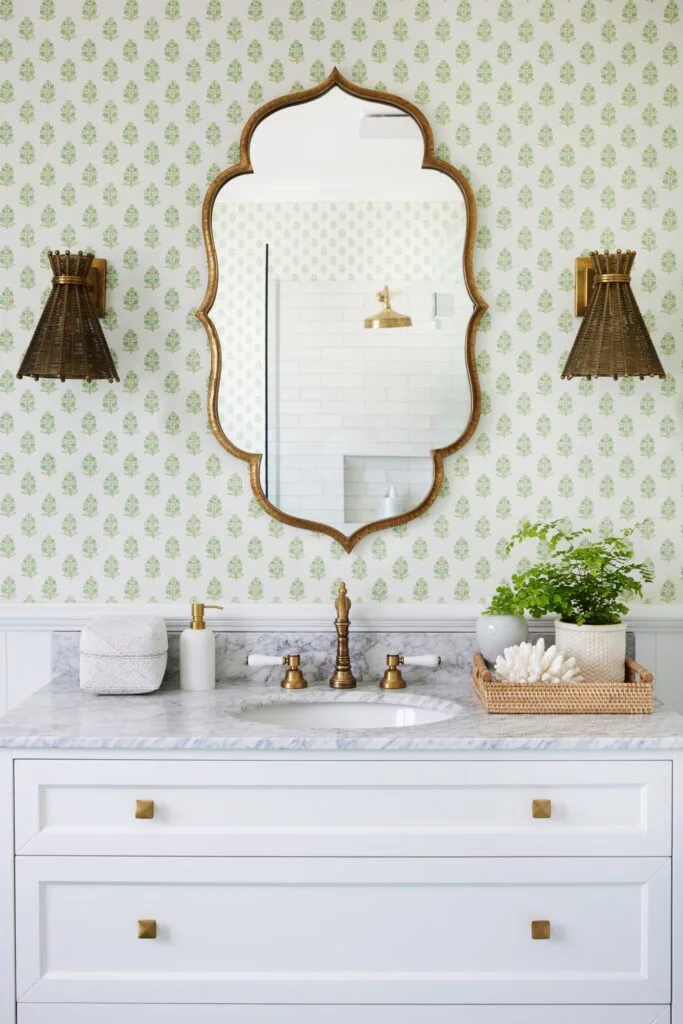
Ben recommends fibro-cement sheeting or V-groove panels as “a cost-effective solution to refresh interiors or to mask the flaws of an older property”.
3. Invest in bathroom tapware
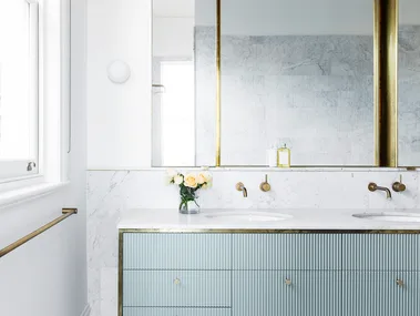
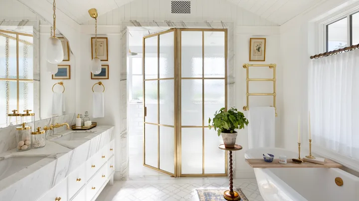
DO splurge on tapware. Ask any interior designer about tapware and they’ll encourage you to buy the best you can afford. “All tapware is not created equal, and it can be false economy to buy too cheaply,” says Mishell, whose insider tip is to check if the internals are brass or plastic. “Premium fittings will last and finishes such as living/tumbled brass will patina and become more beautiful with age.”
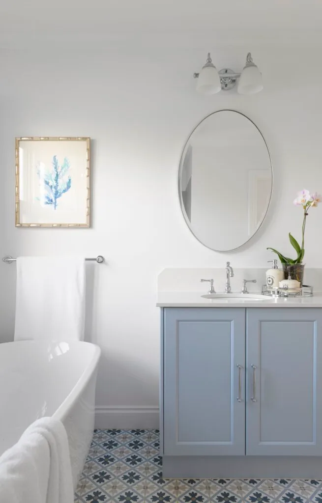
If you’re undecided about the mechanism, Lauren Mahoney, creative director at Studio Trio, suggests this: “Imagine yourself using the mixer every day and think about how you would like to control it.”
4. Curate your own bathroom style
DON’T blindly follow fashion. “Bathroom renovation is expensive and involves more trades than any other room in the house, so it’s important to create a space that you’ll love now, and in five or 10 years’ time,” says Conway + Wise interior designer Shellie Conway.
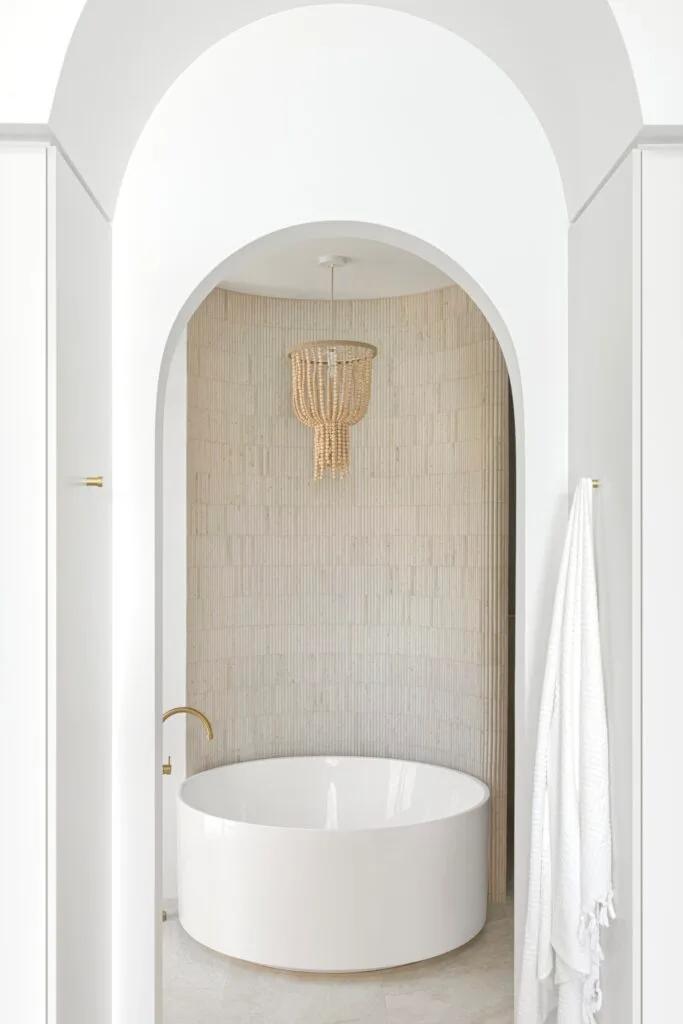
“We always say choose passion over fashion, which for us means designing bathrooms people love and that will stand the test of time. If you look at bathrooms in luxury hotels, they’re rarely busy or jarring, but designed to soothe the senses with a sophisticated and calm tonal palette paired with classic fittings and fixtures.”
5. Form follows function
DON’T overlook who is going to be using the bathroom. While there are basic ‘rules’ to bathroom design, Mishell says there’s no ‘formula’. “You always consider the architecture and style of the home as well as the people who live there and its function. To create a personal and bespoke look, we design a space that embodies the people using it. Some like colour, some don’t… and if we’re designing a bathroom for teenagers, for instance, the tile pattern might be fresher and a little more playful. Using scale, colour and texture in different ways, the ideas are infinite. I guess that’s the bit of ‘magic’ that designers bring to the table.”
6. Balance colour and texture
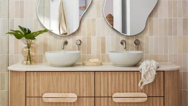
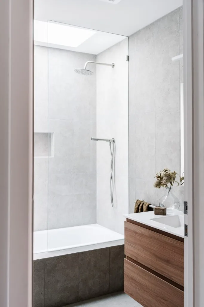
DO embrace contrast. If well-designed interiors are about contrast and balance, your bathroom is no exception, explains Lauren. “The hard, flat and shiny surfaces need other elements to soften and warm the space. A timber vanity or stool gives instant warmth, while panelling or wallpaper behind your vanity instead of tiles lends texture and a softer finish. Having said that, with so many handmade tiles around these days, they can add texture too.”
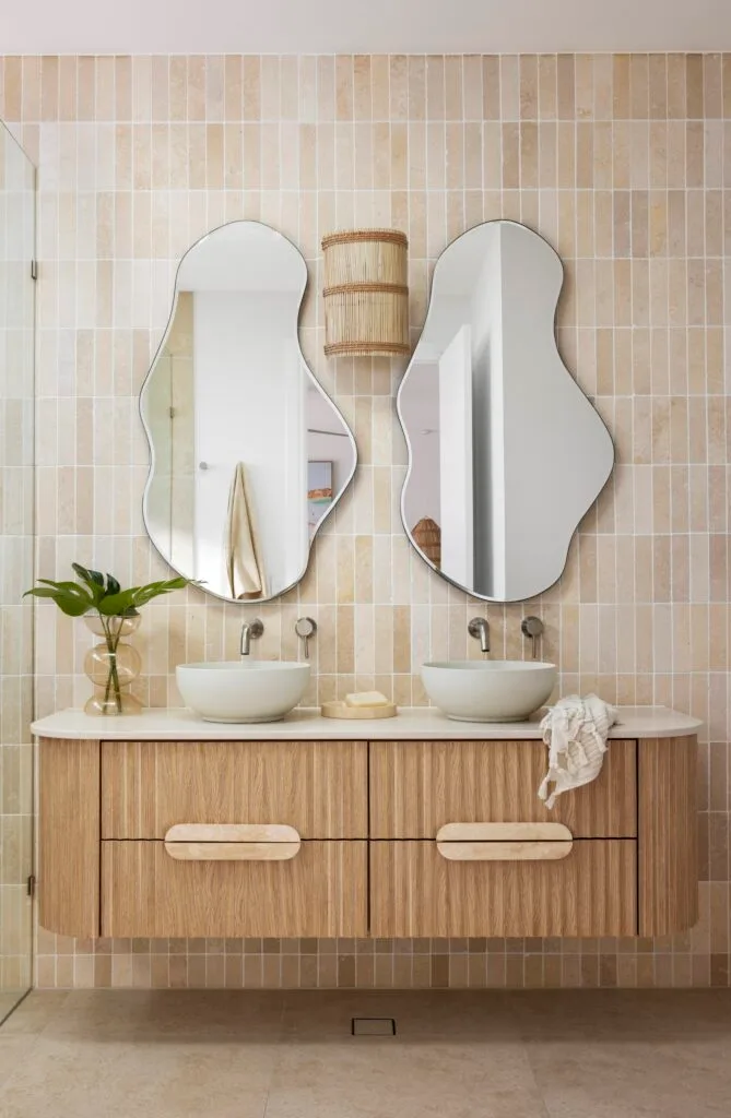
Lauren suggests using wall sconces to bring a gentle, warm glow as well as “spherical and curved shapes to soften straight lines”. Need a quick fix? “Plush towels with a little colour or pattern will lift the space.”
7. Incorporate timber in the bathroom
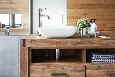
DON’T be afraid to use timber in your bathroom. There’s nothing like timber to lend style, warmth and contrasting texture to a bathroom, but what about all the moisture? “There shouldn’t be any issue with hardwood if it’s well-sealed and waterproofed to prevent warping and discolouration,” says Sarah, who loves featuring custom-made vanities in her projects.

“If you want to add a layer of protection, a stone top will increase the durability of your vanity and add to its design,” says Sarah. A well-ventilated bathroom is also a must to keep your timber happy and periodic sealing and refinishing is often required.
8. Fix your bathroom fixtures
DO position your fixtures thoughtfully. ‘Location, location, location’ isn’t just a mantra for house hunting – where you place key pieces is the secret to a beautiful and functional bathroom.
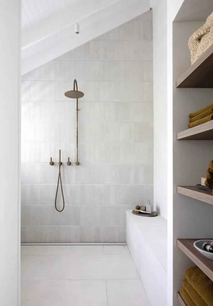
“You don’t want the first thing you see to be the toilet,” says Lauren, who suggests hiding it behind a nib or door, or in a small room. “If possible, place your shower mixer in a ‘dry’ location away from the shower and make sure screens swing out, not in, to avoid hitting the shower head. I place towel rails conveniently near the shower or bath area, but you need to check any regulatory distances between water and some heated rails.”
9. Get creative with a dark palette
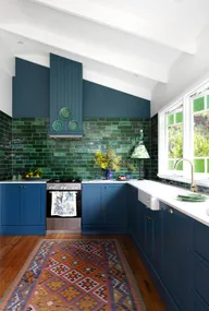
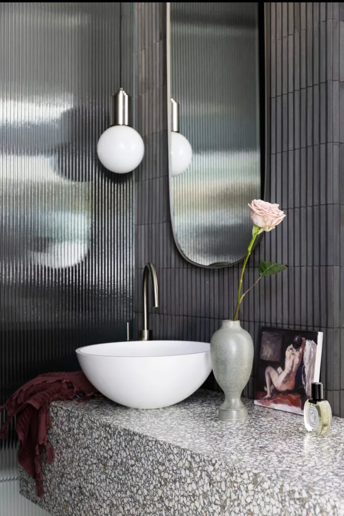
DON’T be afraid to embrace the dark. ‘Dark and moody’ isn’t generally seen as a great personality trait, but in your bathroom? Bring it on, says Sarah. “Darker shades of wallpaper, tiles or paint combined with moody lighting can work well, particularly in a powder room where there is often no natural light. A small space that’s only used sporadically, unlike a main bathroom, is the perfect place to choose something a little adventurous in a darker palette.”
10. Add plenty of bathroom storage
DON’T forget storage. It doesn’t matter how soothing your colour palette is; if your bathroom is cluttered, you can kiss tranquillity goodbye. “Plan practical storage solutions from the outset and make it a priority, not an afterthought,” says Mia Nixon from ABI Interiors.
“Choose a vanity with plenty of storage (drawers are generally more useful than cupboards) and inside, keep things tidy with adjustable shelf dividers and clear acrylic organisers. For cupboards, turntables make the contents more accessible,” adds Mia. A roomy shaving cabinet and baskets on a vanity shelving will also keep your wet zone clutter-free.
11. Choose the perfect lighting
DO make lights the hero. One feature people often overlook is lighting, says Ben. “At its best, bathroom lighting blends function with decorative charm: wall sconces or pendants subtly convey that your bathroom is more than just a wet zone, it’s an integral part of your home where significant time is spent. Fittings made of glass, ceramic and metal can play a hero role in the space and shouldn’t be overshadowed by simple downlights.”

12. Style your bathroom tiles
DO feel confident about choosing tiles. Where to start? “Look at your home’s overall design narrative, including its style, colours and what lighting is available,” says Christie Wood, Beaumont Tiles design specialist.
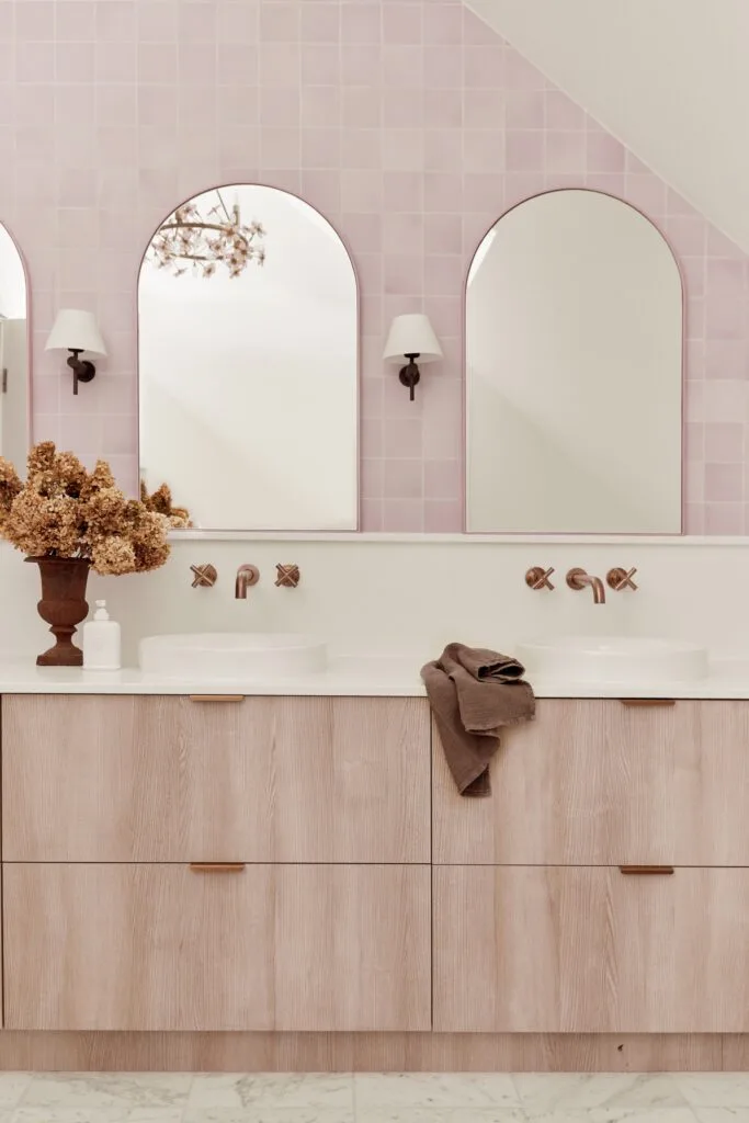
“Next, start collecting tiles that fit with your style and palette, then you can experiment with various combinations in a flat lay. Look at colour, texture, and size, and the interplay between them and try bringing in metallics with your tapware and accessories alongside vanity and cabinetry swatches.” Lastly, you can always ask for samples to help you make your choice.
 Photography: Ema Peter / Styling: Kelly Deck Design
