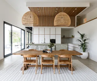
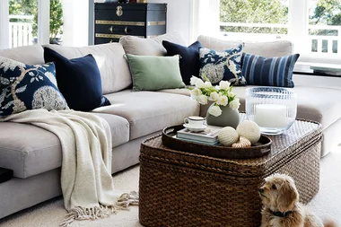
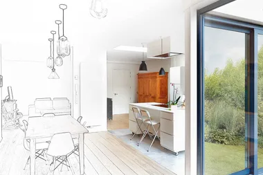
During living and dining room reveal week on The Block, the contestants discovered that there’s a lot to think about when designing an open-plan home. First, you must decide on the perfect layout so that all of the spaces feel connected. Next, you have to style the rooms in a way that makes all of that open space feel somehow cosy, yet not too cluttered. You also need to have a very clear design vision to ensure all of the zones are distinct, yet have a consistent look and feel.
It was these kinds of design challenges that The Block contestants found themselves up against this week. Some were better at planning ahead than others, creating gorgeous open-plan spaces with undeniable style and flow. Those who failed to scrutinise the floorplans ended up with cramped living spaces that may “cost them the auction.”
Here are three of the biggest open plan living and dining room mistakes made on The Block and how you can avoid making them in your own home.
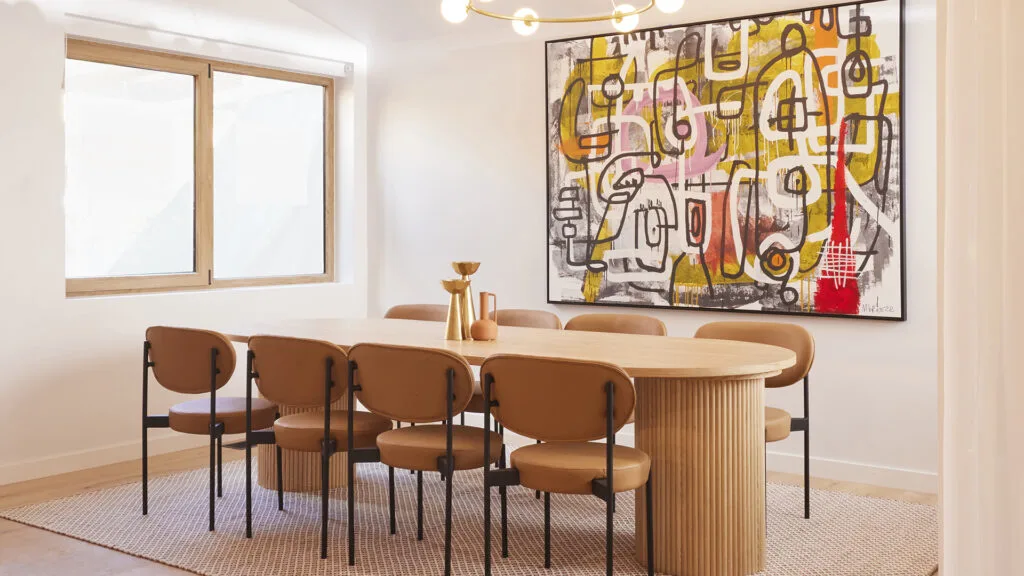
Mistake #1 – Furniture is out of proportion
It doesn’t matter whether you’re styling a large living room, or a compact, cosy space – selecting furniture that is just the right size for the room is paramount. Buy something too big and the room will feel cramped, buy something too small and the room will feel mean and unfinished.
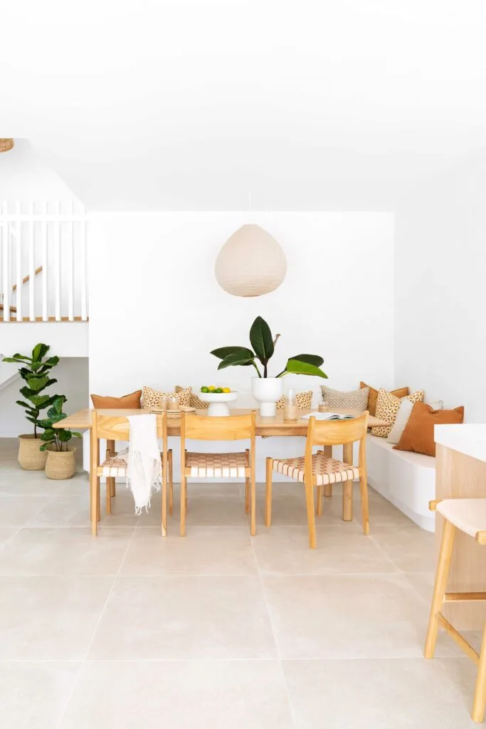
It’s a lesson many Blockheads learned this week. Kyle and Leslie were called out for a dining table that was just way too big. Over in House 2, Leah and Ash may have styled their living and dining area to perfection, but according to Shaynna, should have upsized both the dining table and couch, “because we do have the space.”
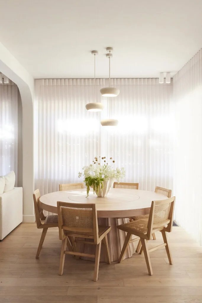
Do this instead: To select the perfect-sized dining table, Freedom give the following advice: measure the size of your dining space. Subtract 1800mm from the length and width of the room. This will give you the ideal maximum size of your dining table.
Leaving at least 900mm on each side of the table will allow enough space for chairs to be moved in and out, and allow someone to pass behind the chairs when everyone is seated. Then it’s just a matter of selecting the right-sized pendant light for the dining table!
As for the living room, Lounge Lovers recommend using painter’s tape or newspaper to measure out the size of a potential new couch, so you can clearly picture how much space it will take up. You also want a sofa (or pair of sofas) that can accommodate everyone in the household, plus extras – if you can – for guests.
Mistake #2 – Zero ambience
There’s something inherently romantic about the phrase, ‘Dim the lights.’ Subdued lighting creates a cosy atmosphere, which is exactly what you want during evenings snuggled up on the lounge binging your favourite show. Subdued lighting is also highly flattering and a gentler option on the eyes if you want to stay in tune with your body’s circadian rhythm.
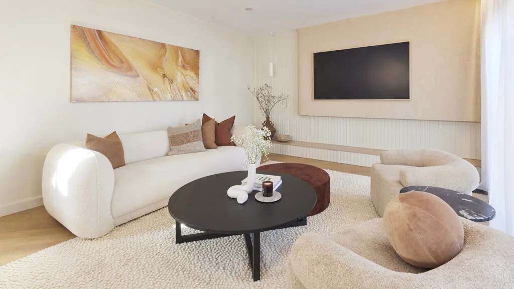
Sadly, almost every couple on The Block this week (save for Leah and Ash) forgot to add ambient lighting to their rooms – much to Neale Whitaker’s dismay. “This room is crying out for a lamp,” Neale remarked in House 3 Kristy and Brett’s living room. “We need something to create that evening ambience.”
“It’s not just a little oversight, it’s a major oversight,” he continued. “This is the living room! What are we going to do at night, sit here underneath the downlights? Of course, you need a lamp!”
Do this instead: When designing a room, it’s important to think first about the space’s main source of lighting, but don’t overlook secondary light sources such as lamps, pendants and wall sconces which create the kind of subtle, moody illumination you need in a living space.
Mistake #3 – Lack of a focal point
Ever wonder why your living room doesn’t quite look like the ones splashed across the pages of a magazine? It could be because it lacks a focal point! In most ordinary homes, the layout of the living room is configured entirely around the position of the TV. Despite this, many designers agree that the TV shouldn’t be the focal point of the living room – which should be set up as a space to gather together, entertain and chat instead.
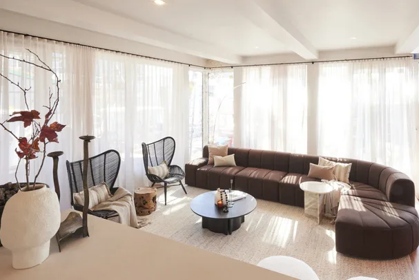
It was a style choice the judges discussed at length, particularly in Kristy and Brett’s House 3, which featured a 3-sided Stokke fireplace on one side of the room, and a TV on the other. Darren thought the fireplace ought to be the room’s focal point, while Neale had no issues with the less ‘traditional’ layout with the TV front and centre.
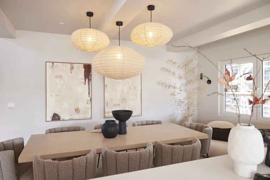

Steph and Gian’s House 4 dining room, on the other hand, lacked a focal point for an entirely different reason: too much stuff. “There’s too much of everything,” said Neale. “It’s feeling almost like a retail space here. You know, are we in a home or are we in a store?”
Do this instead: If a TV must be front and centre in the living room, consider concealing it behind cabinetry or investing in a TV that looks like artwork.
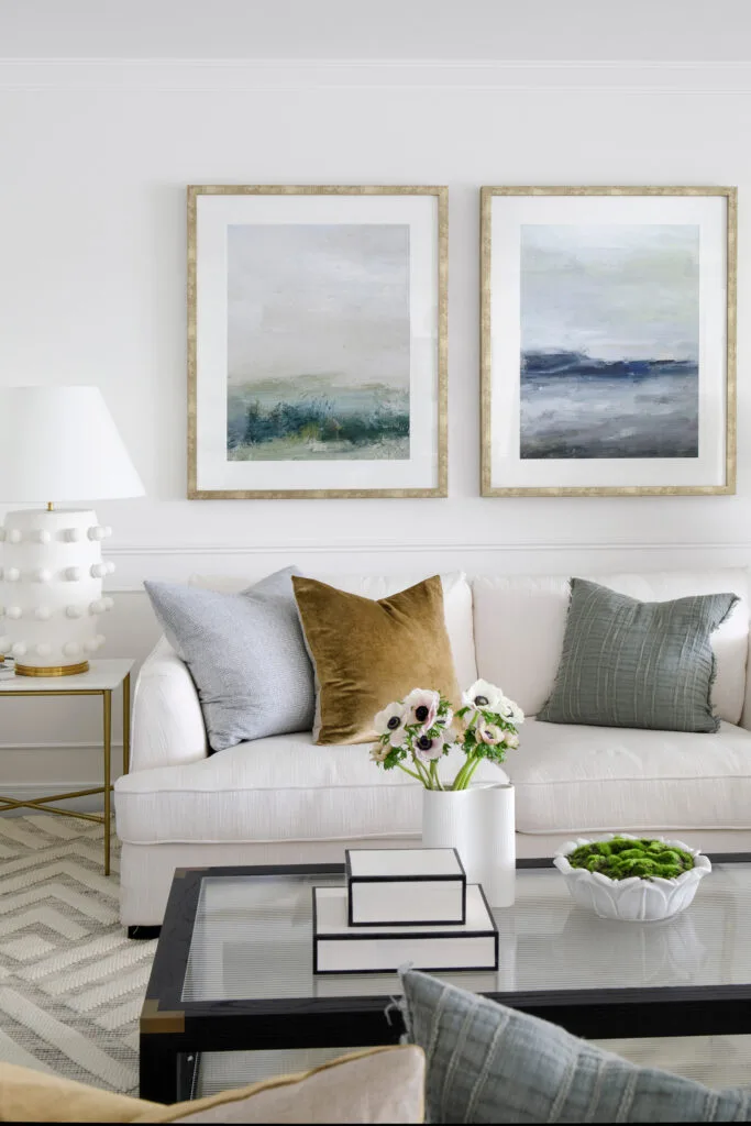
When styling your living room, it’s important to think about what the hero feature of the room will be. It could be a fireplace, a dramatic piece of artwork, a beautifully styled bookshelf or a sofa in a statement colour. All of the room’s other design choices – including colour choices, rugs and cushions – should complement and refer back to the room’s hero feature.
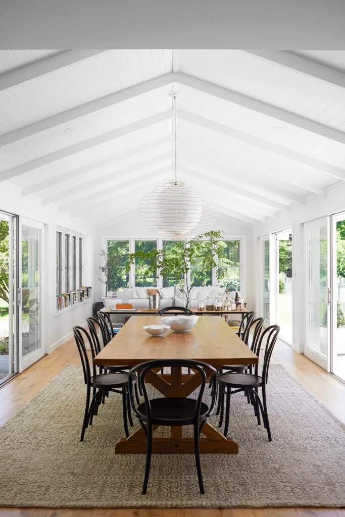
It can be tempting, but try not to overaccessorise. Invest in key pieces of decor that mean something to you and add to the overall look of the room, rather than buying a bunch of trendy items just for the sake of it. In the words of Coco Chanel: “Before you leave the house, look in the mirror and take at least one thing off.” The same can be said of your home’s decor.
 Nine
Nine
