With glittering turquoise water on one side and rolling green fields on the other, the location of this beach property on the NSW South Coast is heavenly – but the house itself was far from sublime. Then, interior designer Melinda Hartwright blew through the property like a refreshing sea breeze, lifting it from modern mediocrity to a personality-packed stunner that’s utterly worthy of its divine location.
Now based on Queensland’s Sunshine Coast, Melinda is formerly of NSW’s Southern Highlands, which is where she met her clients, working on their Bowral home, then a city apartment. She had a firm grip on her clients’ style and had earned their unerring trust. “Having done two other projects with them, they had become more adventurous in their choices. They knew my style and the kind of things I was going to present to them – and I knew how far I could push them,” she says.
Melinda’s brief from the clients was a two-part challenge: first, to add character to the charmless build, and secondly to bring a sense of playfulness. This was to be a place to relax and retreat, entertain and make memories – and the house needed to reflect that. “It’s a weekender for them and they wanted a place that was joyful and fun, relaxed and happy.”
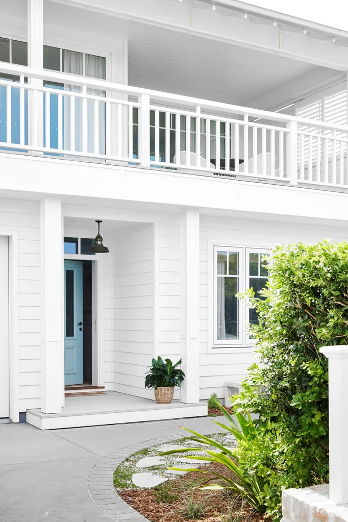
First up was an architectural personality transplant. Melinda diplomatically says the house was “just a bit blancmange”. Less forgiving commentators might have called it stoically serviceable, with its brown brick exterior, shiny floor tiles and lack of whimsy. On the up-side, the location was incomparable, the backyard generous, and the house itself built to take advantage of the views, with living areas located on the upper storey.

The makeover began with a facade facelift, an overhaul designed by Melinda, working with a draughtsman, then carried out by local company Life Home Builders. A forest of view-blocking concrete pillars made major surgery of this process, but with new structural supports, they were removed, and the staggered frontage squared off to create one long verandah upstairs, and space for an extra bedroom downstairs. Brown brick gave way to fibre cement weatherboard cladding, and blank windows were replaced with new panelled windows and French doors.
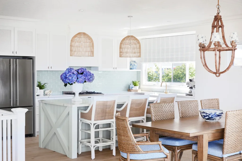
Inside, the miserly little skirtings were replaced with a wealth of interest: elegantly detailed cornices, architraves and skirtings, new doors and hardware, and VJ panelled ceilings, which epitomise classic coastal style.
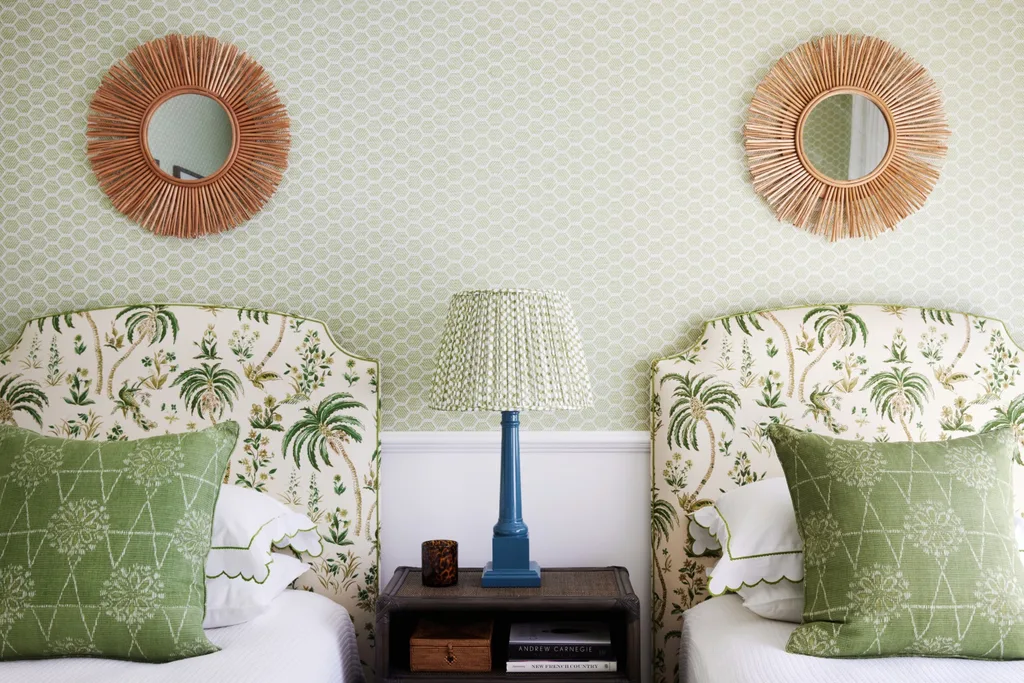
Next up was the really fun bit, layering the home with a carefully curated kaleidoscope of colour and pattern. “It’s got a beautiful view with glorious turquoise water, so we wanted the vibrancy of that to be matched by the interiors,” says Melinda.
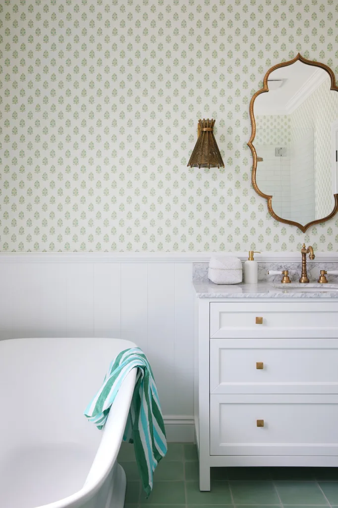
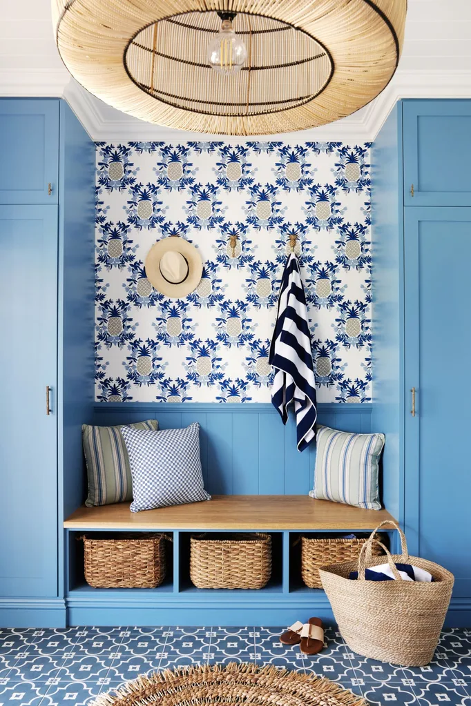
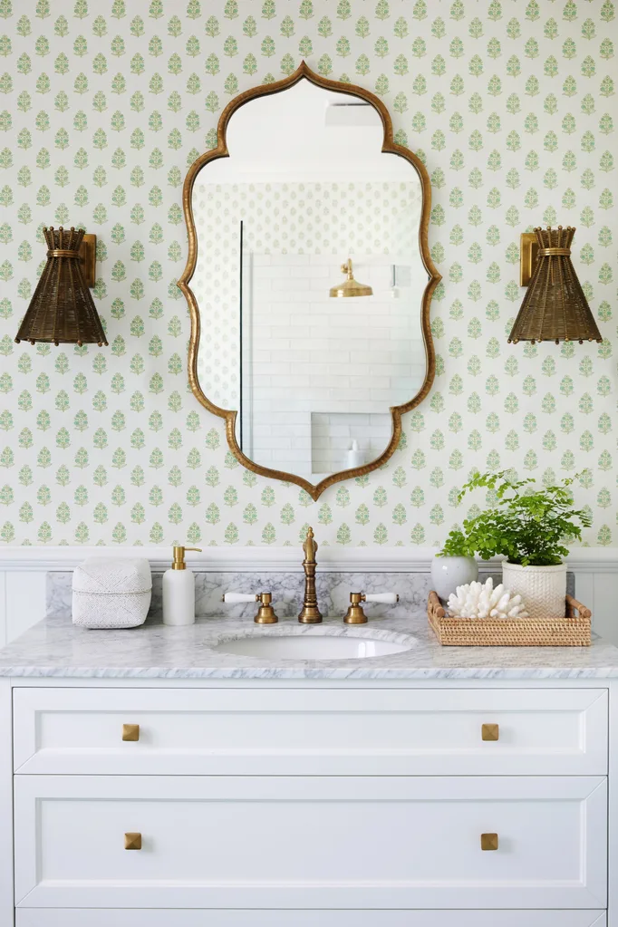
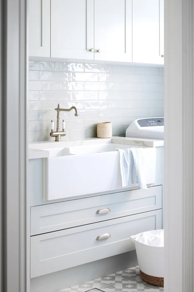
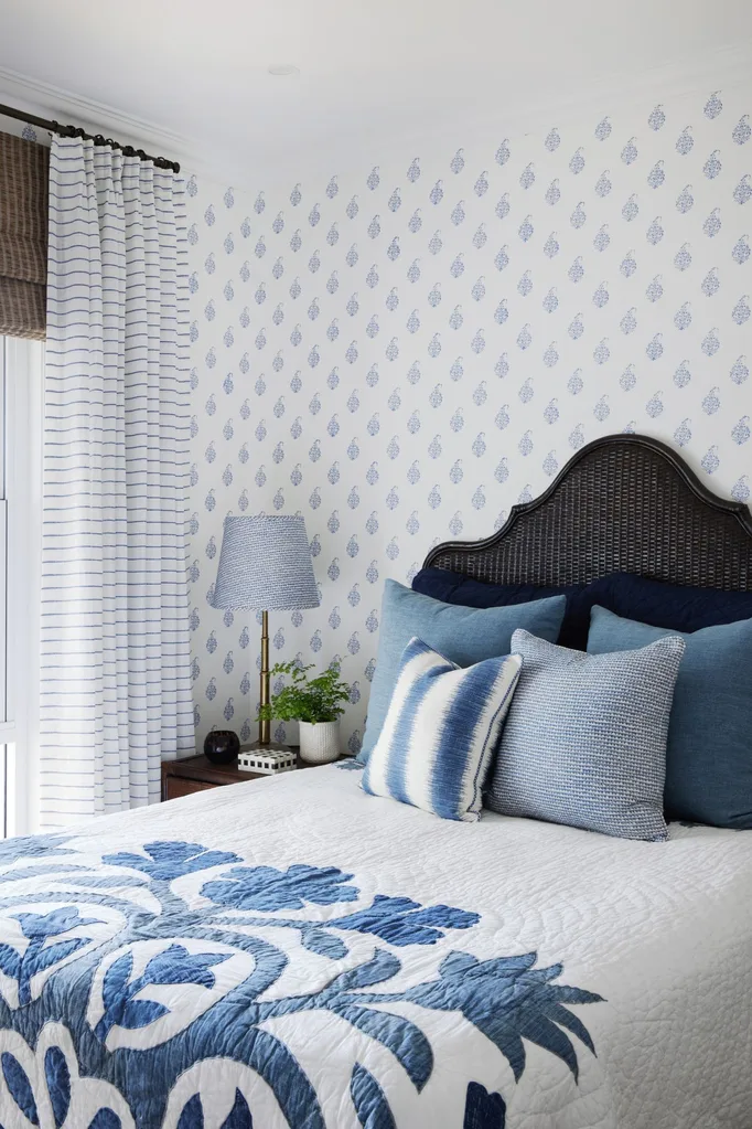
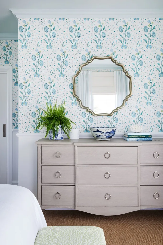
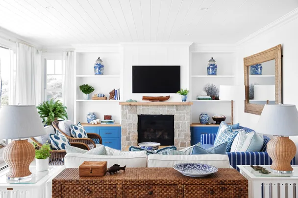
“We wanted classic interiors, but creative and playful and pretty,” she says. A core palette of coastal blues is expressed through bright cerulean cabinetry, patterned fabrics and wallpapers, offset by crisp whites and touches of sand. Branching out from blue, each bedroom is themed by colour (green, pink, aqua), while the bathrooms are each defined by beautiful wallcoverings, adding warmth – a signature feature of Melinda’s style.
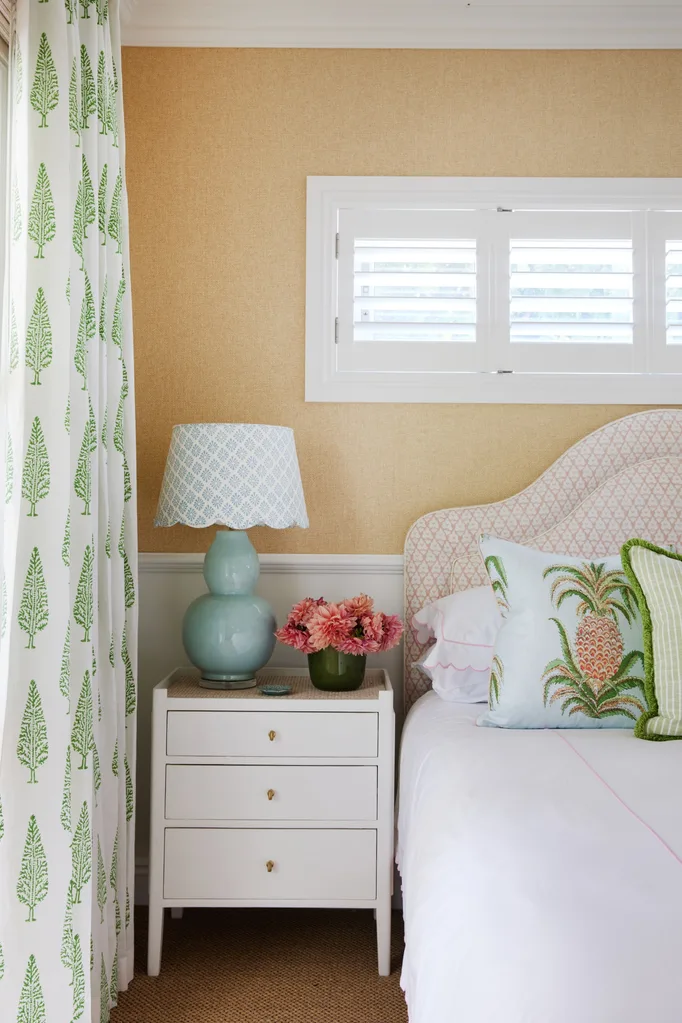
Functionality was always top of mind – this is a beach house, it needed to survive sandy feet, wet swimmers and future grandchildren. With this in mind, Melinda embraced outdoor fabrics, hard-wearing sisal carpet and sand-camouflaging timber floors, plus a striking sand room – the beach version of a mud room.
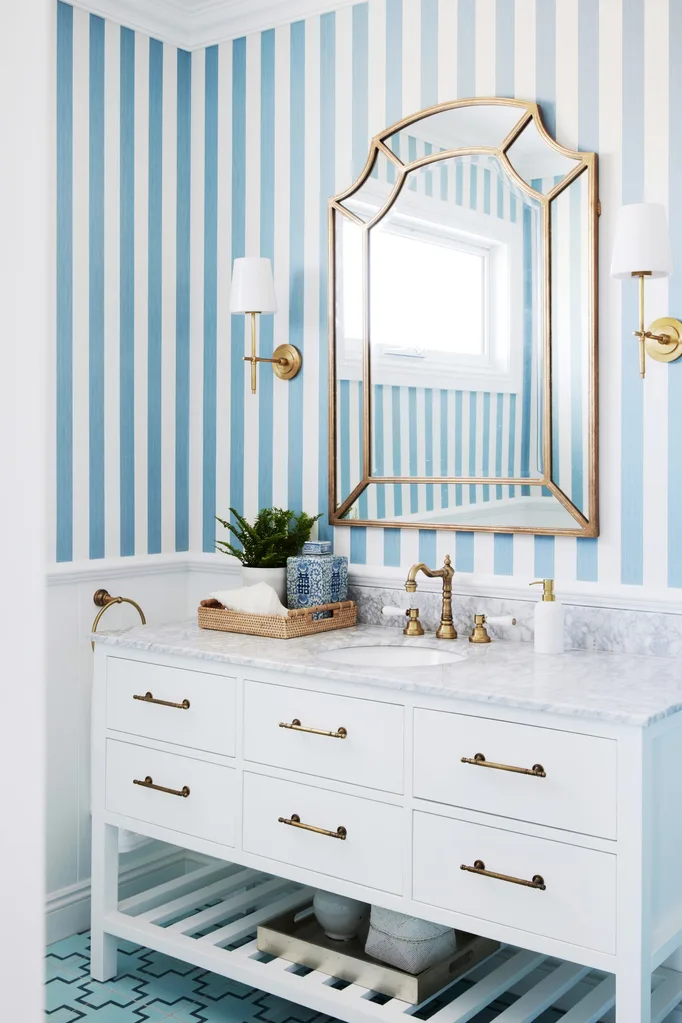
“It’s not your typical beach house – it’s a little more structured and more formal. But it’s still relaxed and inviting,” says Melinda. Her clients’ reaction is all the endorsement needed, Melinda says. “She said to me, ‘I never really liked going down there. Now I want to go every weekend and never want to leave!’”
Designer Tips
These are Melinda’s insider insights on how to add character to every room.
Where do I begin? “I usually start a room with a statement artwork, a fabulous rug, or amazing hero fabric. Everything else falls into place once the lead character is established. Paint colours come last as there are many to choose from and the focal point is always unique and special.”
How do I make a room feel unique? “If there is a chance to use wallpaper in any room, I will grab it. If you don’t want pattern, you can add glorious texture, interest and depth of colour.”
Can I use wallpaper in a bathroom? “I don’t do tiled walls except in the shower, they are too clinical. If you have good ventilation and water will not be splashed on the paper, then absolutely wallpaper bathrooms.”
How can I start small? “The perfect place to try out bold, patterned wallpaper is the powder room. It’s a small room that can handle big impact, doesn’t cost a lot, and one that you don’t spend lots of time in. Powder rooms can be the jewel of the house.”
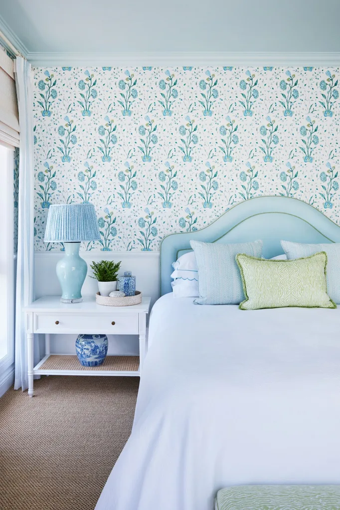
How do I mix patterns? “I usually work in a dozen or so fabrics into a good-sized room. Have a nice blend of pattern sizes and beautiful combinations of colours, then the sky’s the limit.”
Any rules for prints? “Go for plainer fabrics on sofas and upholstered items, and play with bolder patterns on cushions and lampshades that can be readily and less expensively changed.”
What are your go-to material combos? “I always try to incorporate a mix of stained timber and white-painted furniture, rattan, glass and some kind of metallic finish in a room. And a touch of black is usually needed somewhere.”
What’s a quick design tip? “Avoid putting sofas against walls with a lone coffee table wallowing in the middle of the room. Make sure side and coffee tables are only a reach away, so that you can easily put a glass down.”
What’s one big-impact item? “Lamps, lamps, lamps. Overhead lighting is great for making a statement and adding a feature to a room, but when it comes to cosiness, atmosphere and ambience nothing beats simple, soft lamp light.”
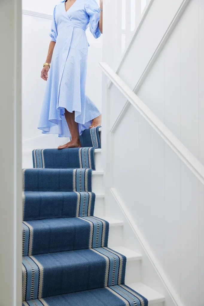
Stairs
The orange-stained timber stairs were transformed with white paint, and a Roger Oates ‘Westport’ runner turns them into a statement.
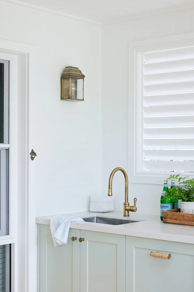
Outdoor Kitchen
A pale green is carried through cabinetry in a calming shade of Dulux Pale Celadon in the barbecue area.
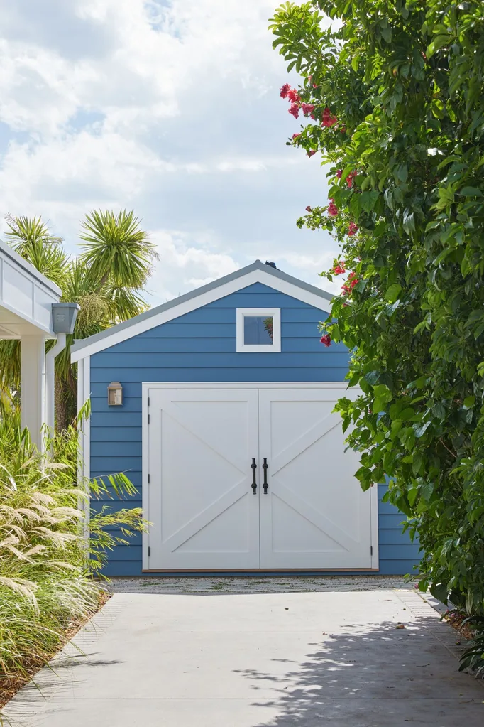
Guest House
Originally a shed, the navy guest house in Dulux Eclipse Blue has maximum impact alongside the all-white house. “Painting the house white worked, because we then had this fabulous splash of brilliant blue on what looks like an American barn,” says Melinda.
SOURCE BOOK
Interiors: Melinda Hartwright, Melinda Hartwright Interiors, melindahartwright.com.
Builder: Life Home Builders, (02) 4234 4830, lifehomebuilders.com.au.
 Photography: Chris Warnes / Styling: Melinda Hartwright
