Family room
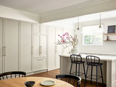
Bright and sunny in summer and warm and cosy in winter with its romantic open fireplace, the family room is always the most social of zones. “Opening up the house on the northern side has completely changed the quality of light through the whole rear extension,” says Carolyn. “There are windows flanking the wood-burning fireplace to the south, light-wells to the east, borrowed northern light from the meals area and the sliding doors to the entertaining deck outside.” An organic, pared-back palette, with soothing splashes of green, provides a seamless link between inside and out. “We kept this space simply furnished in natural textures and tones that echo the gardens,” adds Carolyn.

Family room
Carolyn’s design tip: “Built-in storage was key for this busy space and allowed me to introduce a timber element in scale to the room’s size,” she explains. “A credenza-style unit runs the length of the room and has timber storage at the other end in a stainless-steel-lined box.”

Kitchen
Housed in the luminous new extension and grounded by the timeless beauty of smoked and black oak boards, the Hamptons-style kitchen is as family-friendly as it is beautiful. Topped in a Stone Italiana bench, the central island appears more like a piece of furniture. Subway-style tiles in honed Carrara marble swathe the splashback, while inky-hued 2-pac cabinetry adds a touch of drama.

Entry hall
A stunning ‘Maxwell’ antique mirror and gold-leaf pendant light from Regency Distribution sets the scene in the entry hall. “This room has beautiful original wall panelling and a decorative plaster ceiling that we wanted to preserve and freshen up with white paint,” says Carolyn.

Stairs
A brightly-coloured runner adorns the original staircase leading to the children’s wing on the first floor. “It was important to have some energy, pattern and colour here,” says Carolyn. “I also love bold, graphic wallpaper in transitional spaces and, as there was not a lot of natural light in the centre of the house, I used a metallic paper here to bounce some light around.”

Formal dining room
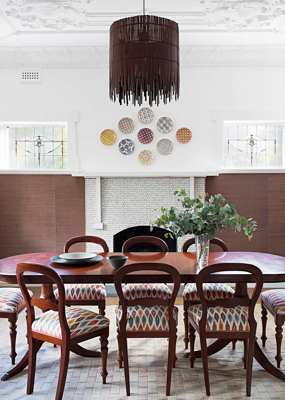
Leading directly off the entry hall, the dining room is a study in elegance. Carolyn updated an antique table setting by reupholstering the chairs with a Schumacher ‘Ikat’ print. “I picked up the jewel tones in the fabric, and also the beautiful original leadlight windows, through a Baresque ‘Bodhi’ grasscloth wallpaper,” says Carolyn.

Powder room
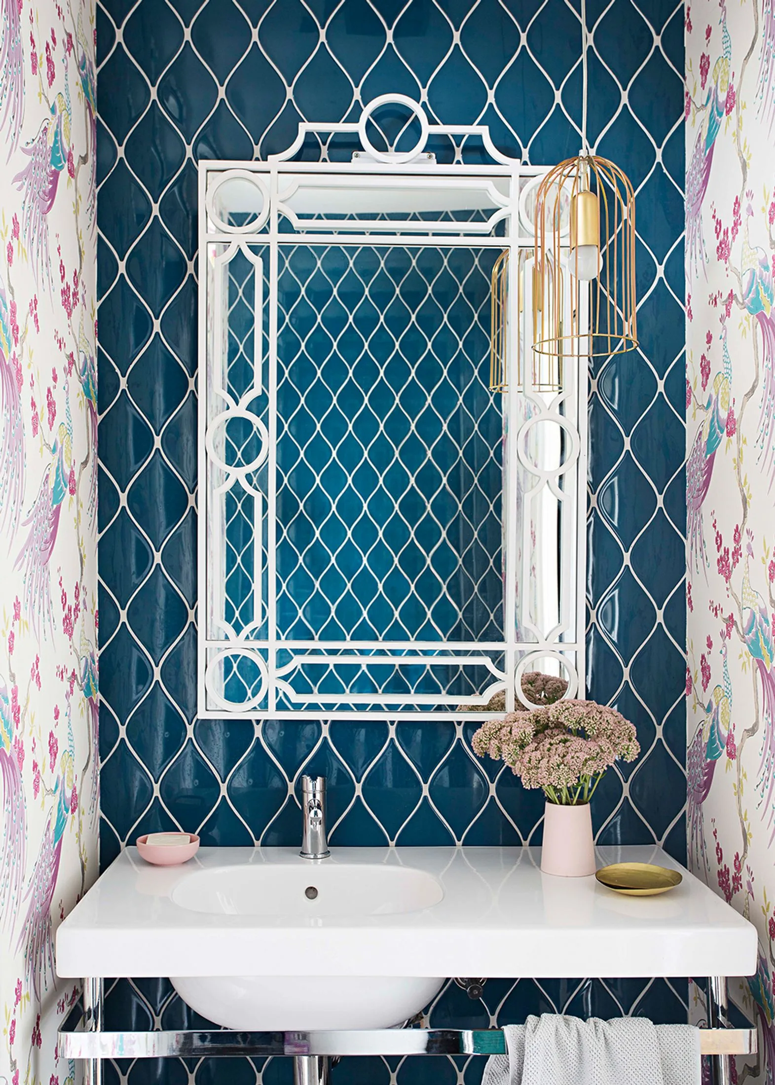
Carolyn used the same Clarke & Clarke ‘Indira’ wallpaper in the entry hall on the side walls, with a deep turquoise three-dimensional tile (‘Aya’ ceramic mosaic tiles from Academy Tiles)
for the end wall. “The Pozzi Ginori basin on legs is a modern take on an old-fashioned washstand,” says Carolyn. “The [‘Treillage’] mirror from Regency Distribution provides a chinoiserie touch, and the [‘Nudie Slim’] pendant light from ISM Objects is reminiscent of a birdcage – just to follow the bird theme through!”

Master ensuite
As busy working parents it was important to the owners that their ensuite bathroom be transformed into a sanctuary. A sculptural freestanding Caroma Pearl bath, teamed with a gleaming Scala floor-mounted mixer from Reece, a Kado Quad wall-mounted heated towel rail and a twin-basin stone vanity, all add up to a relaxed pamper zone. “I used a charcoal colour palette, a pattern-tiled feature wall [Jatana Interiors tiles] and a furniture-like floating double vanity for a sense of calm and balance,” explains Carolyn.

Master ensuite
Carolyn’s design tip: “It was important to keep the proportions generous, especially with the high ceilings, which allowed us to hang a whimsical but inexpensive Ikea [‘Stockholm’] pendant,” says Carolyn of the show- stopping feature. “The play of light across the patterned tiles in this room is particularly nice, and the dark colour scheme makes it feel a world away from the family spaces.”
 Martina Gemmola


